Maya Fundamentals
First project of the course, concentrating on the basics of the VFX industry, and so, teaching essential skills and techniques within the industry standard software. The unit contains technical workshops for skill development in Maya, Nuke and 3D Equalizer, as well as research tasks concerning the historical and possible future context of VFX, all accompanied by evaluation of own work.
All pictures can be enlarged by clicking on them.
Week 1
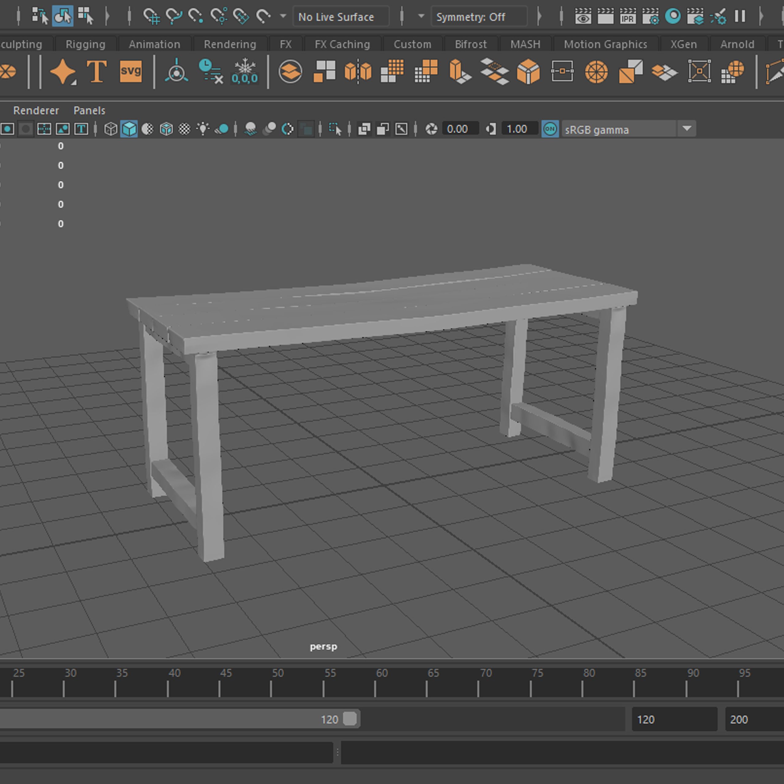
Cottage kitchen scene
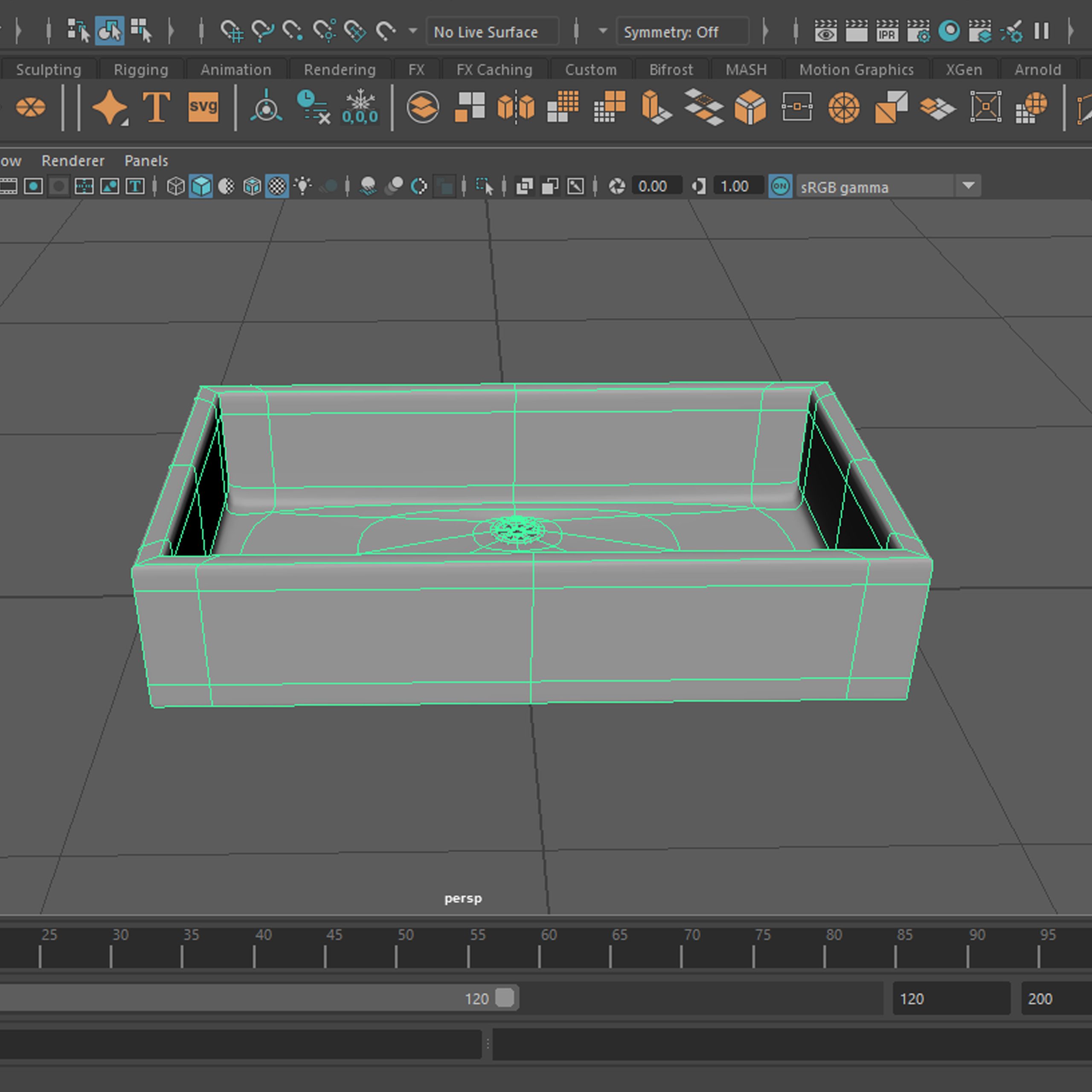
– Table
Progress
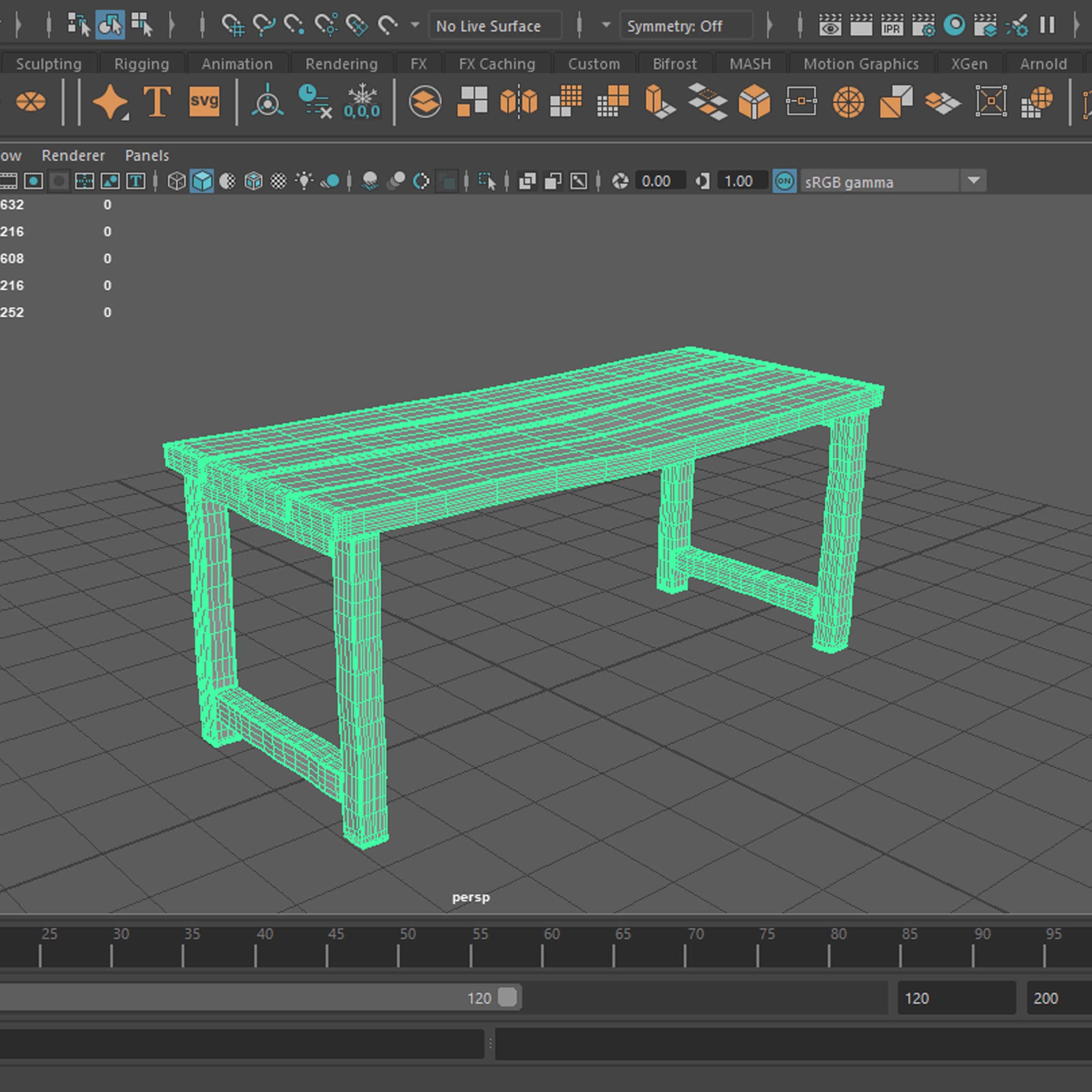
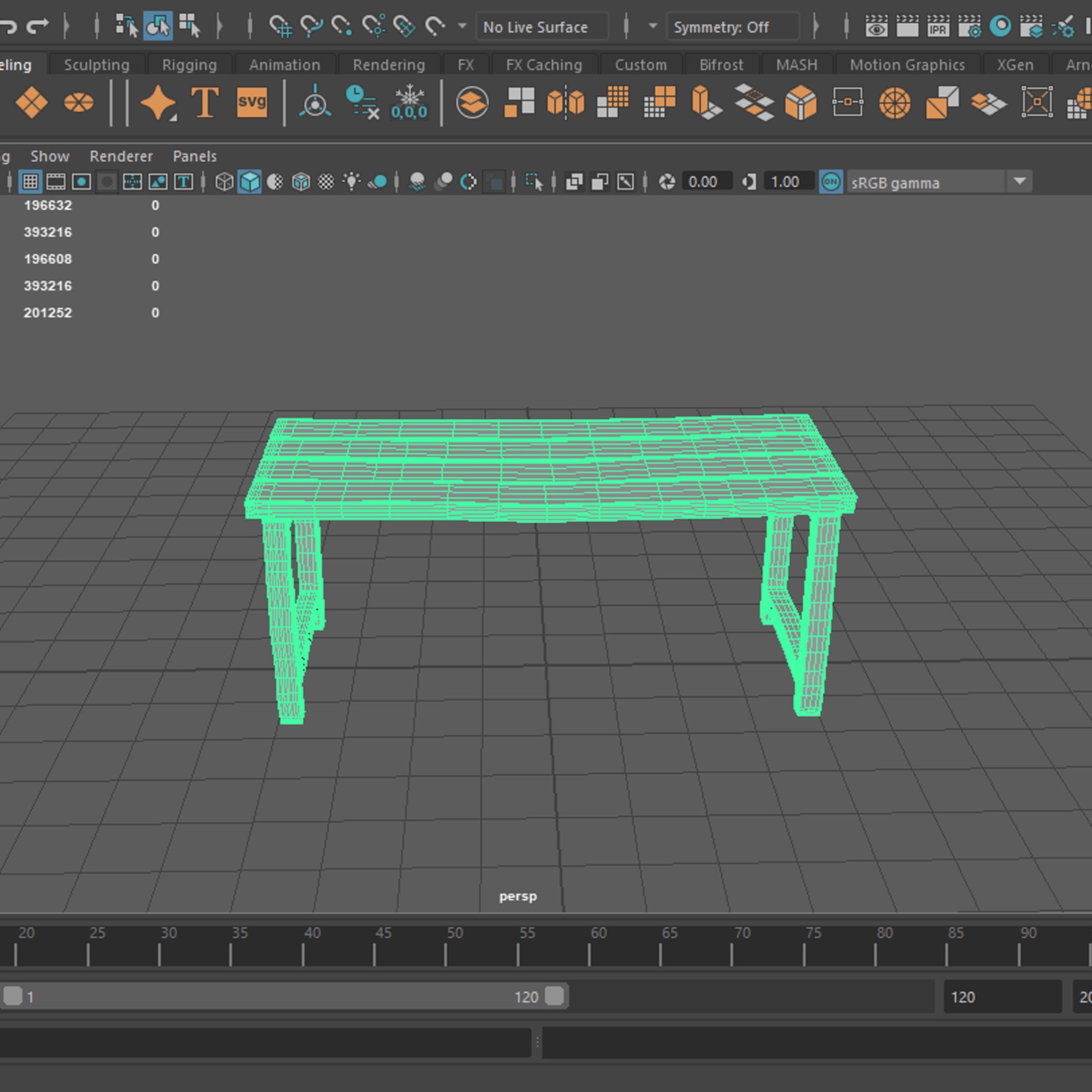
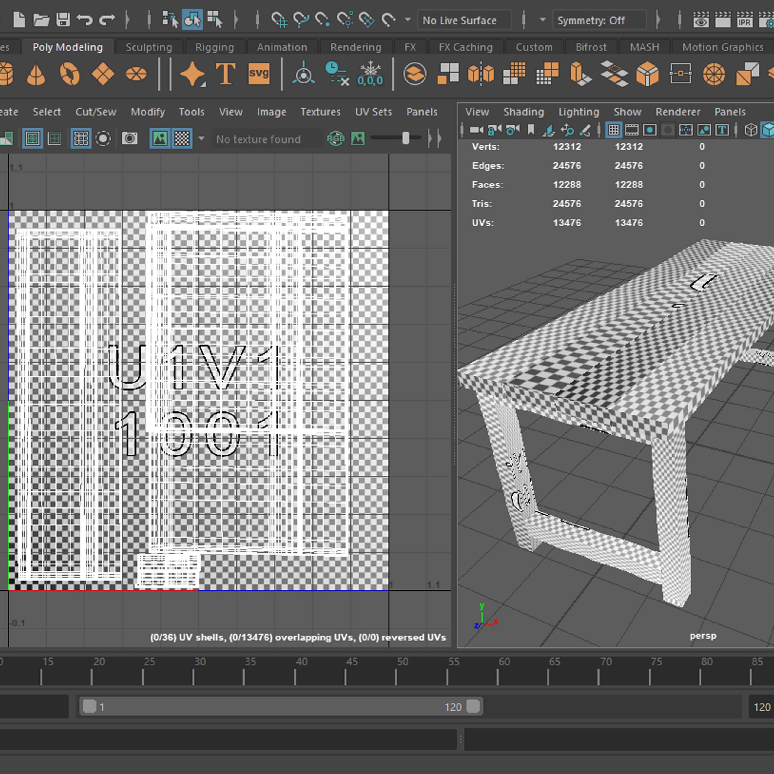
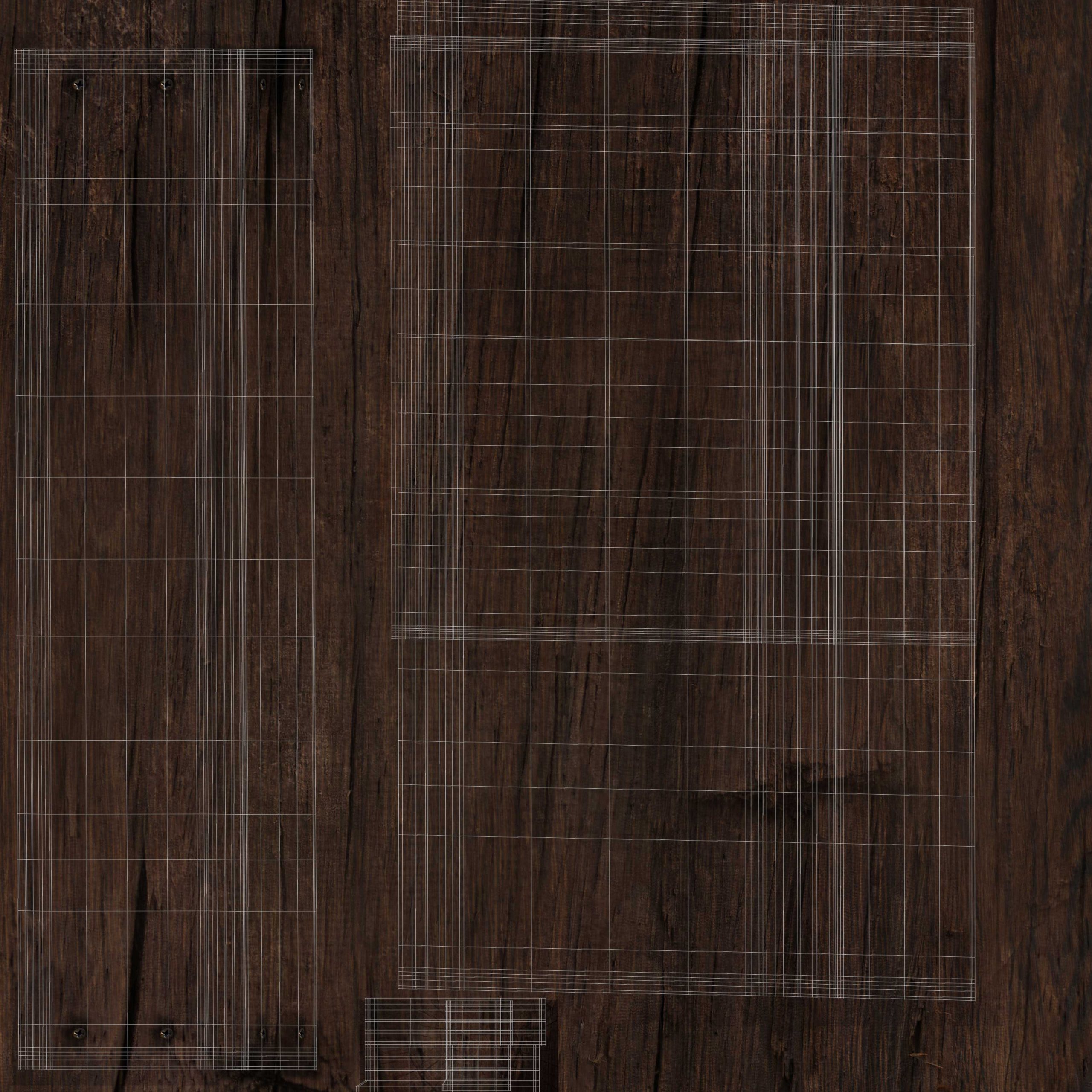
Pictures showing the progress of building the model. First three just show the model and its wireframe, fourth one shows just the model and remaining two show the unwrapped UV’s – the last one with texture.
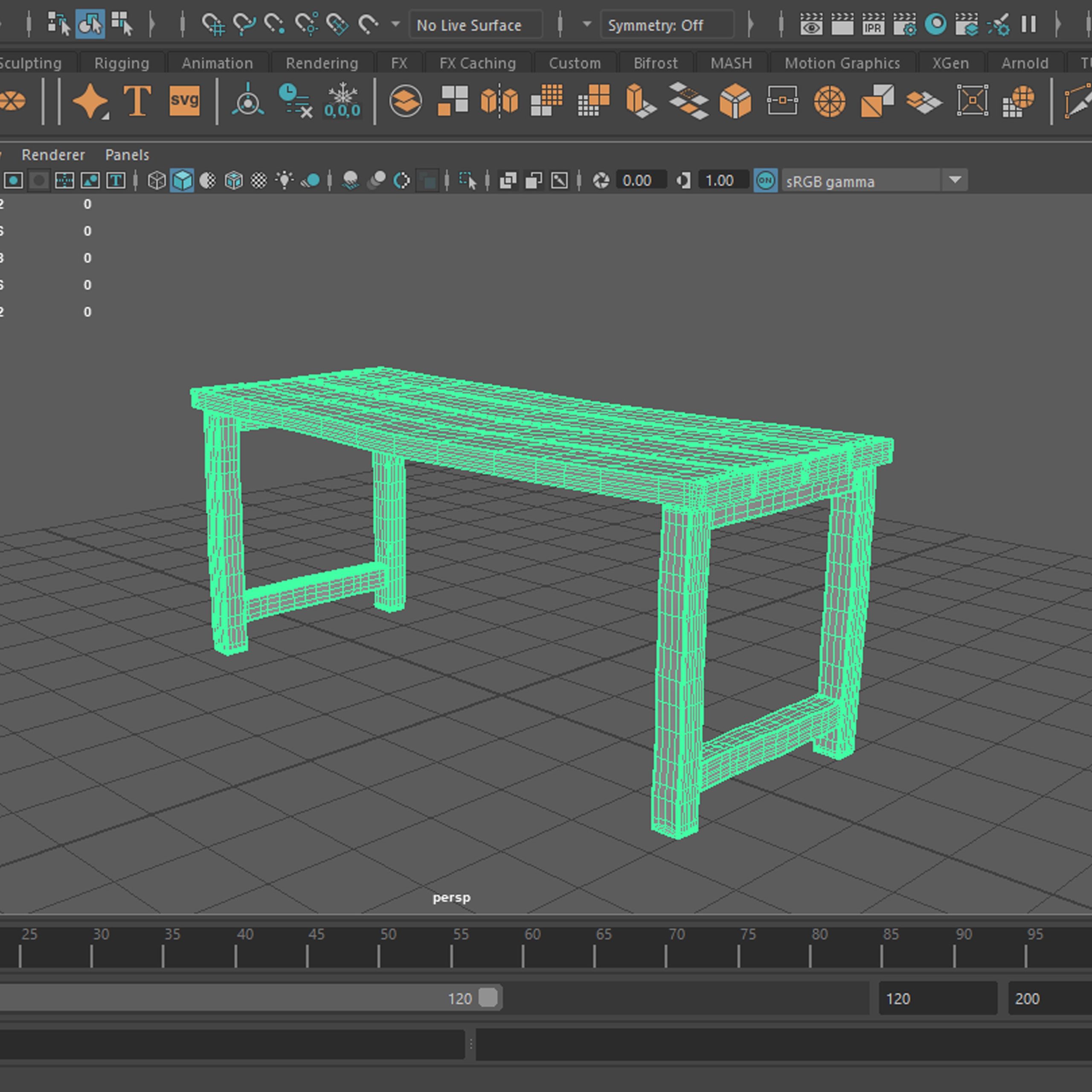
Renders
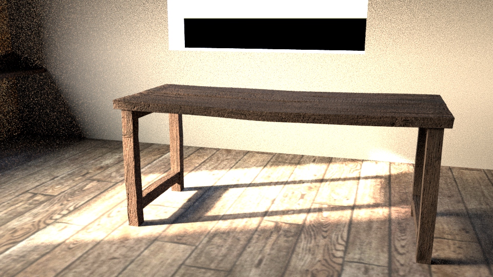

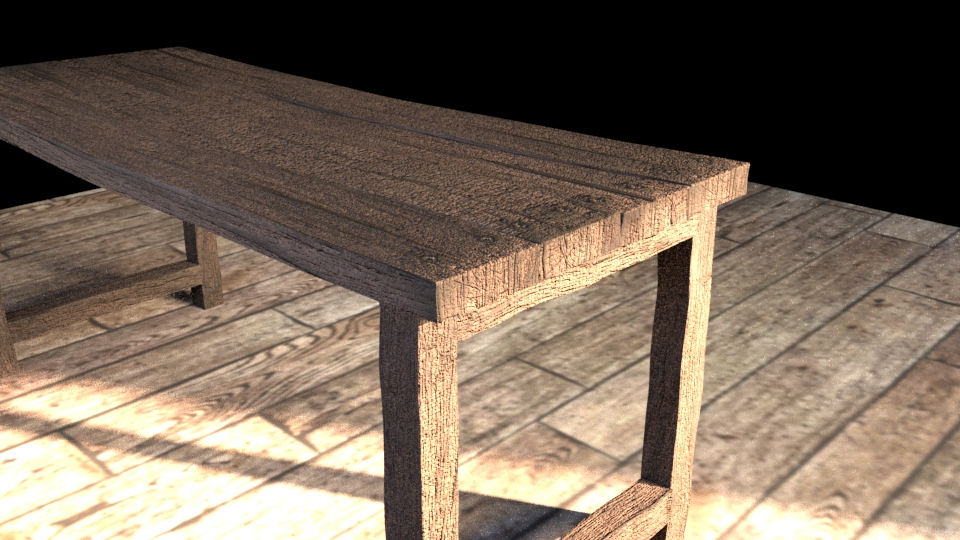
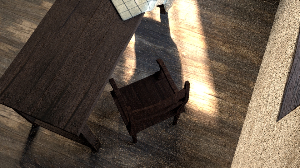
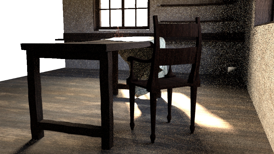
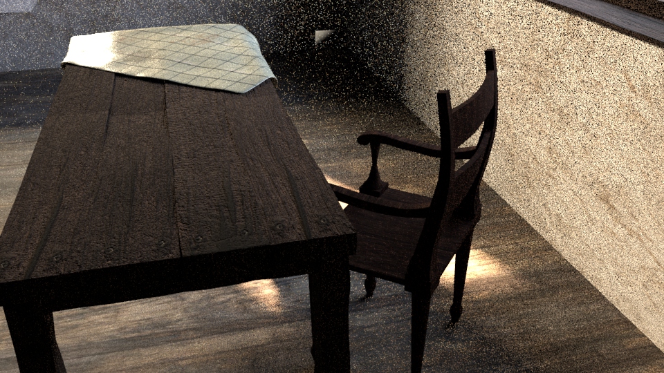
A few renders of the final table model. First three just the model and the others is the model in the setting.
Cottage kitchen scene
– Chair
Progress
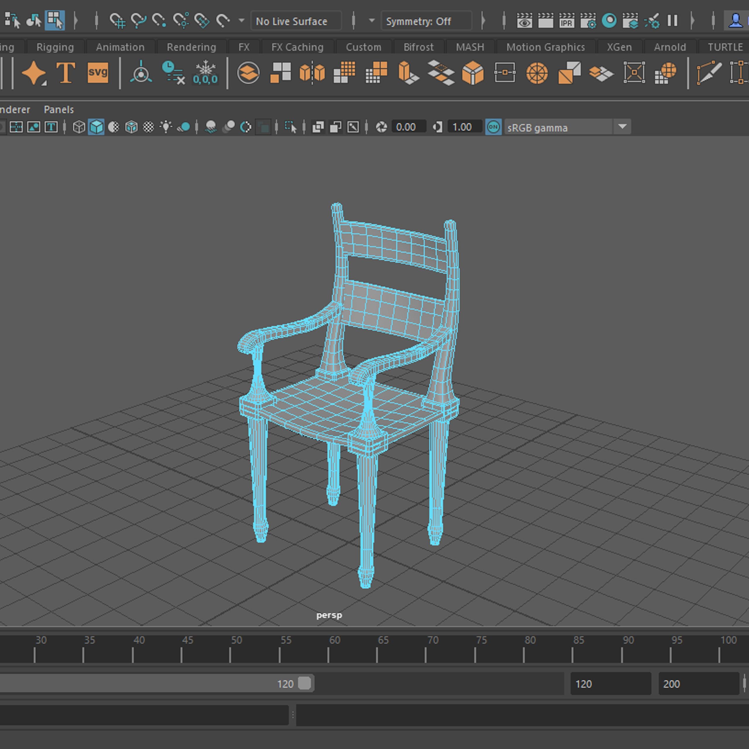
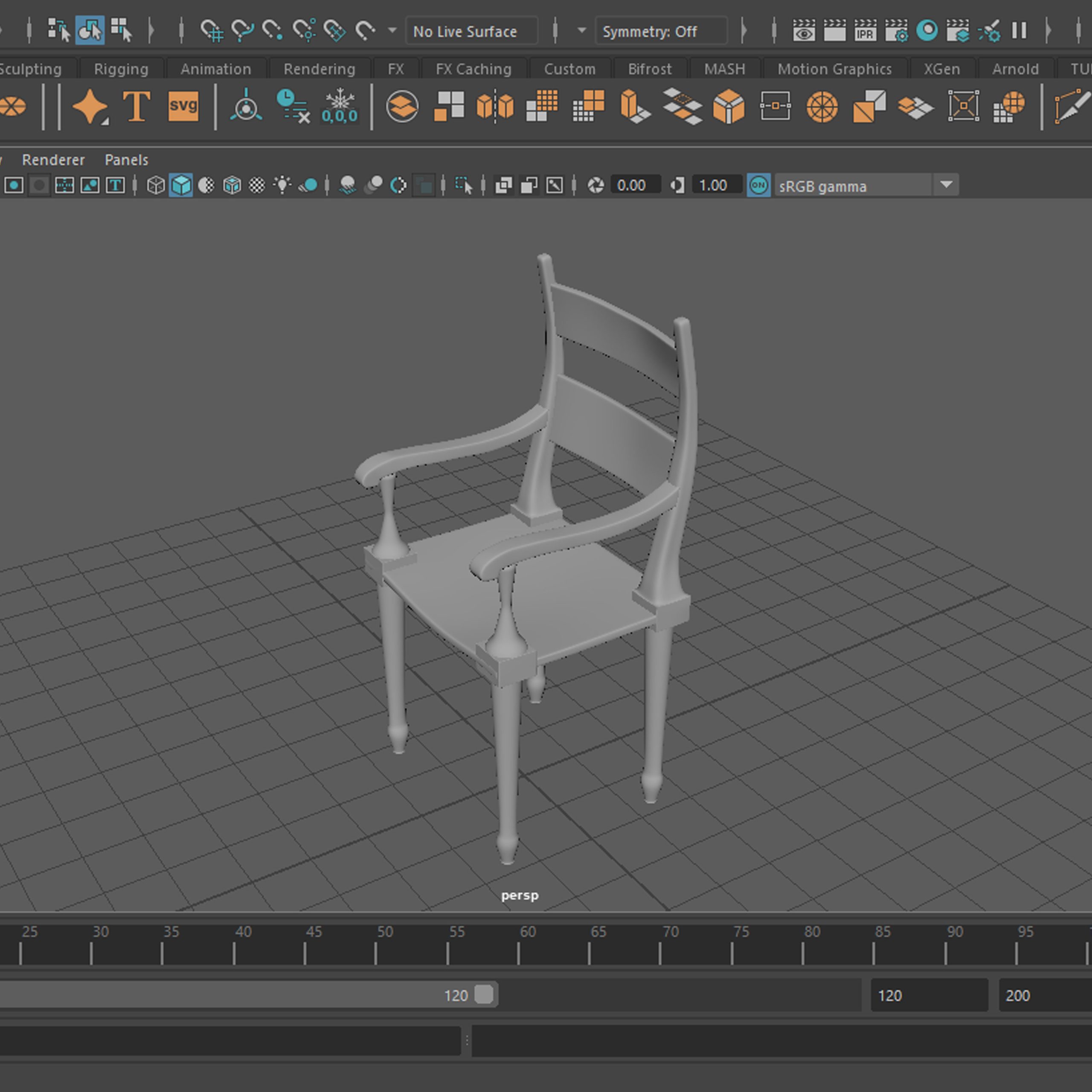
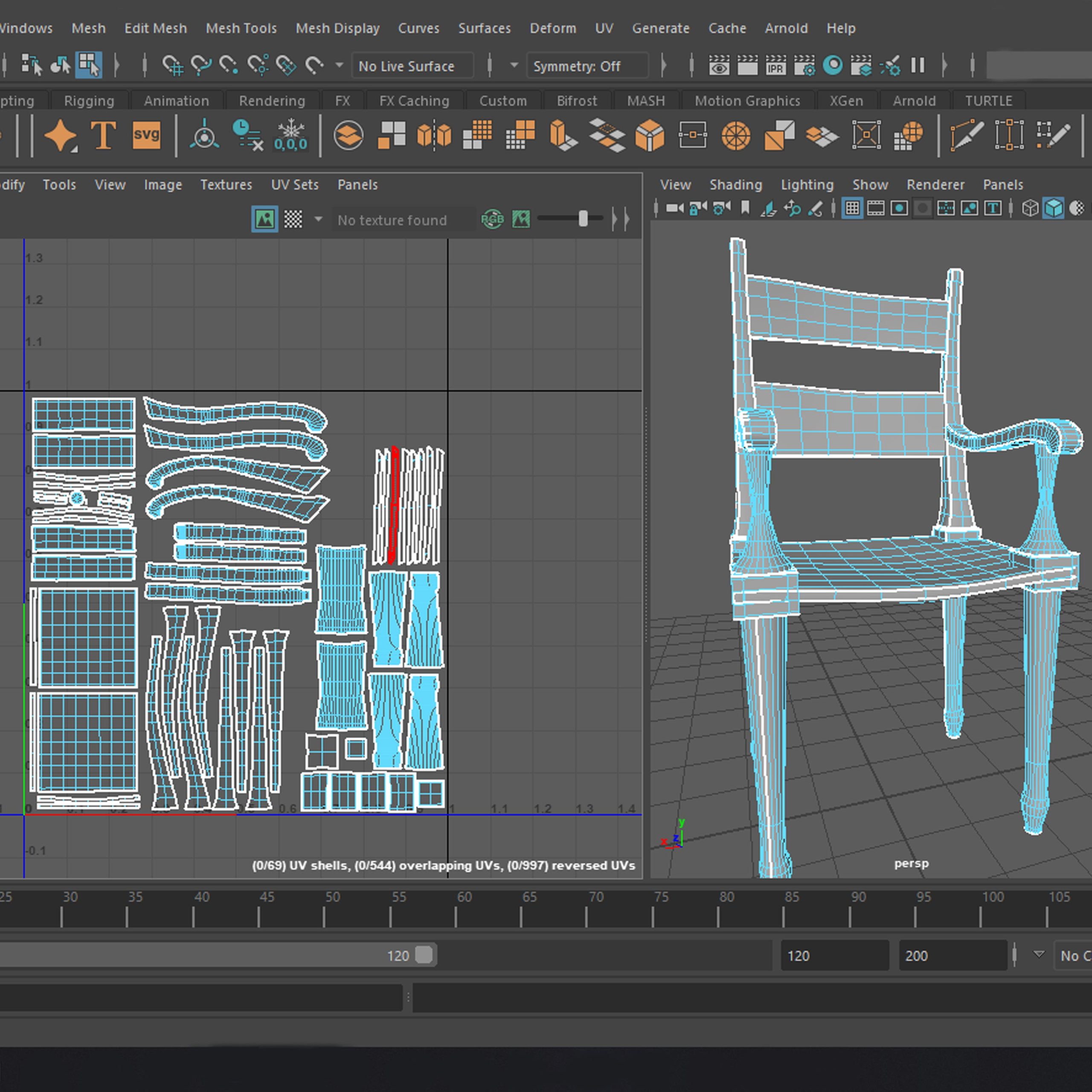
Three screenshots of the model with the wireframe shown, followed by two displaying only the model and one showing the unwrapped UVs.
Renders
Week 1 – Cottage Project Evaluation
First stage of a bigger still life, scene in progress. The intend of this project was to start getting used to the modelling, texturing and rendering techniques and methods as well as possible workflows. The brief asked to employ CG techniques in terms of creating a final, bigger scene, in this case a rustic/ historic cottage kitchen was chosen as a subject and theme. The scene was meant to resemble reality as much as possible to point us into the photorealism aspect of VFX (crucial for combining CG with real life footage).
This first week worth of work presents a table and a chair model within a started environment of the kitchen (walls, floor, kitchen counter, windows). The set-up textures (wall and floor) varied too much in the colour tone and value decreasing the illusion of one coherent environment, which eventually made me decide against them and adjust them to my needs (.psd), they did however help me realise my idea and the overall aesthetic that I wanted to go for. The floor may need a skirting board or something of this sort, as the transition between the wall and floor is too sharp and unrealistic. Textures on the table and chair need adjusting since the bump map made it too grainy (not visible from afar). The table cloth on the renders above was just a quick block out and needs further adjustment to fully fit the shape of the table. The light of the sky dome works very well in the set angle creating the illusion of a sun set or a sundown, highlighting the table which will eventually be the central piece of the scene (elements on top). The placement and light direction on the table are setting the direction of this project well, pointing to the fact that the attention will be heavily on that part of the room, although the light angle could be slightly higher to make sure the table top is properly lit (right now the side of the table is lit better than its top, which will house quite a few elements of the scene).
The render quality is not the greatest (as clearly visible in the shadows which are way too grainy) but it shortened the render time and still allowed me to see the final aesthetic of the work, which for the beginning stages of a project is good enough. For further renders higher render setting will be used.
Week 2
Cottage kitchen scene
– Sink
Progress
Development stage of the sink for the kitchen scene, 1. wireframe, 2. smooth model, 3. drain in wireframe and 4. smooth shaded, 5. unwrapped UV’s and 6. checker pattern test of UVs.
Renders will be shown in the tap section below (week 3).
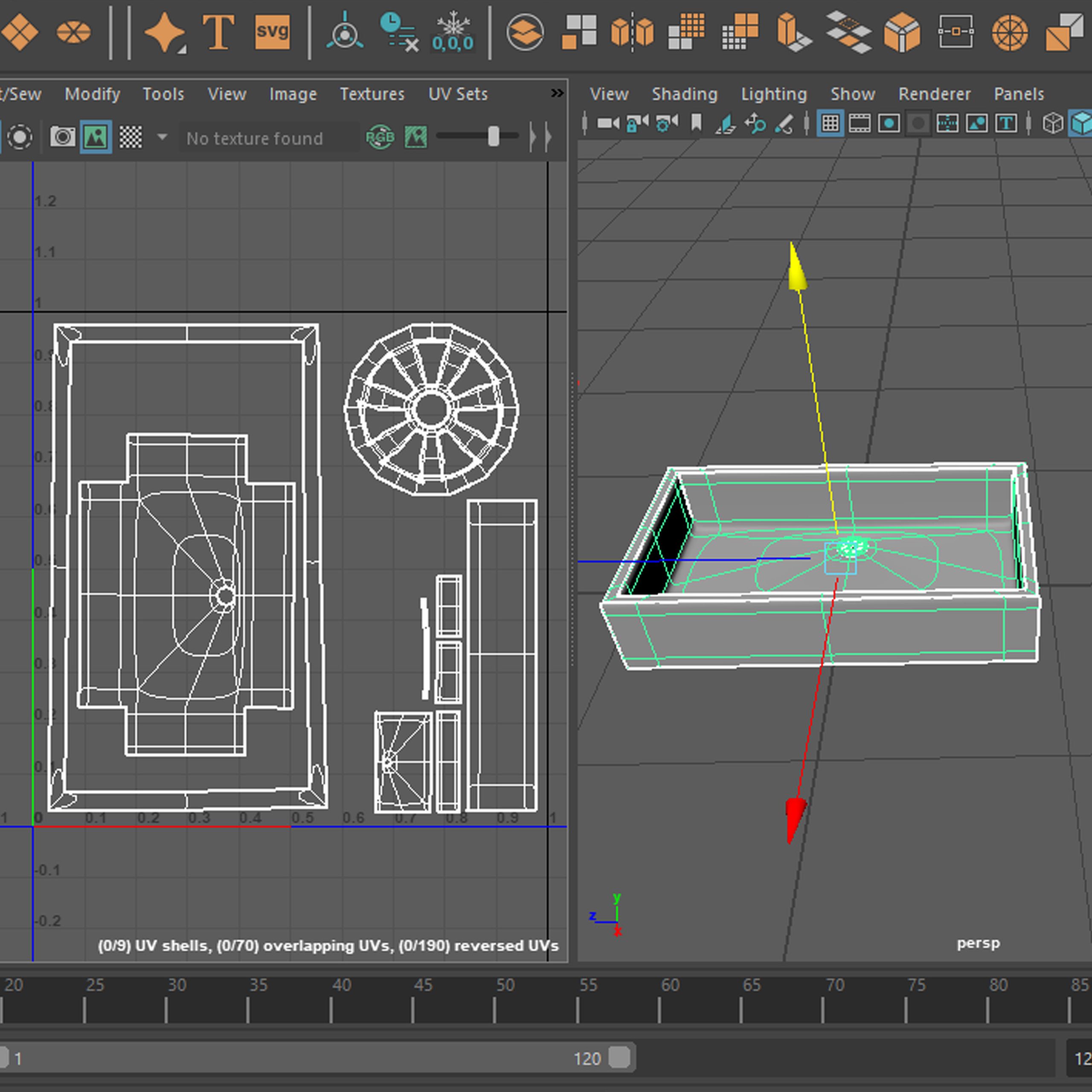
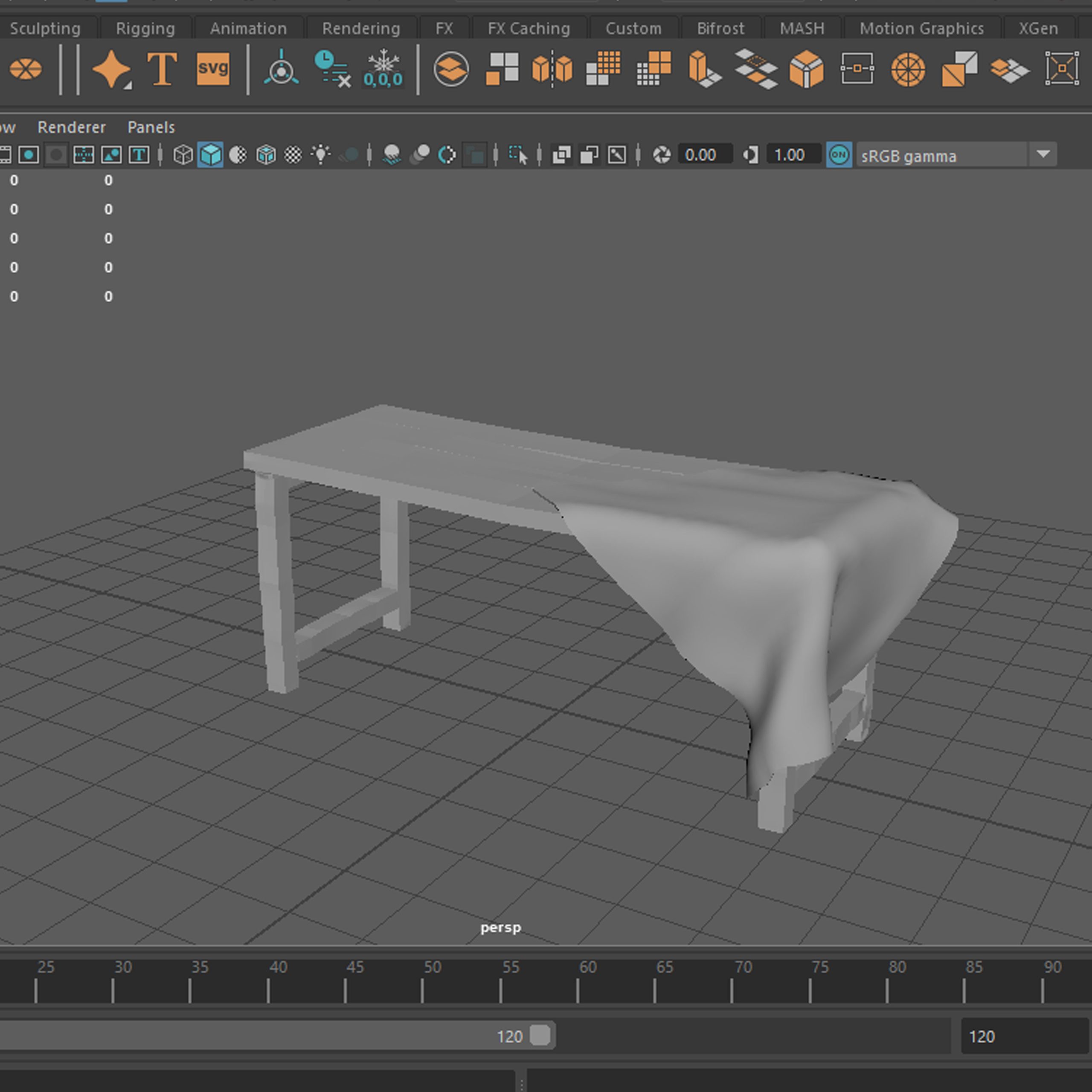
Cottage kitchen scene
– Tablecloth
Progress
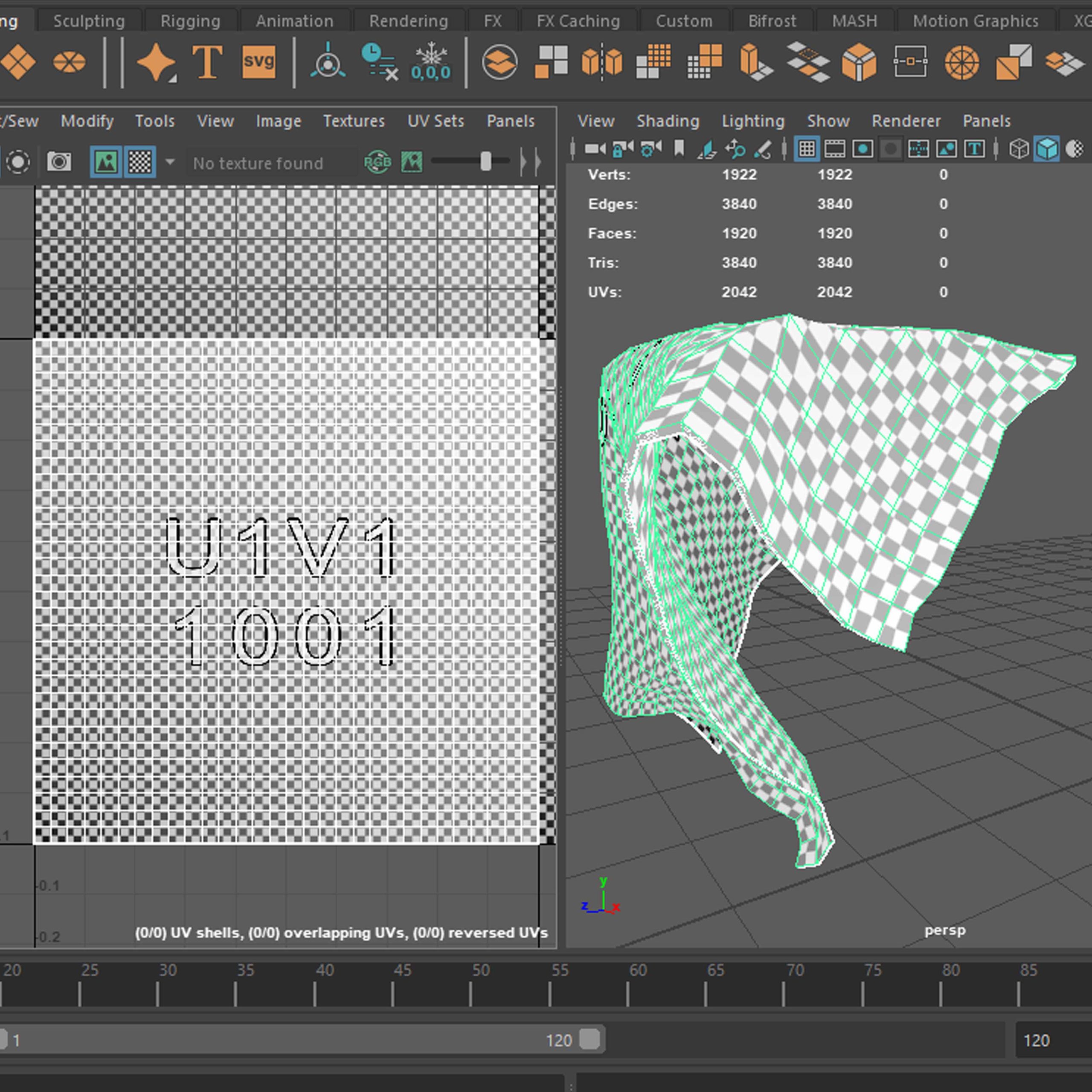
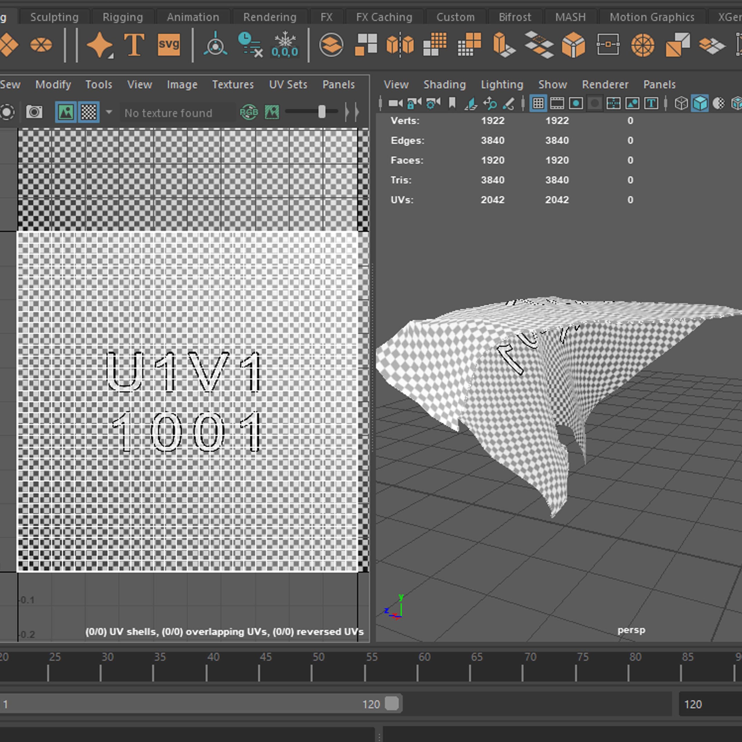
Respectively; smooth shaded, wireframe, UVs with wireframe and UVs with checker pattern.
Renders
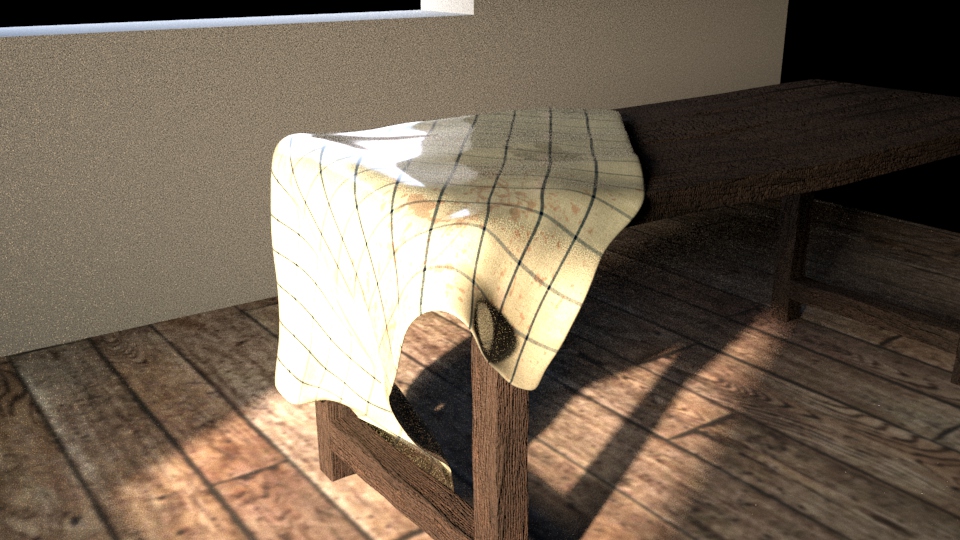
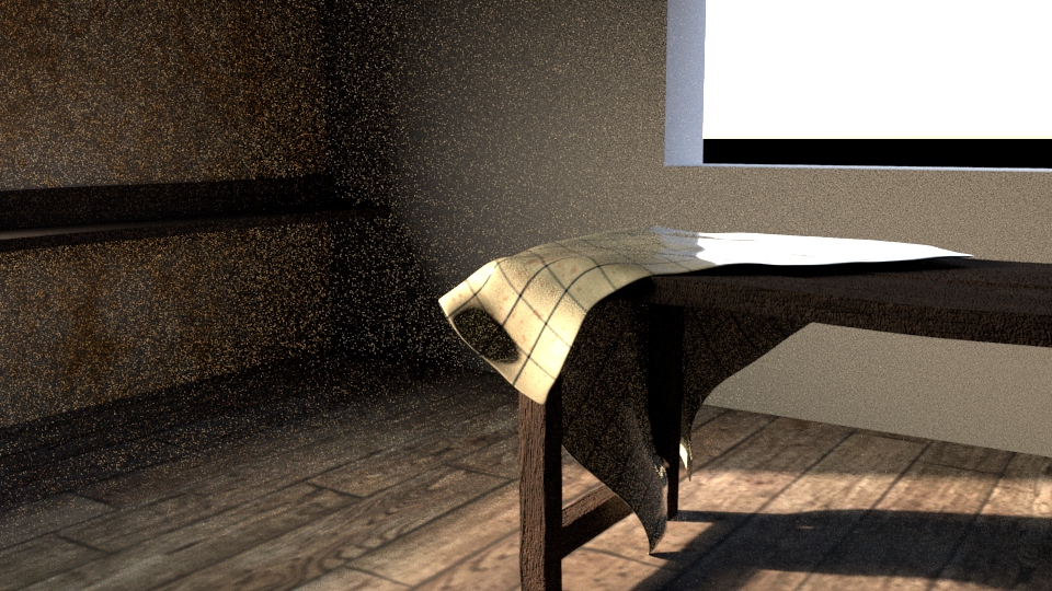
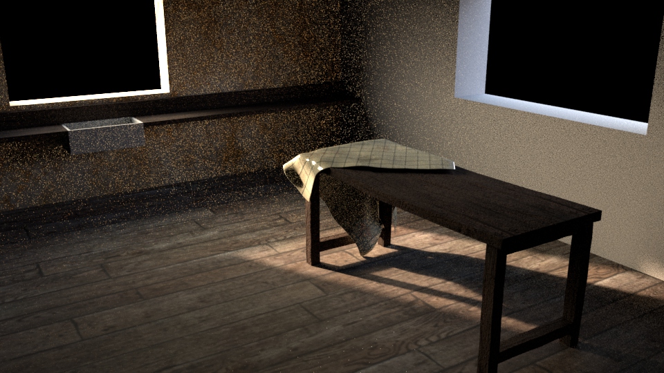
A few very rough renders of the table with the table cloth on from the started scene set-up, loads to fix but a good starting point.
Week 2 – Cottage Project Evaluation
The second week, we had worked on filling in the kitchen counter with a sink, and in my case, adjusting the table cloth I had started the previous week. As simple of a model as the sink was, I had learned a few new techniques for example using the ‘Edit -> Duplicate Special’ and ‘Circularise’ commands, both very useful in box modelling. Both models, the sink itself and the drain were made by manipulating basic geometry in Maya to achieve the final, desired shapes. At this point I had also learned new UV unwrapping method (Camera based).
After placing the model in the setting I played around with different material settings, after which I decided to go with the default ceramic pre-set (rendered together with the tap, further down the page). As a homework I had set myself learning more about the texturing workflow as I wanted to make sure I understand everything right in terms of avoiding unnecessary mistakes (UV). This led me to developing further the table cloth texture, to which I added subtle details such a wine and coffee stains and general wear and tear marks which – I hoped – will up the realism of the scene and increase the period correctness as well as maybe immersion level the piece could offer (wandering about the genesis of the little details can transport the viewers mind into the created scene). Since I was recreating a poor, everyday life tiny cottage in the middle of the forest, including these signs of use made sense, as everything would have been reused as long as it was usable and nothing would be easily wasted as it is nowadays. This made the scene appear habitable and not sterile, like no one was there for a long time, which I should try to use in more elements I model for similar scenes in the future.
The table cloth material roughness issue was realised at this stage and fixed in the further development stages of this scene, but here the shine of the cloth is still visible. The shape of the cloth is also slightly ridiculous and was corrected later, after realising the issue on the renders above. The light concentrates too much on the light cloth in front of the table, which looks interesting, and it could be an aesthetic choice, but in my case, it took away the attention from the top of the table which was meant to be the centre piece and was too much ‘in your face’ which I made me adjust it further.
Week 3
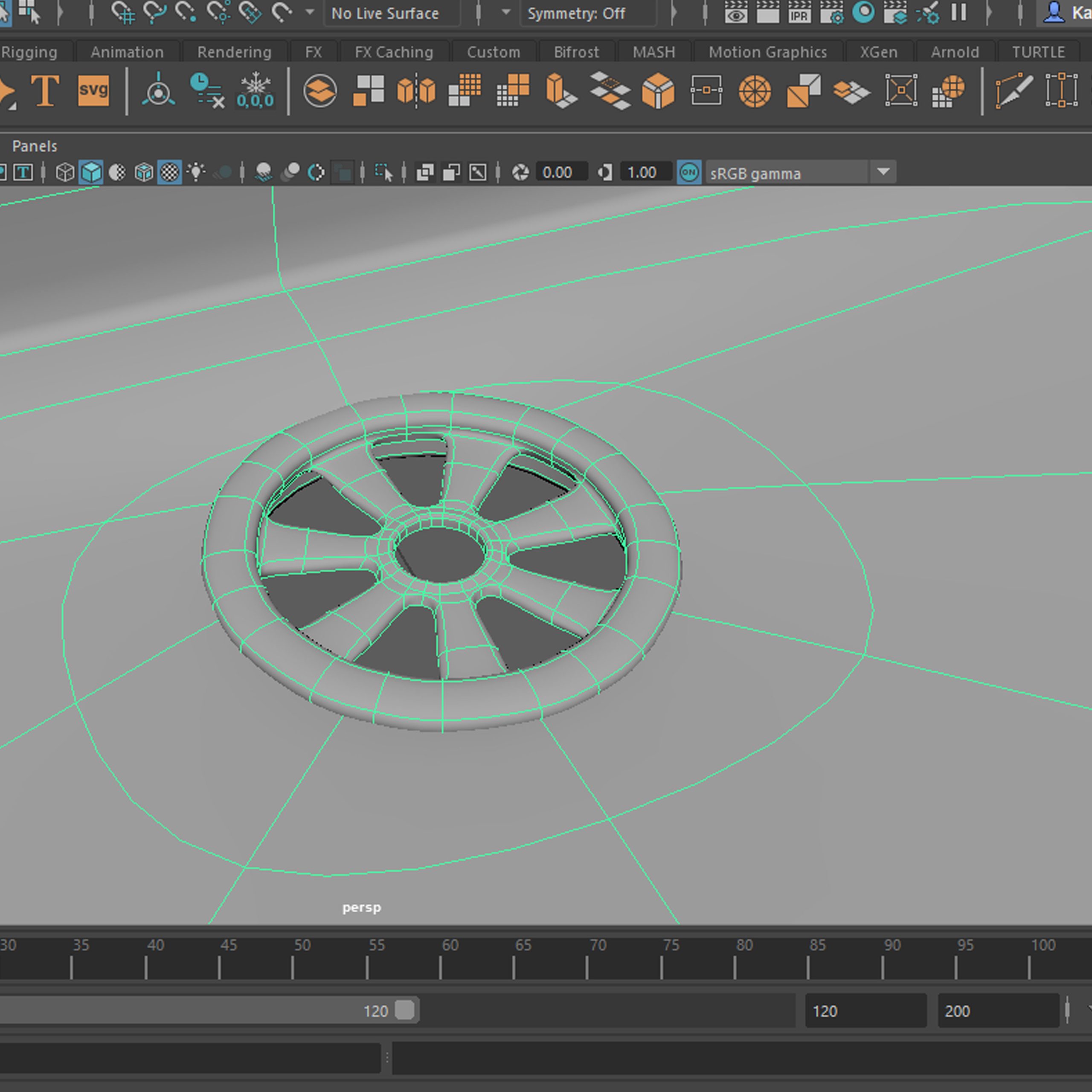
Cottage kitchen scene
– Tap
Progress
Progress
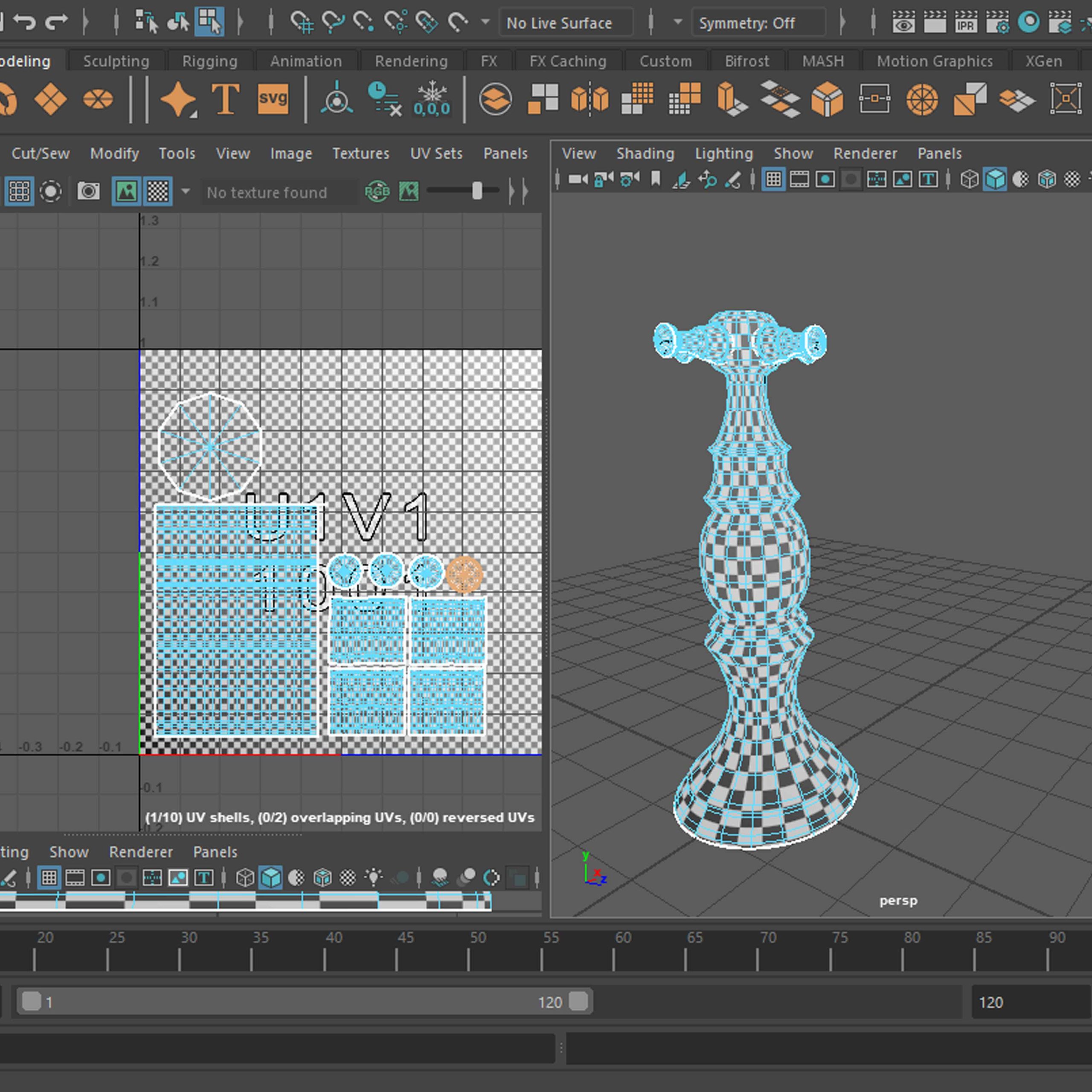
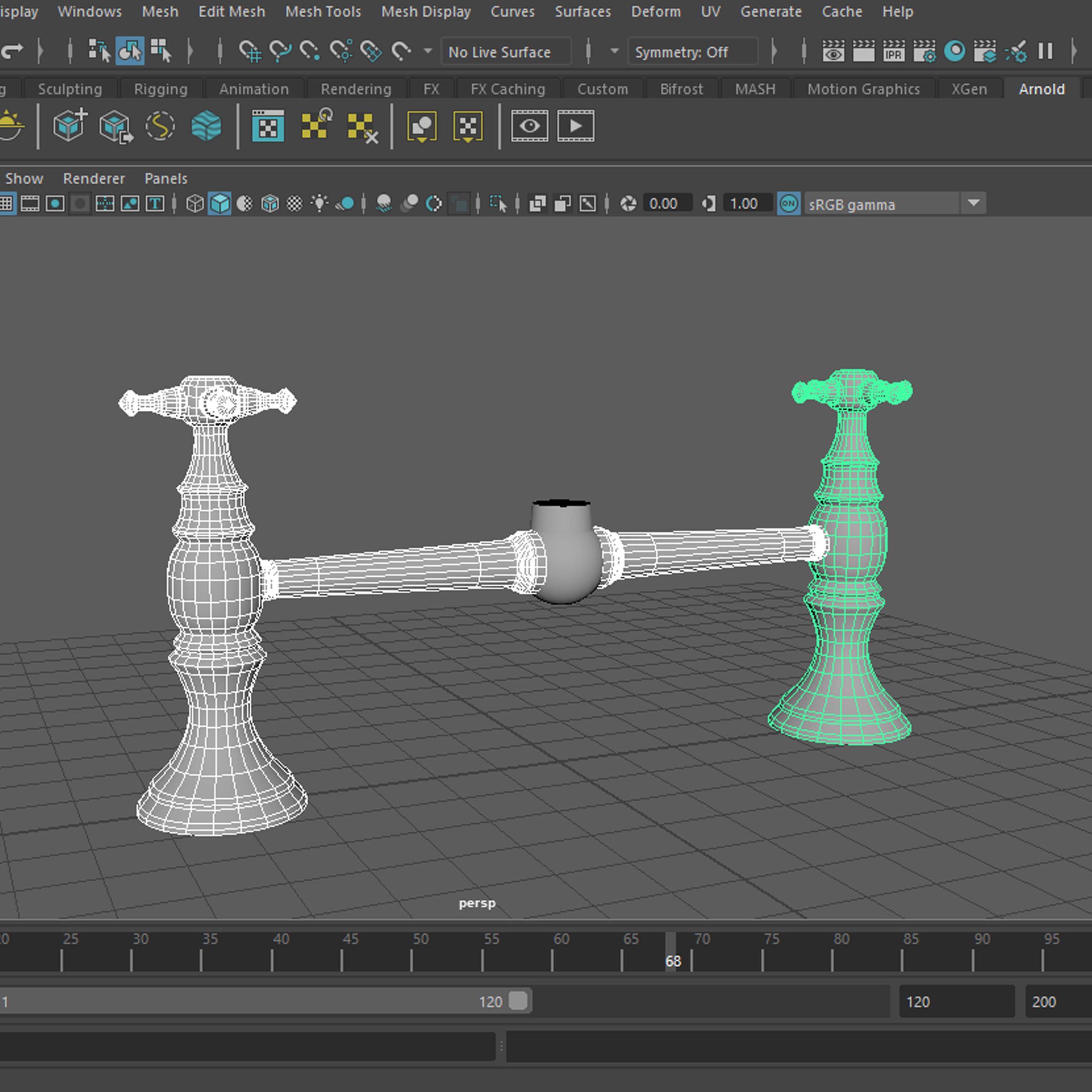
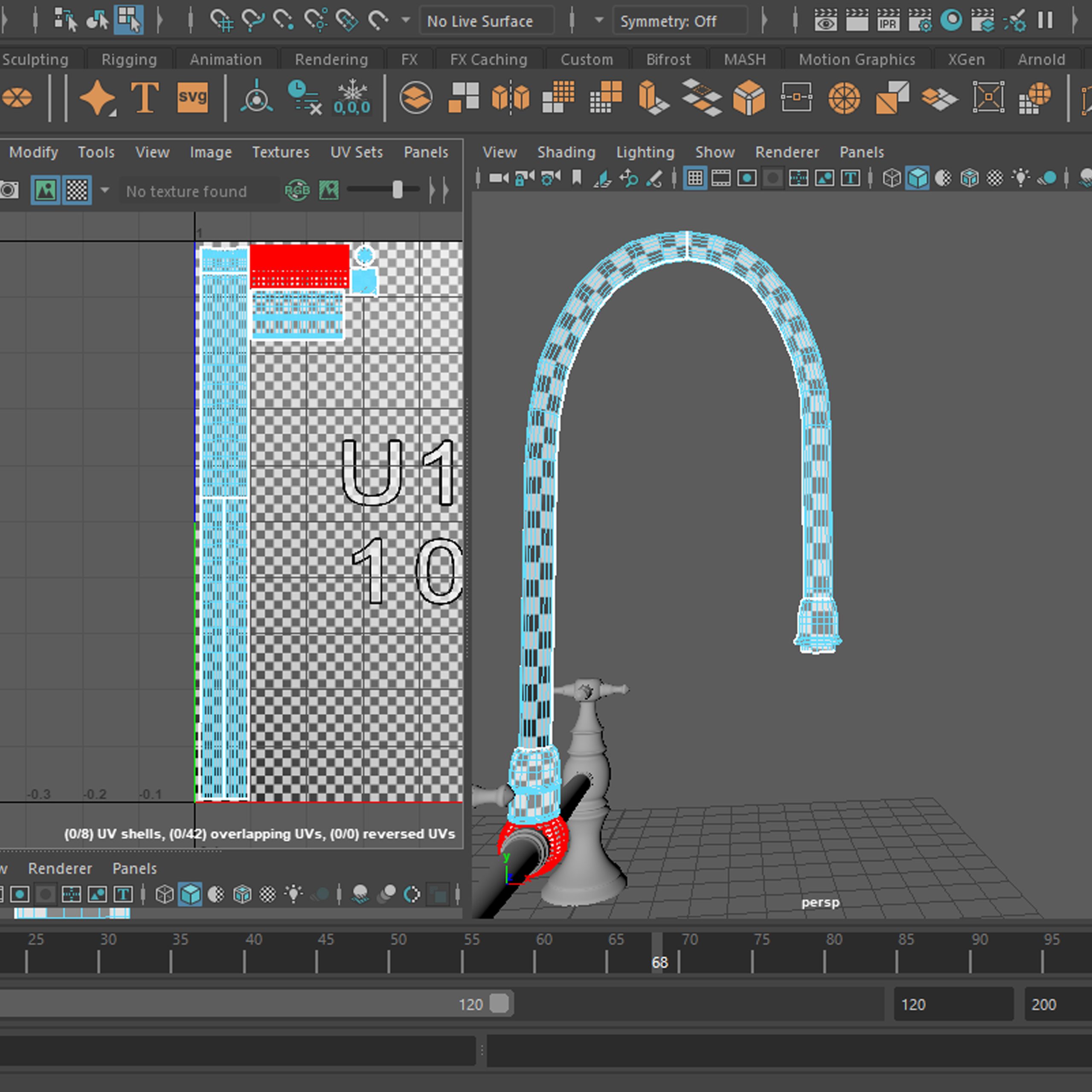
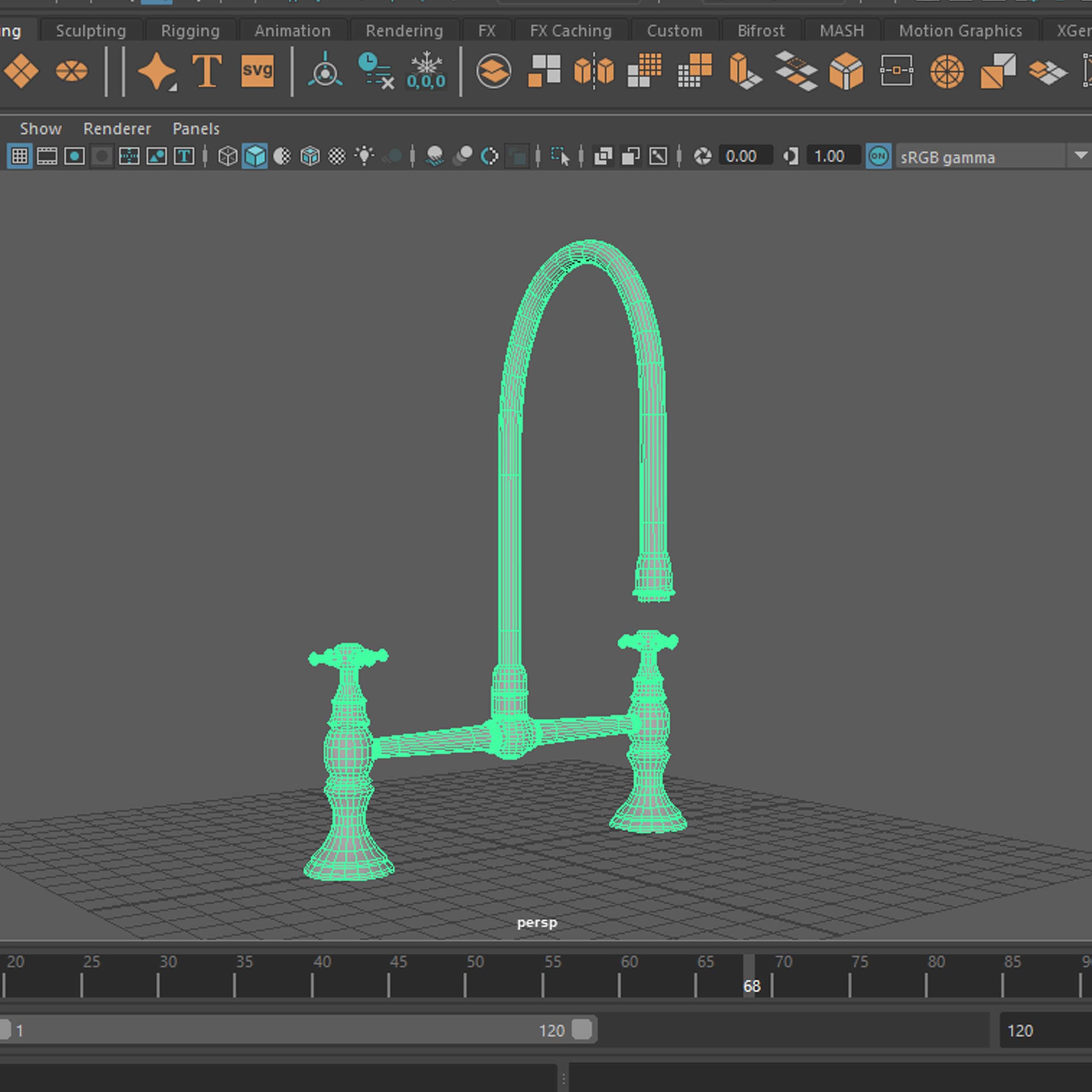
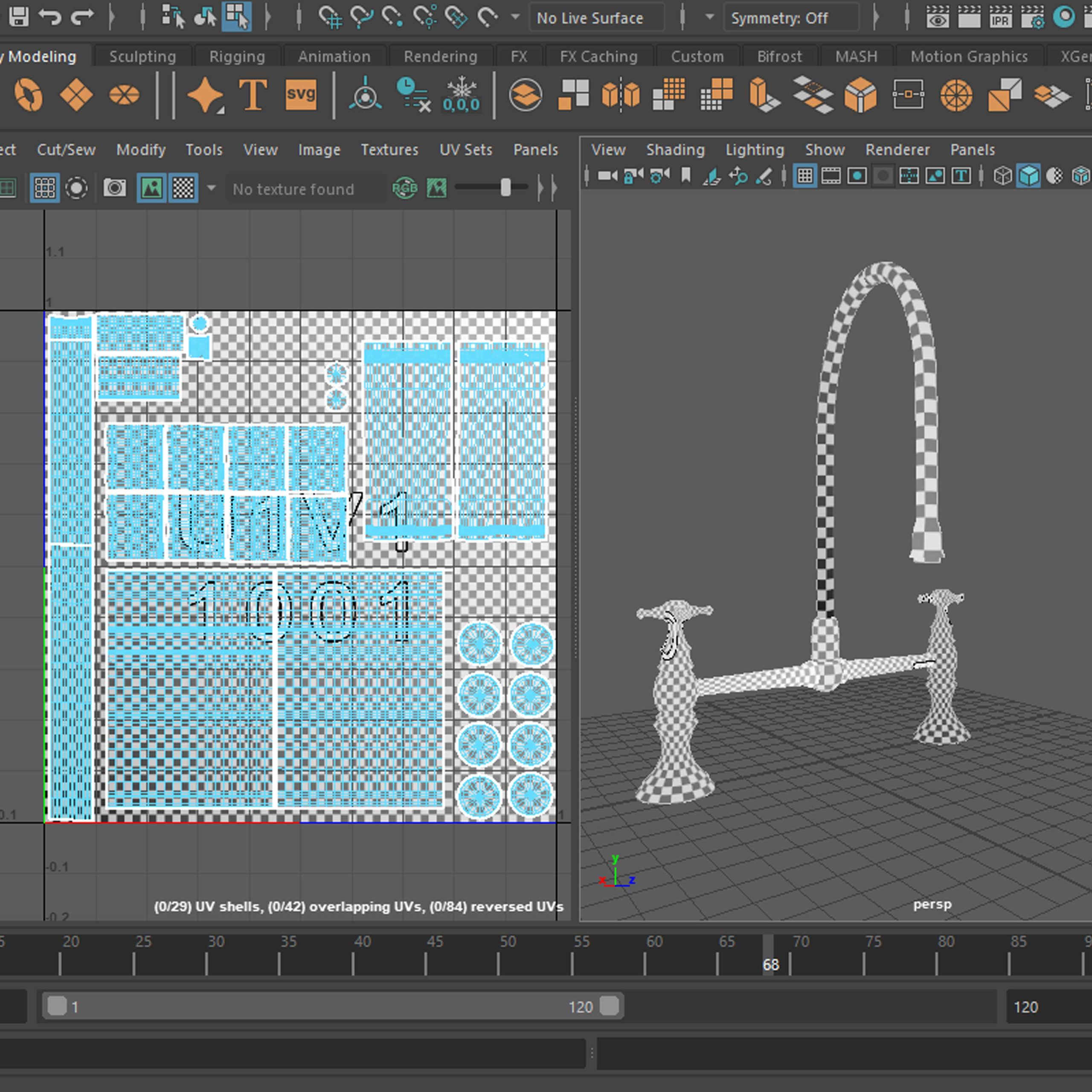
Each element of the whole (knob, link and spout), is displayed in the order of progression, in series of three. First image of the series shows the smooth shaded model, second is the model in wireframe and third shows unwrapped UVs. The last three pictures show the whole model, following the pattern of the previous elements (smooth, wireframe, UV).
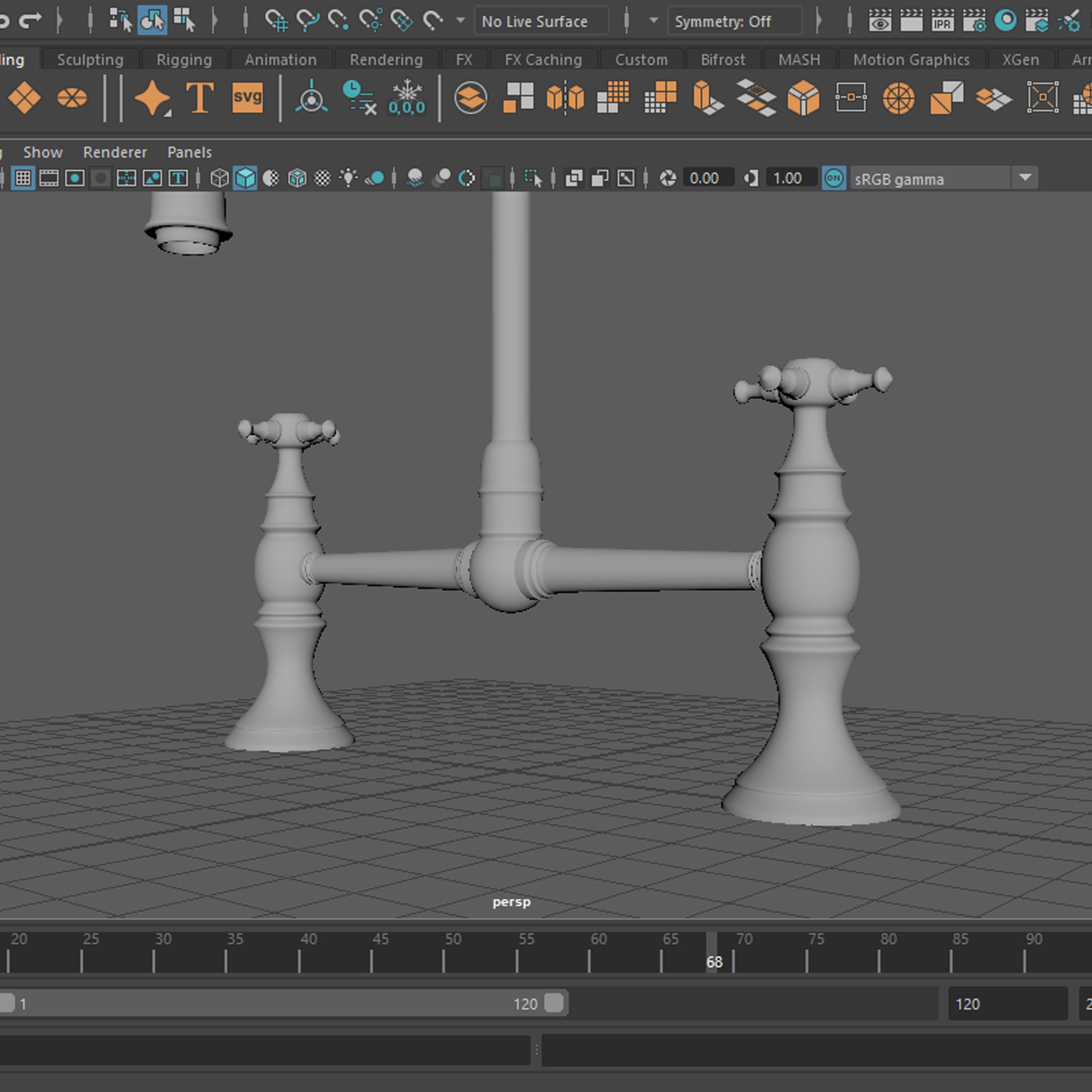
Renders
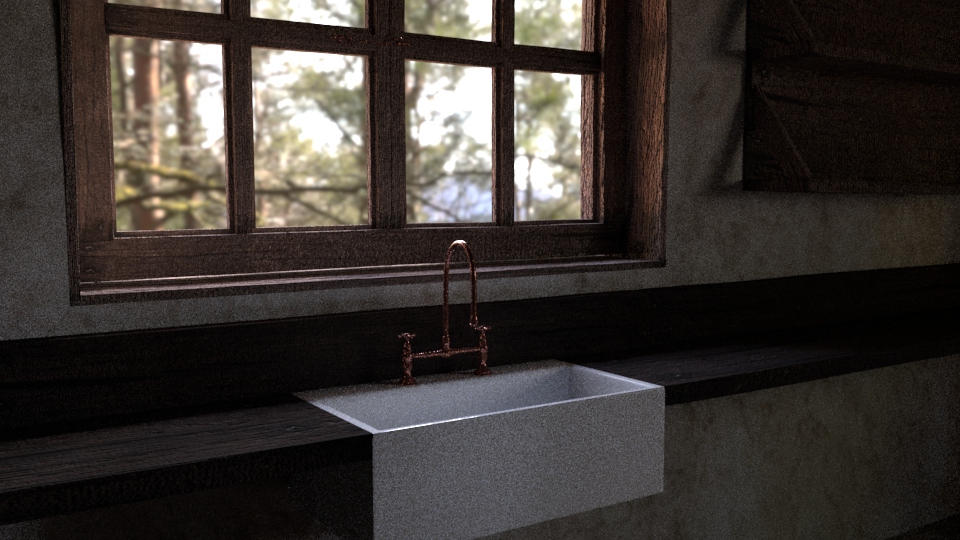
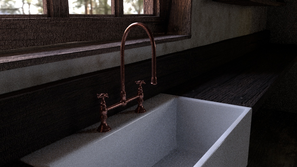
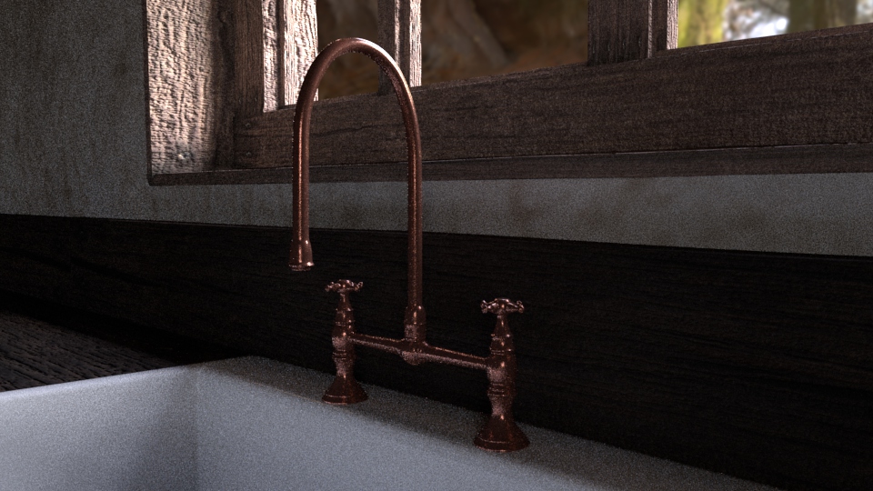
Renders with the light changed and the HDRI added.
Cottage kitchen scene
– Bread
Progress
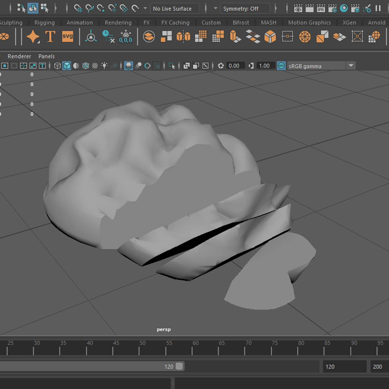
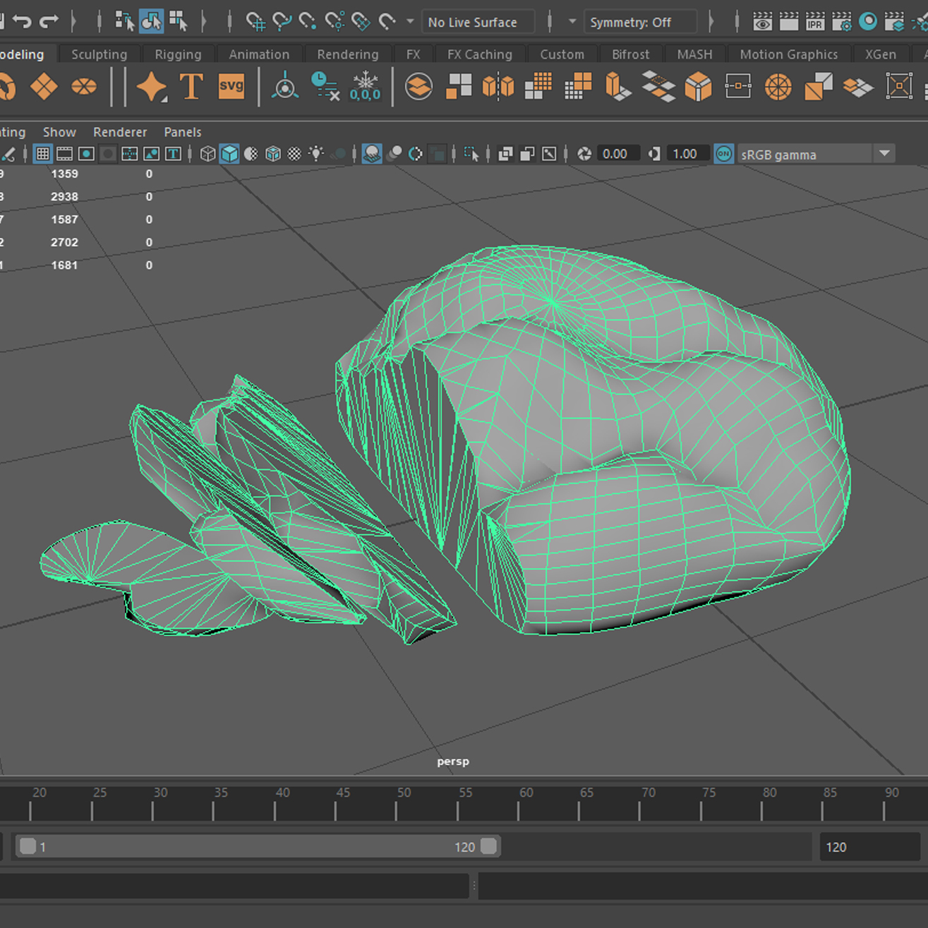
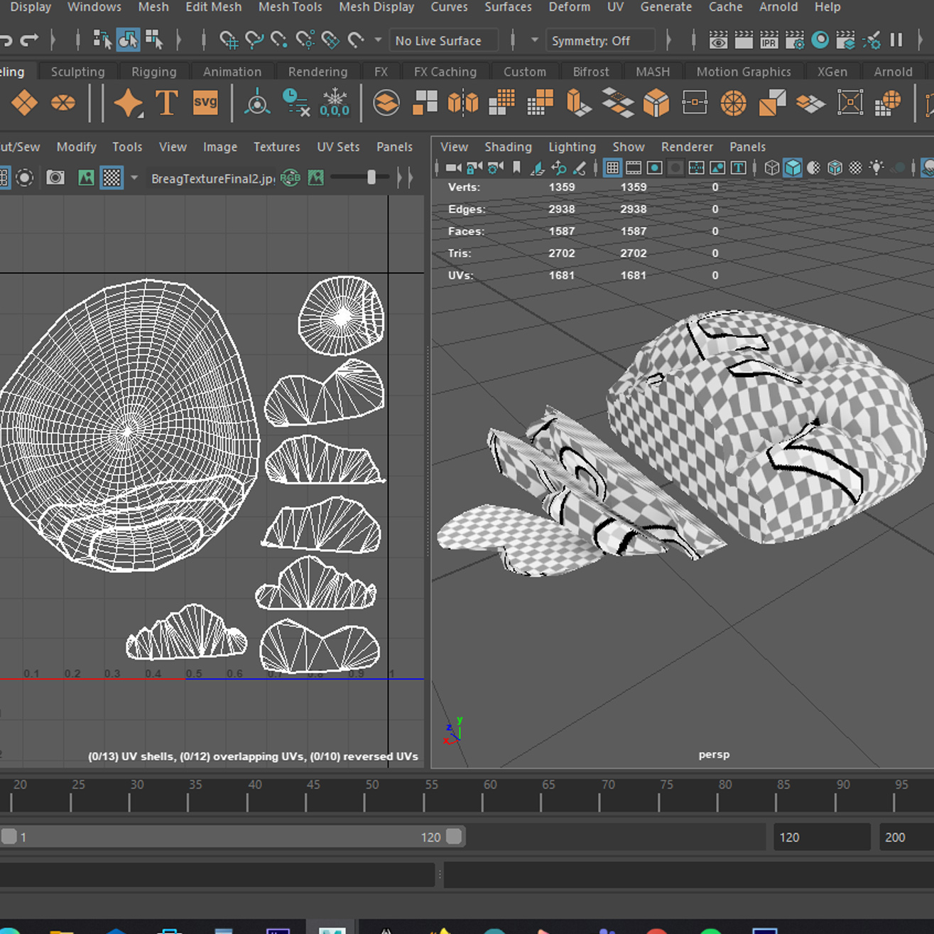
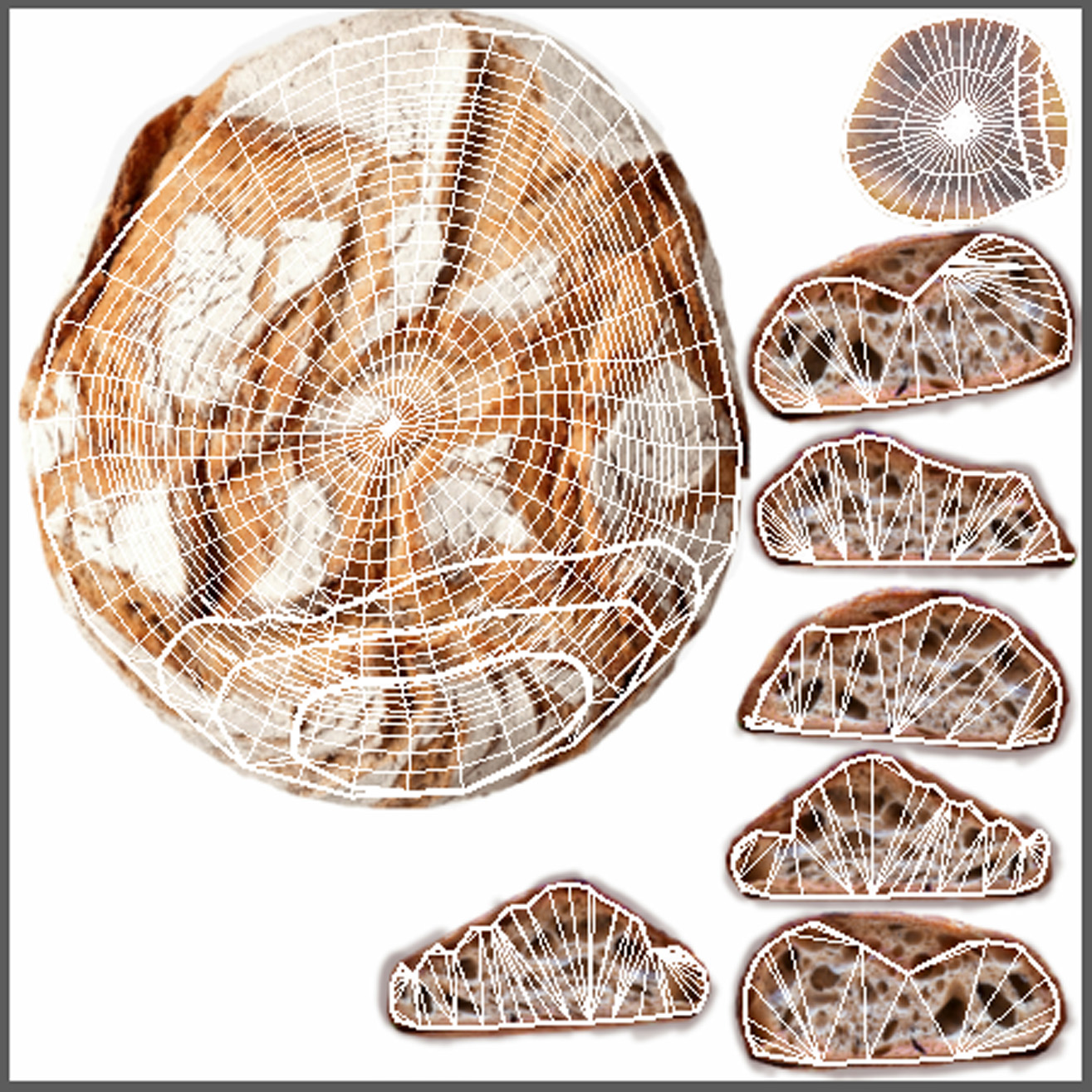
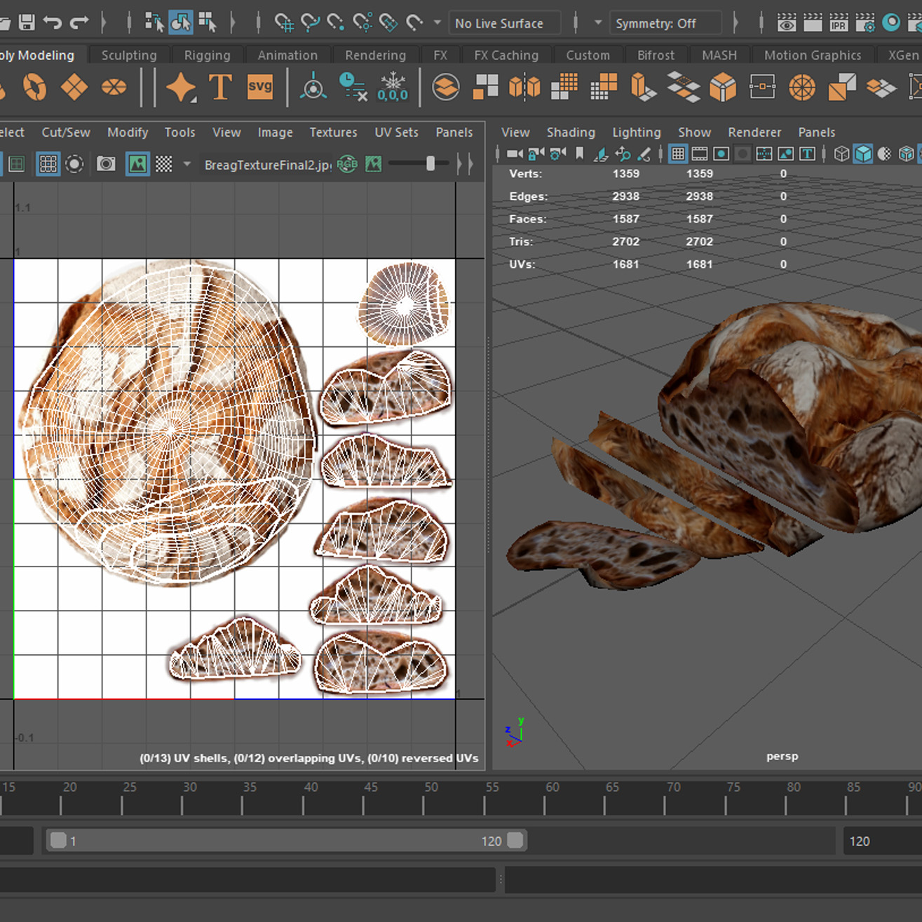
Progress of the modelling and texture adjustment. First is shaded display, second wireframe on shaded, the third shows the unwrapped UV’s, followed by the texture and later with the texture on the model.
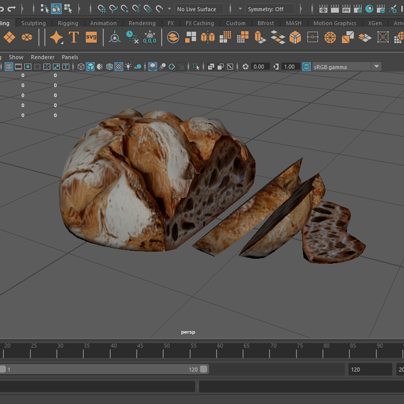
Renders
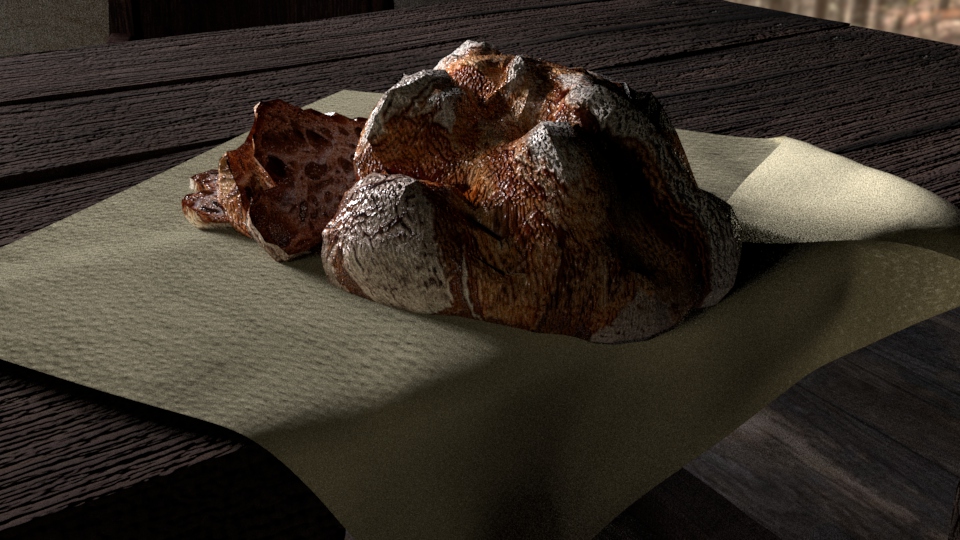
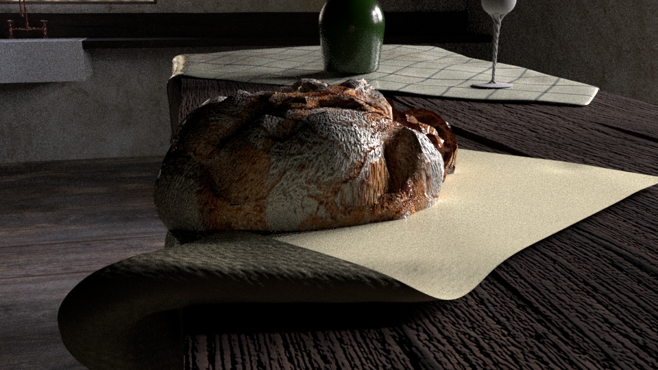
First three show the bread only, next three show the model in the environment and the last three show the cloth I have additionally made to place the bread on. The bread needs repositioning which I realised after the renders and the cloth uses too much bump, which will also need to be adjusted.
Week 3 – Cottage Project Evaluation
This week further work on the cottage scene was done, to supply it with more model and start building up the environment. I have box modelled the tap and bread separately to keep it neat and tidy and to later comfortably place it in the scene.
The tap uses a simple copper coloured metal pre-set material, which works pretty good in this case. Normally I would try to make the texture more varied and speckled with imperfections, but I decided that I don’t want the tap appearing dirty and rusty as it is meant to keep the illusion of a habitable space, and a tap would most probably be kept relatively clean in this circumstance. When I was placing the tap, I have realised I didn’t keep enough space on the sink to neatly place the tap, which I fixed by pulling the back face of the model, slightly squeezing its width and fitting it in the counter top again. I am considering trying out different variations of the copper colour, as it looks a tiny bit dull.
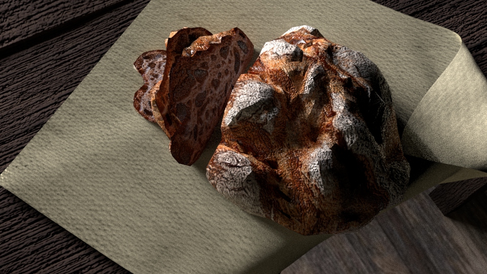
The bread looks more detailed than any of my previous models, so the improvement of technique and new methods used are clearly visible, but it is far from what it could be. As I am not fully used to using sculpting tools in Maya and that I tried to keep it relatively low poly, the top structure is quite more round than it probably should have been, although, as it is far from perfect, it has the artisan homemade effect present which I really like (fits the story the scene is supposed to tell) and that is why I have decided not to redo it. The inside (visible on the sliced parts) varies slightly in colour, despite many adjustments I made to it, also the transition between the two texture parts is quite sharp and visible on closer inspection. The slices also lack the displacement I tried to achieve which may be due to the fact I used one texture file for both, instead of making two materials and applying them to different faces of the model. After the renders I have realised the bread is hanging of the tables and will need to be repositioned, I have also modelled a cloth underneath, to keep true to the time period chosen and avoid placing too many cutting boards to hold the elements (one planned for the cheese, in next stages), although the bump on it is too pronounced and will need to be decreased in the future development. The bread looks more detailed than any of my previous models, so the improvement of technique and new methods used are clearly visible, but it is far from what it could be. As I am not fully used to using sculpting tools in Maya and that I tried to keep it relatively low poly, the top structure is quite more round than it probably should have been, although, as it is far from perfect, it has the artisan homemade effect present which I really like (fits the story the scene is supposed to tell) and that is why I have decided not to redo it. The inside (visible on the sliced parts) varies slightly in colour, despite many adjustments I made to it, also the transition between the two texture parts is quite sharp and visible on closer inspection. The slices also lack the displacement I tried to achieve which may be due to the fact I used one texture file for both, instead of making two materials and applying them to different faces of the model. After the renders I have realised the bread is hanging of the tables and will need to be repositioned, I have also modelled a cloth underneath, to keep true to the time period chosen and avoid placing too many cutting boards to hold the elements (one planned for the cheese, in next stages), although the bump on it is too pronounced and will need to be decreased in the future development.
In this stage I have applied a HDRI environment to the sky dome lighting and adjusted the lighting to suit the rough time of day I have decided would aid the aesthetic of this scene the most and the lighting made it appear much closer to photoreal than it was before. I have also worked a bit more on the overall structure of the environment, I have added in the window frame, some quick shelf experiment and I have revised the walls and floor materials.
The renders were done on much higher settings, backed up by some research into which setting would decrease the noise the most, and they work much better, although for the final renders I will probably revise the settings even further. After the renders I have realised that the window frame planks create a couple of gaps which will have to be addressed further down the development line.
Week 4
Cottage kitchen scene
– Cheese board
Progress
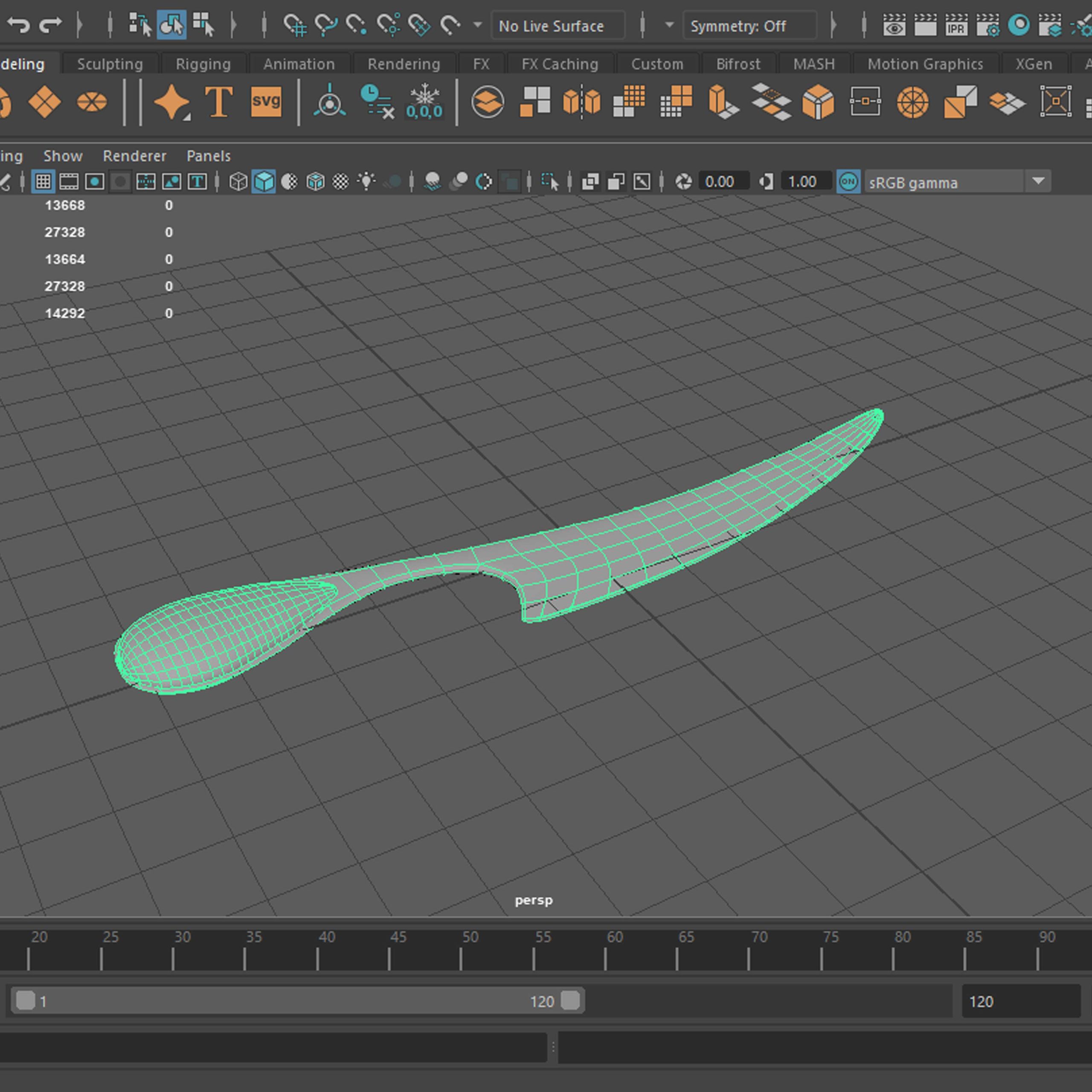
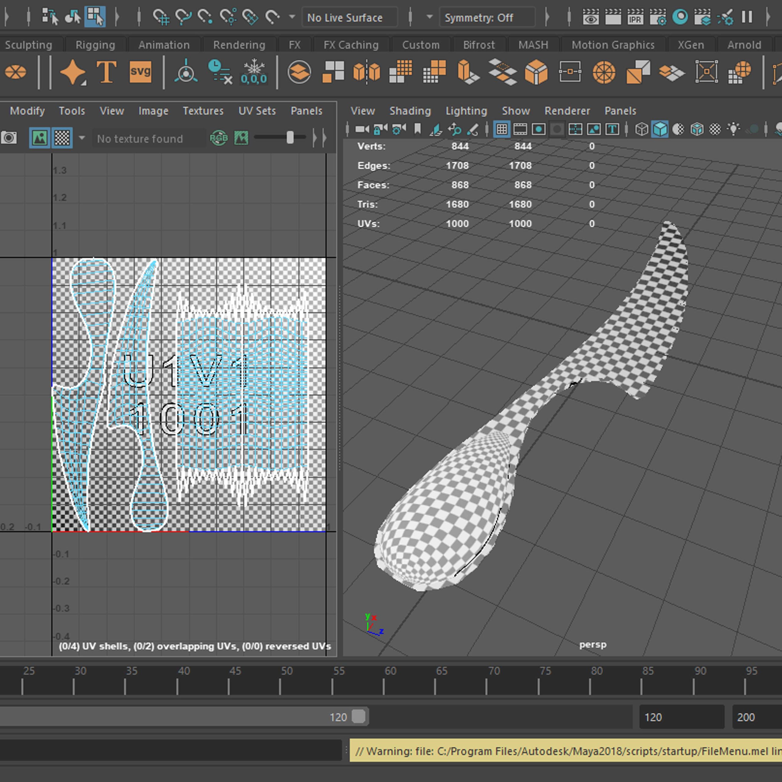
Progress of the cheese board; cheese wheel model (wireframe -> UVs), board with a cheese cloth (wireframe -> UVs), both elements together (smooth -> wireframe), next yellow cheese with holes (smooth -> wireframe), after which, the cheese knife (smooth -> wireframe -> UVs), and all together (smooth).
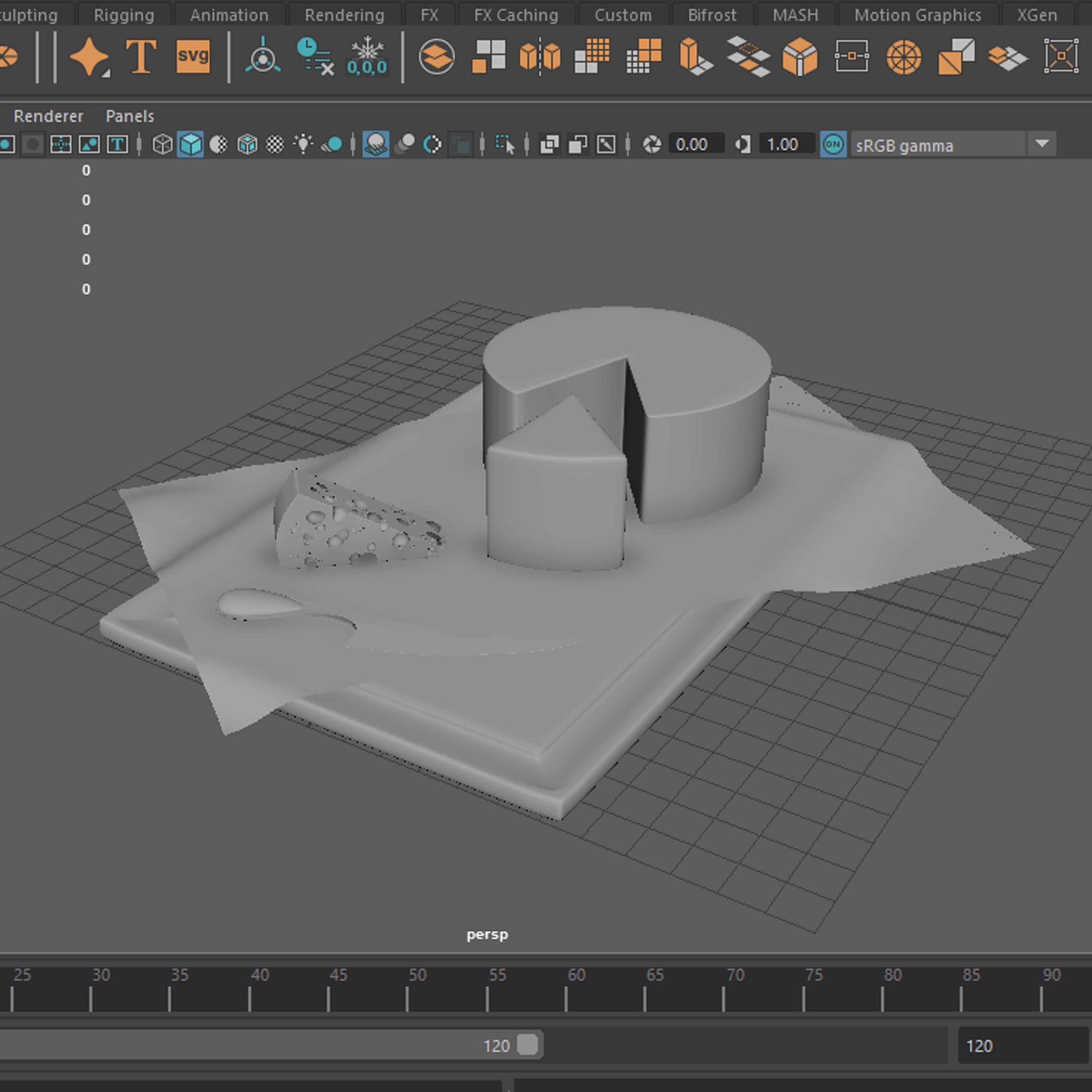
Renders
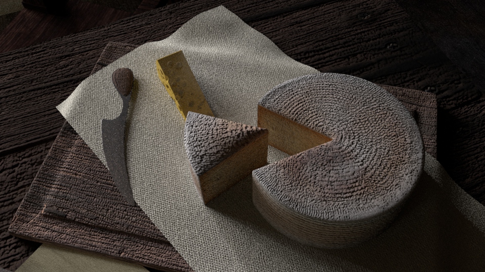
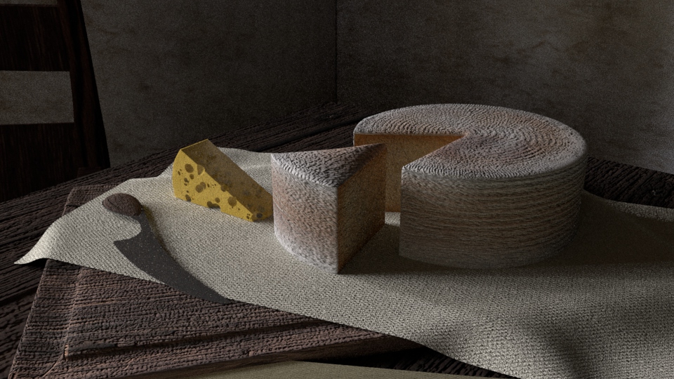
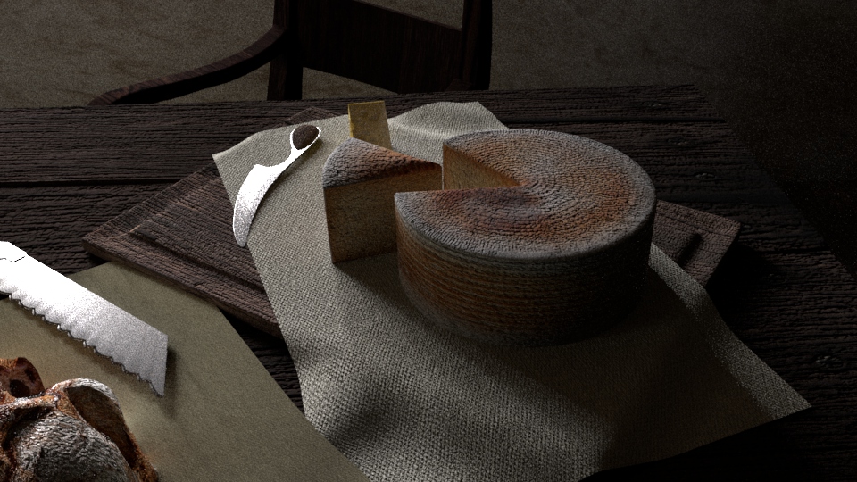
Three renders showing the cheese board I had made, along with the board, cloth and the cheese knife. In the left bottom corner of the last render a bread knife is also visible.
Cottage kitchen scene
– Wine Bottle
Progress
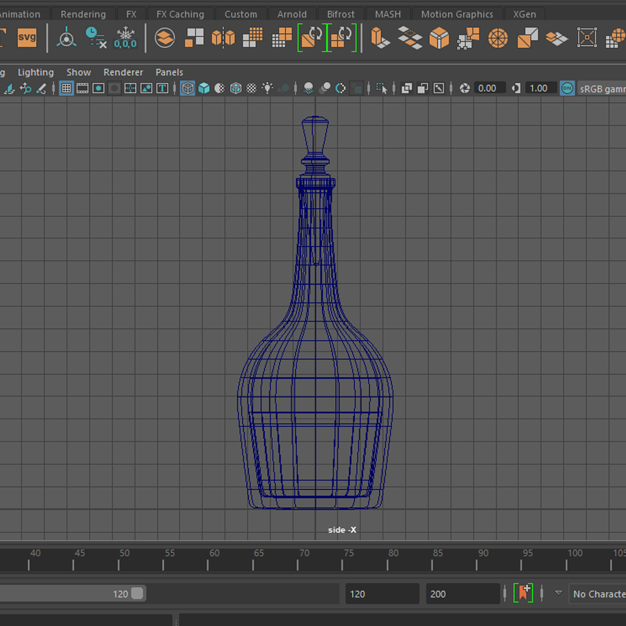
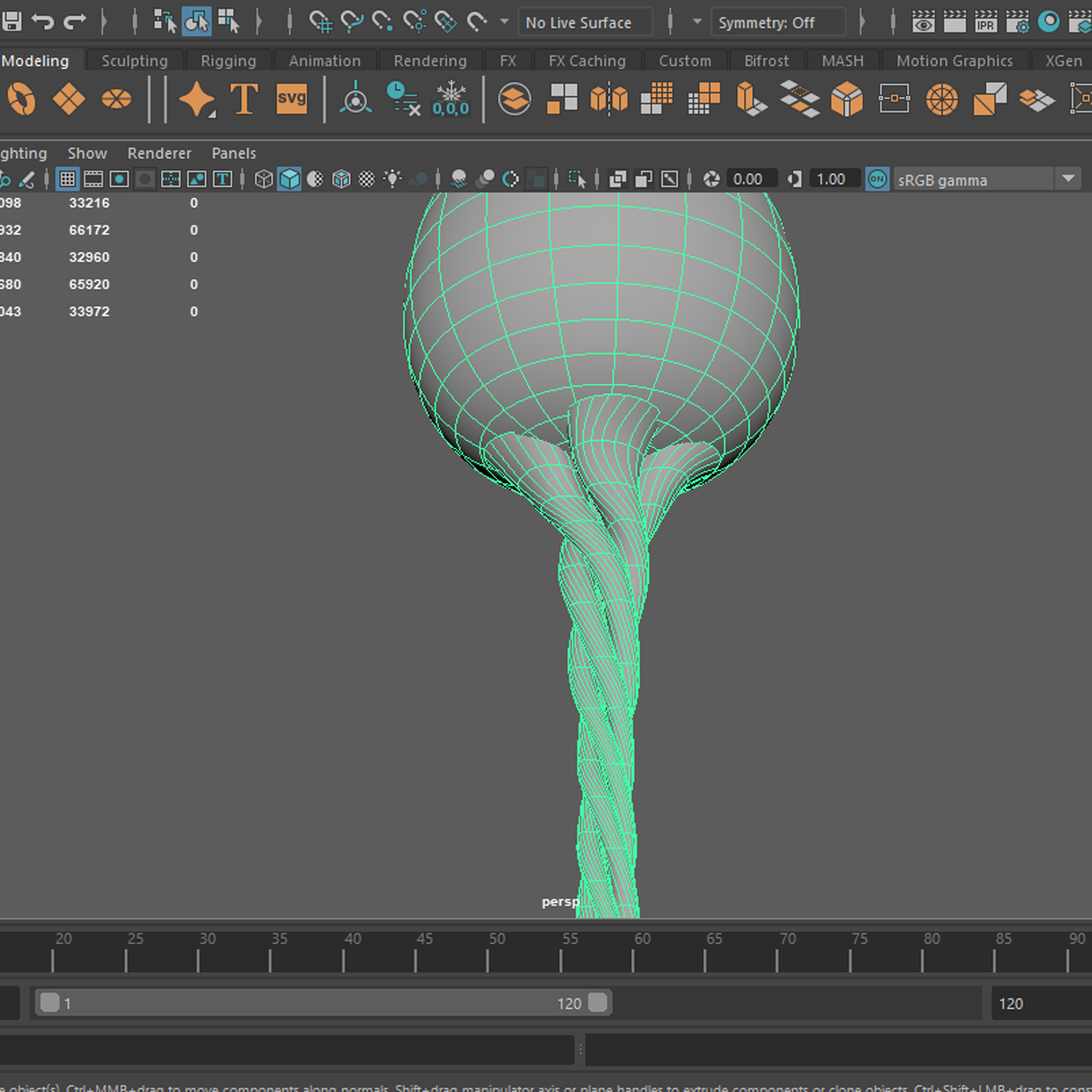
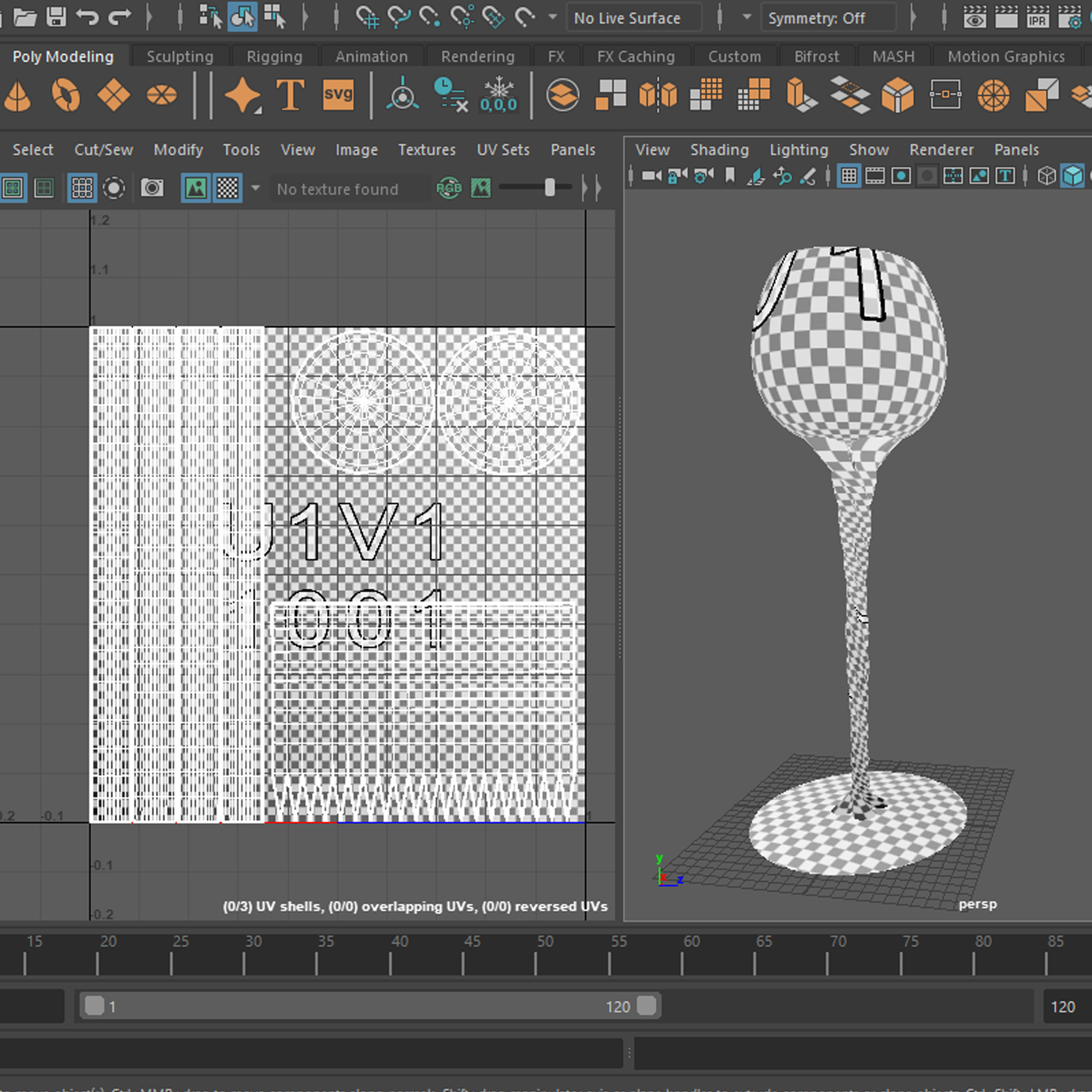
Stages of the wine bottle and glass development, first is the main shape of the bottle and the bottle stopper, next I had worked on the inside of the bottle in wireframe mode, here I had also added the wine layer, I haven’t properly unwrapped the UV’s as I knew I will be using materials in Maya instead of a texture. The next three show the wine glass I made (referenced from a wine glass, I bought a while age for its shape) – UV’s unwrapped for practice as I planned to just use a glass present material available in Maya.
Renders
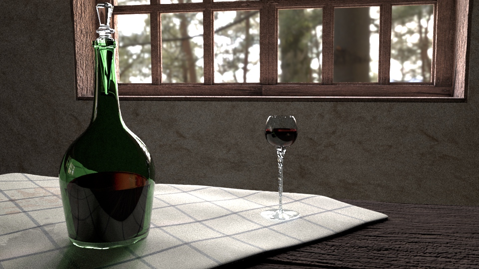
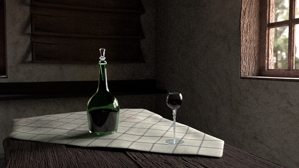
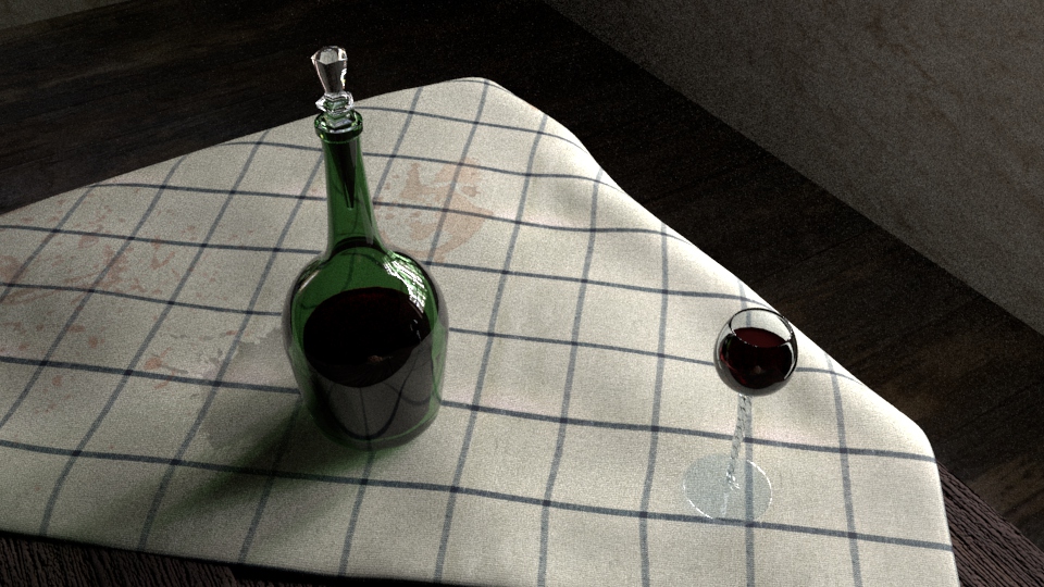
The wine bottle and glass, textured and rendered. The wine glass and the wine in it behave properly although I am not satisfied with the way the green glass of the bottle and the wine in it look like.
Additional Renders – curtain
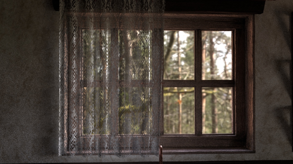
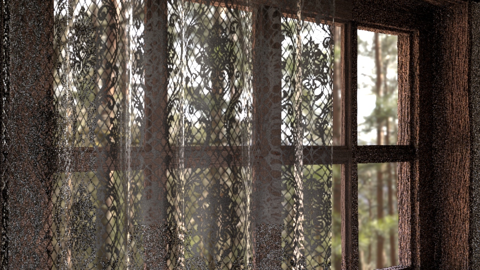
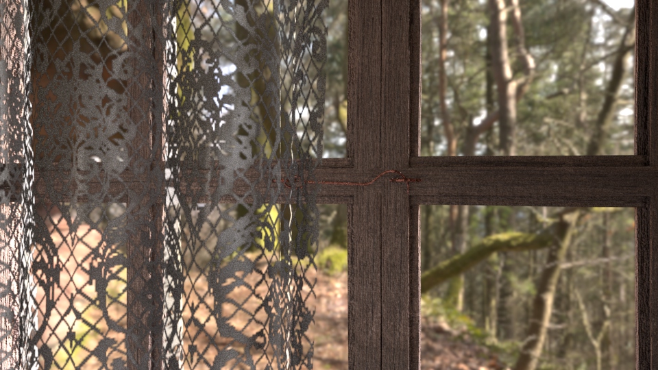
Three additional renders of the curtain I made (also showing the little window hatch I made too keep the scene as realistic as I possibly can at this moment). I have decided to experiment with masks instead of only transparency, as I have planned on using masks in Maya for a while and I know it will benefit my future practice greatly.
Week 4 – Cottage Project Evaluation
This week consisted of fixing the shape and the roughness on the tablecloth material as well as modelling of a few details meant to be placed on the table, and so, I have worked on a little cheese board, accompanied by another cloth (time period correctness attempt) and a cheese knife, I have added a bread knife (bottom left of the last cheese render) and a wine bottle and glass.
At the render stage I have realised that I have forgotten to adjust roughness on the cloth materials (again), and that the table and bread bump are too hard and need decreasing in the future. Since I have used the same material for the cheese board as for the table, that also needs adjusting. The yellow cheese piece has an unnatural colour, but this is the best outcome I got so far, it may not be an issue since it doesn’t stand out in a negative way and the final scene renders probably won’t concentrate on such small details. The cheese wheel, looks like a cheese cake instead, but I quite like the aesthetic and it doesn’t change the outcome of the scene, so I might leave it, although some further experimenting with the bump might be needed as it doesn’t look natural. The transition between the texture parts looks way better than on the bread model, which is an improvement, the cut is clean and sharp and the texture follows that. I did use more of the white mold on top than I originally planned but it did not work otherwise, I experimented with many colour options for the texture and this is so far working the best (although looks like a cheesecake).
The wine bottle has the right colour and shape, but for some reason it pops out of the environment a little bit too much whereas the white glass bottle stopper and the drinking glass fit in the environment well. Possibly something like dust would make it better, but it would affect the story of the scene (living space not an old display). The wine looks ok in the white drinking glass but looks weird in the green bottle, it might be that reflection colour is set to something not very natural or that I have used a pre-set that just doesn’t work, but I have experimented with materials and colour for a white, and this is the closest to working so far. I will try to improve the colour in the future.
Week 5
Mudbox introduction
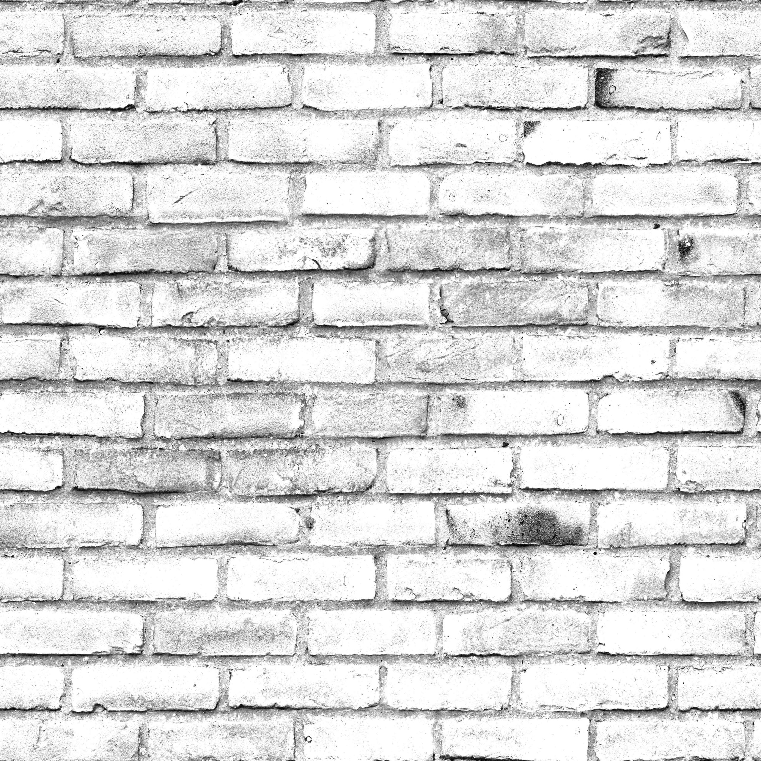
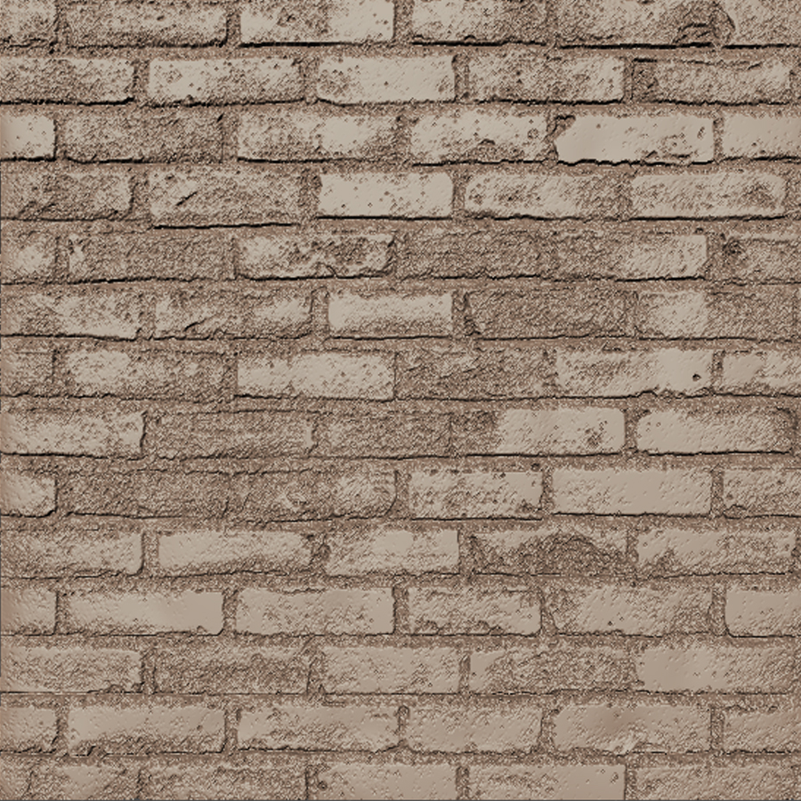
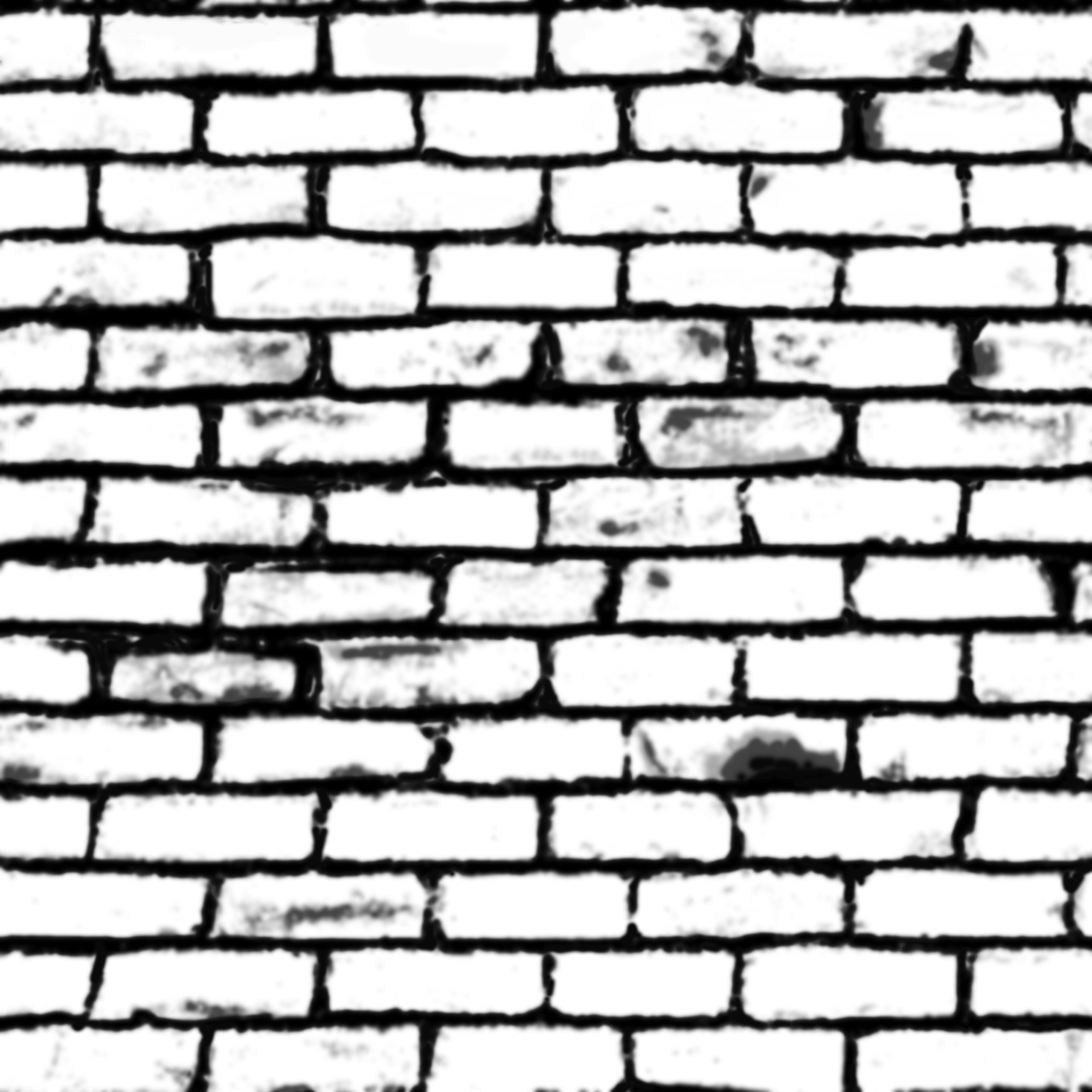
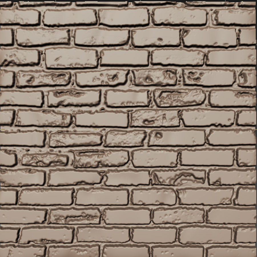
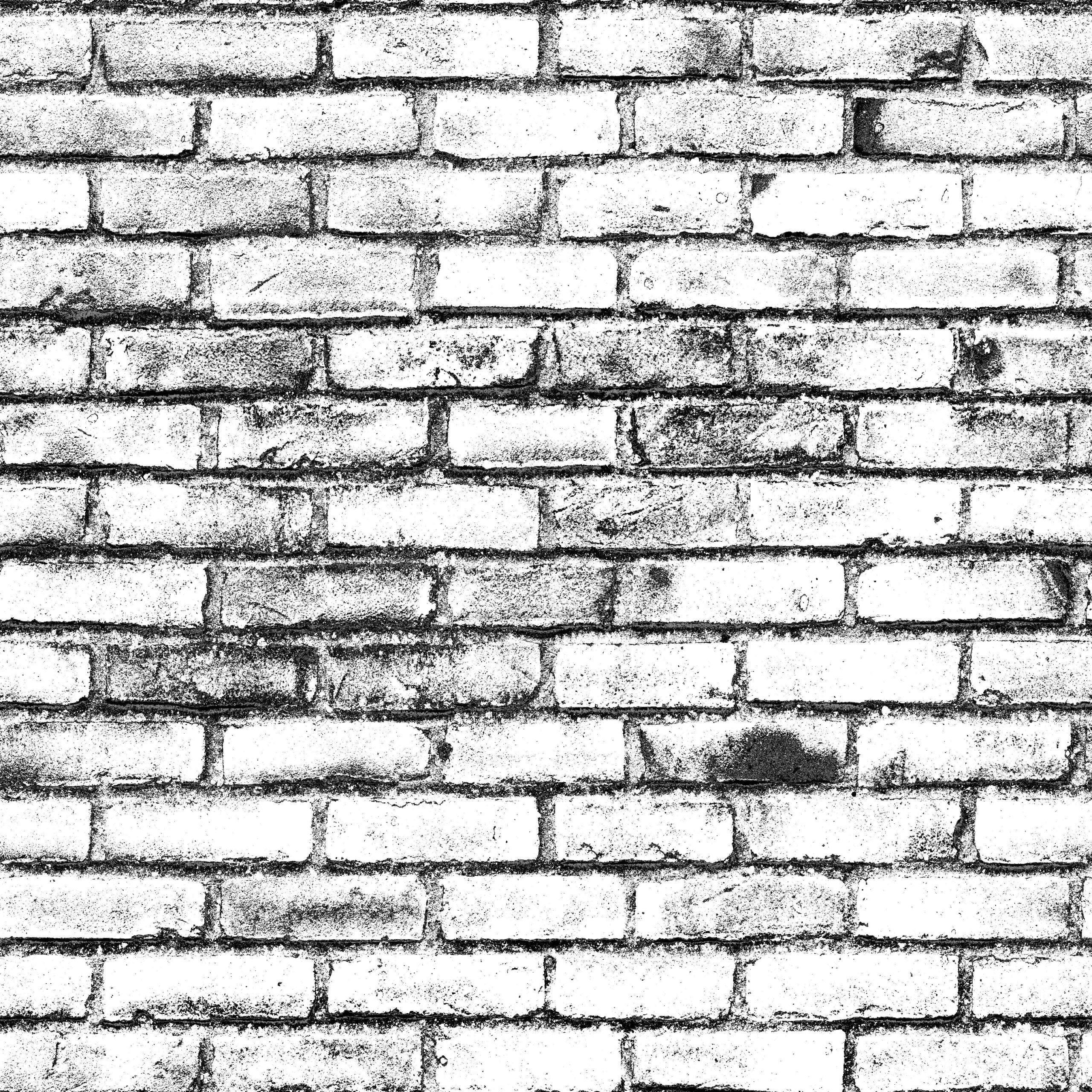
Displacement map workflow and experiment.
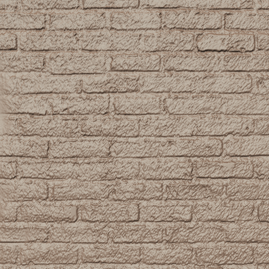
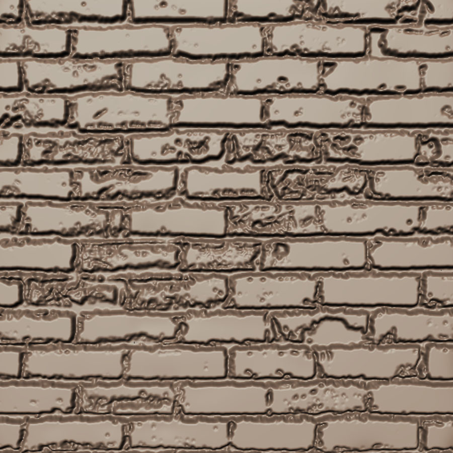
The original diffuse map used to make the below displacement experiments. Following pictures show the progression of the displacement creation and the corresponding outcome (used in mudbox on a plane).
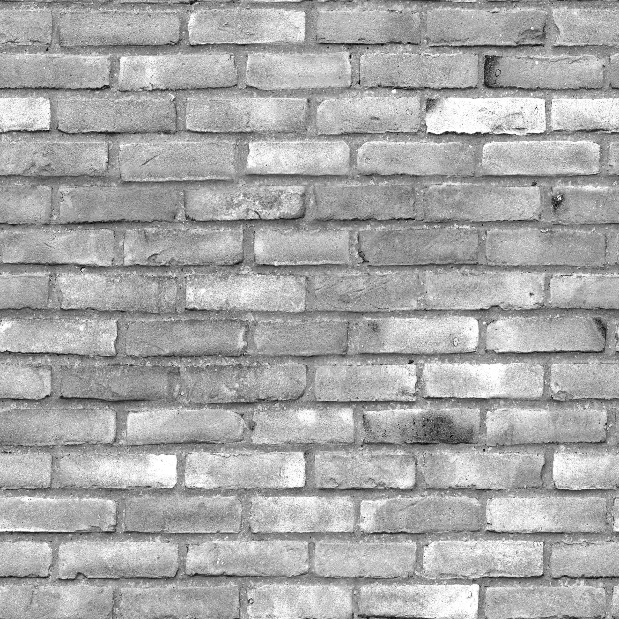
Black and White.
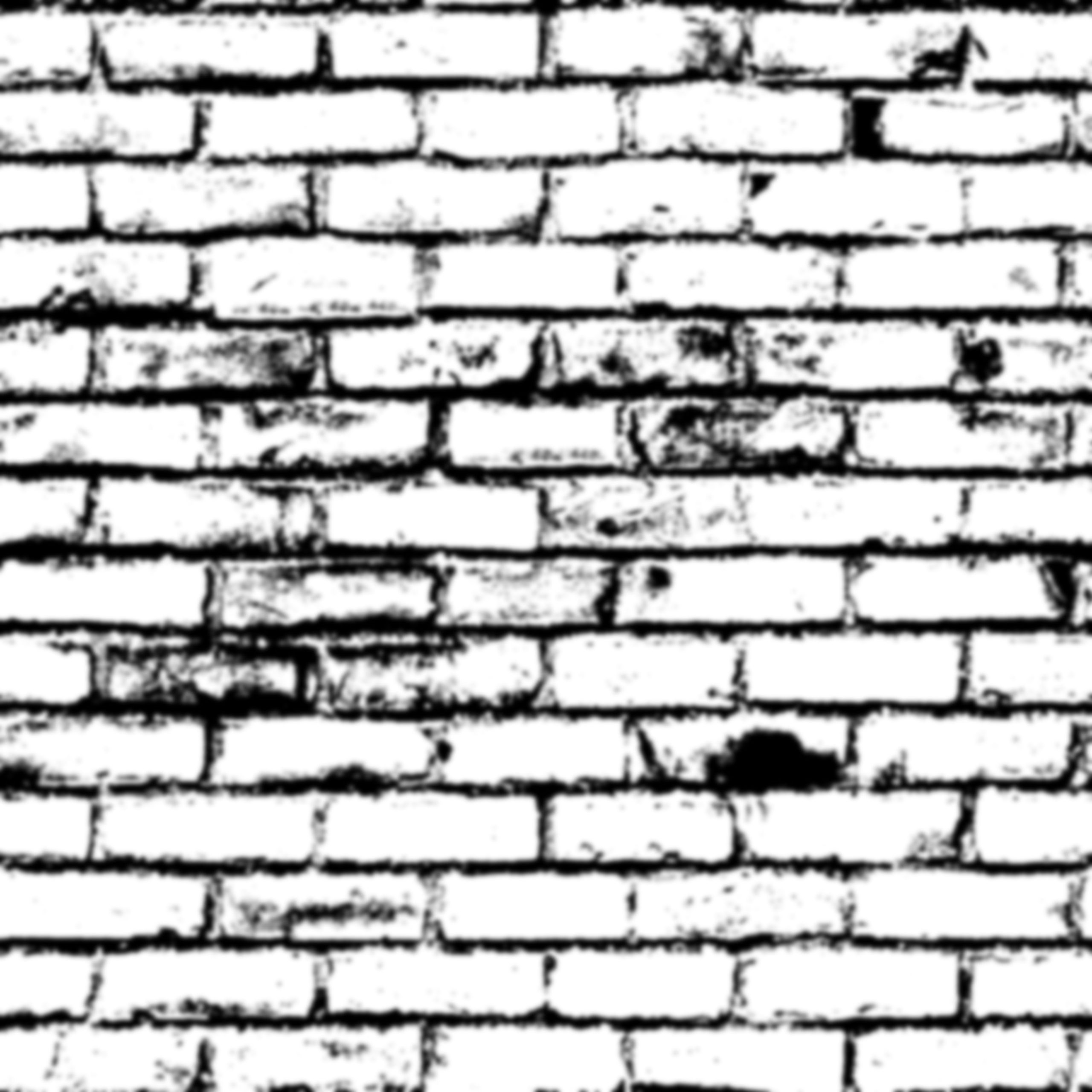
B&W + Levels + Curves +Colour adjustment + B&W + Levels + Blur + Levels
Black and White + Levels
All above + hand painted adjustments
B&W + Levels + Curves +Colour adjustment + B&W + Levels
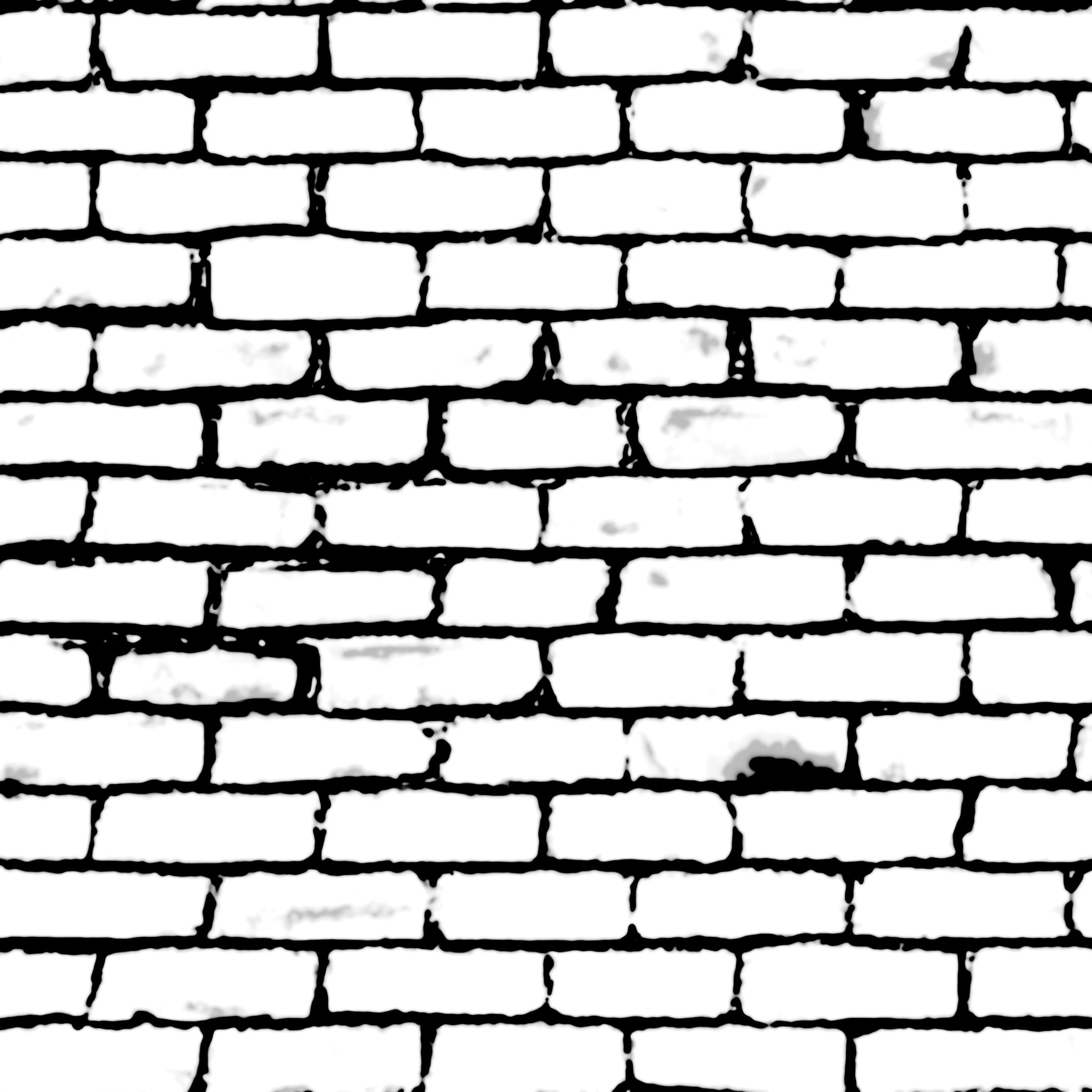
All above + hand painted adjustments + Levels + Curves
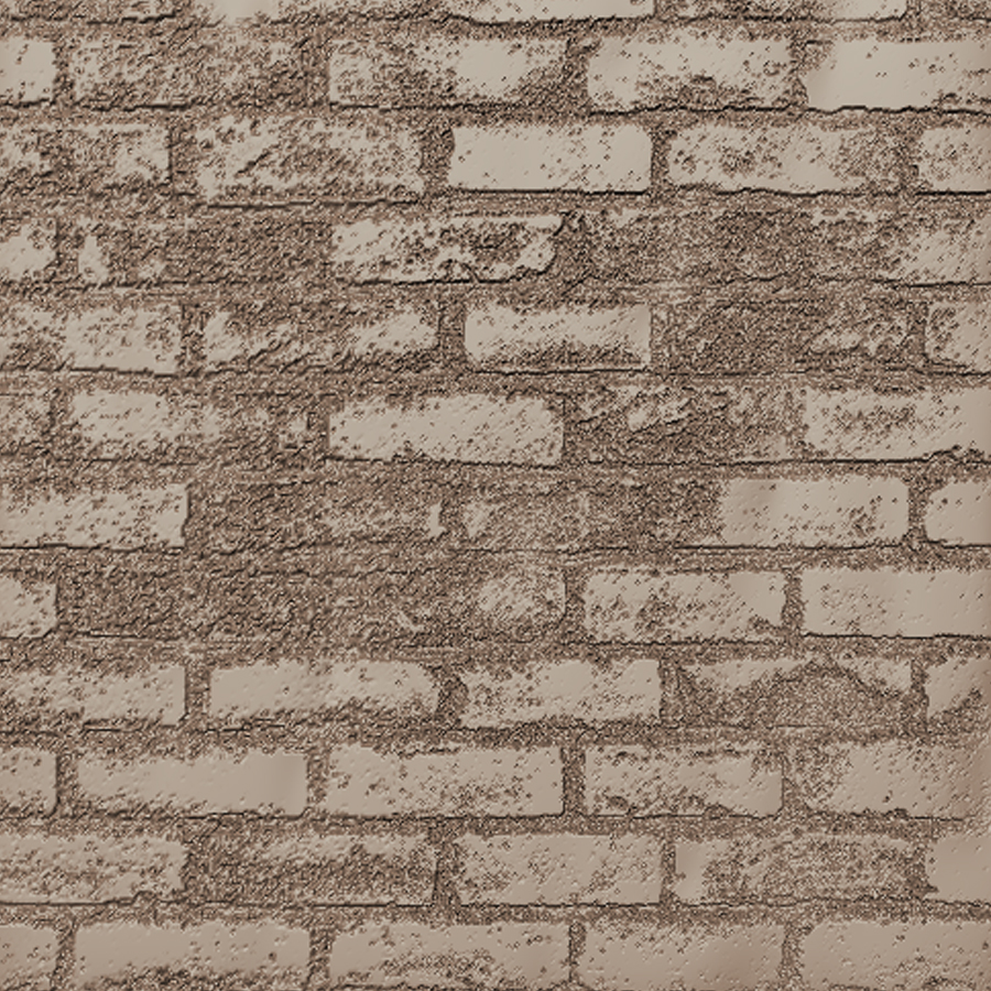
The final outcome of this exercise.
The edges of separate bricks could be blurred to achieve a better blending and realism, but in general the displacement works correctly and I have learned a great deal about how textures and displacement maps work.

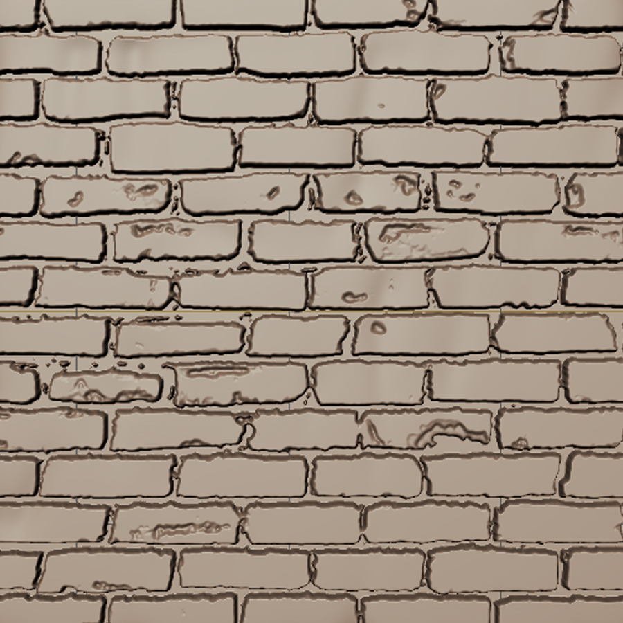
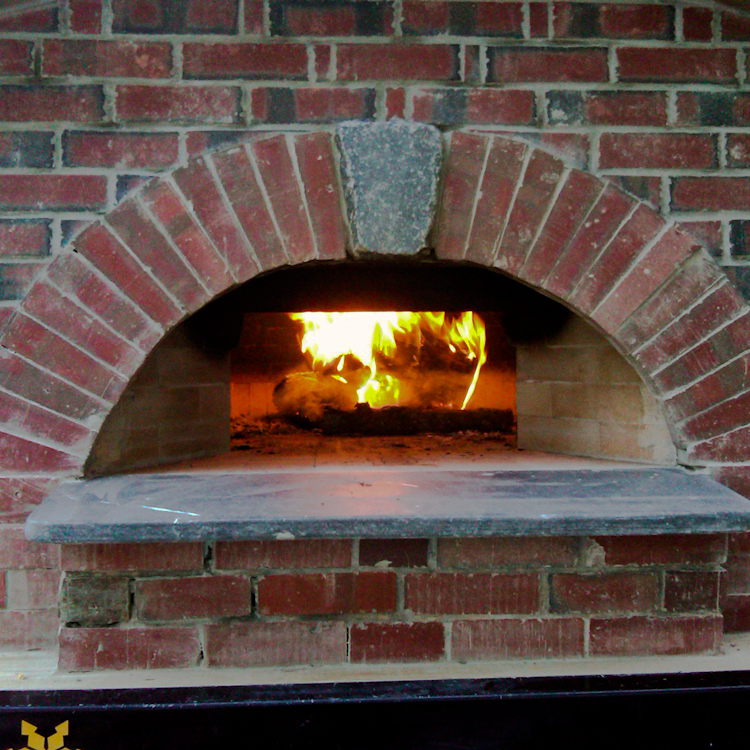
The exercise above in a practical use scenario – oven for the cottage scene.
Cottage kitchen scene
– Oven
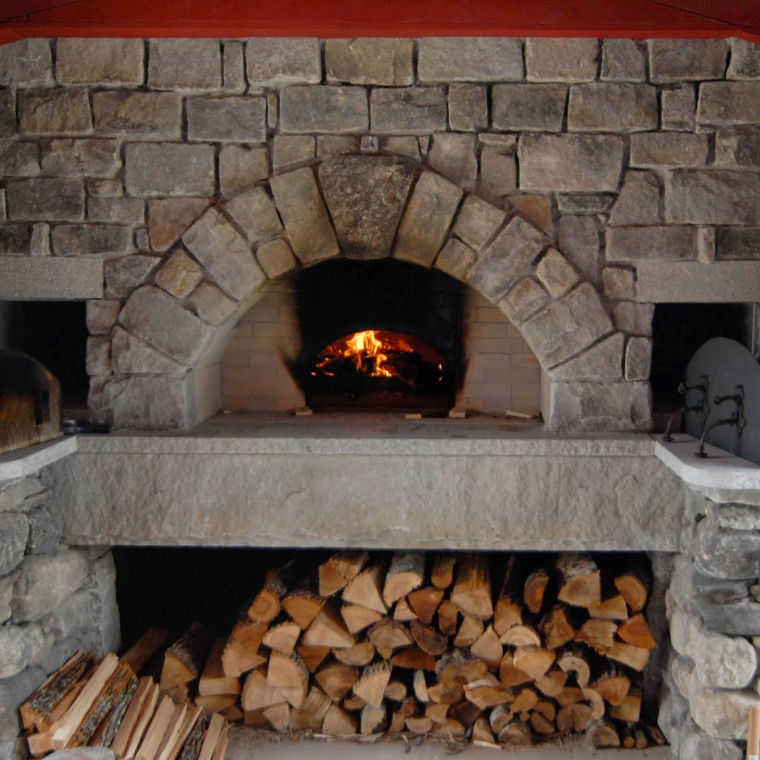
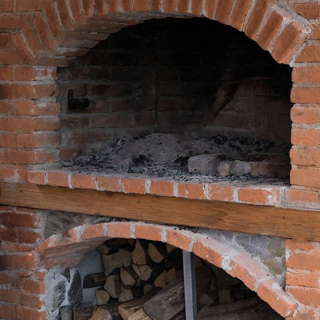
References
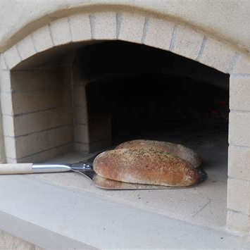
A few reference pictures of the idea I had in mind for this bread oven.

Progress
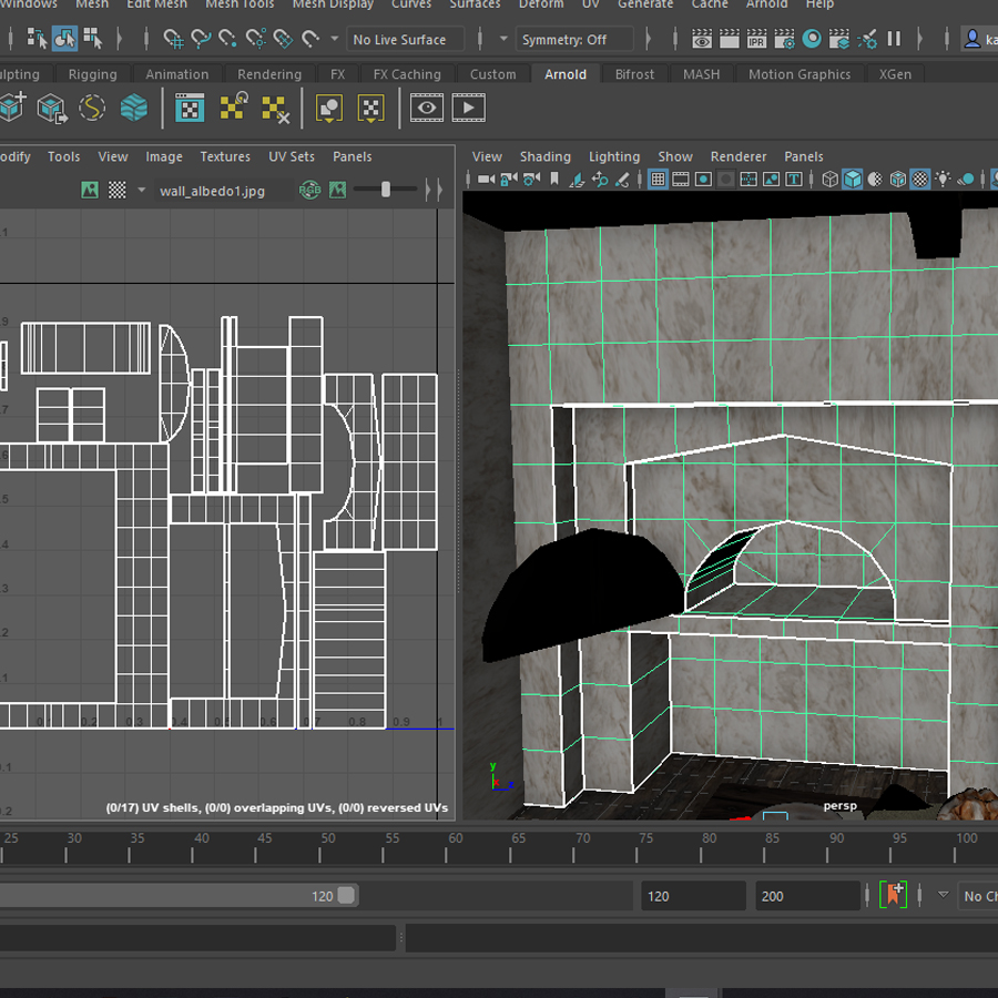
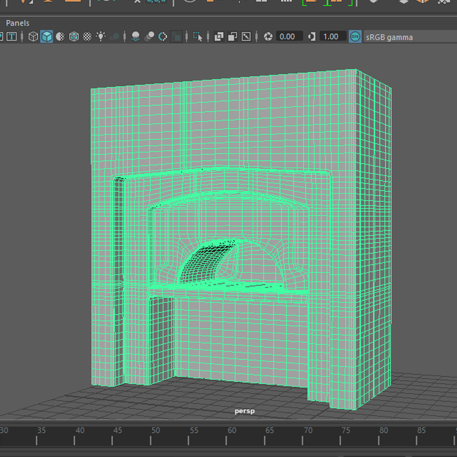
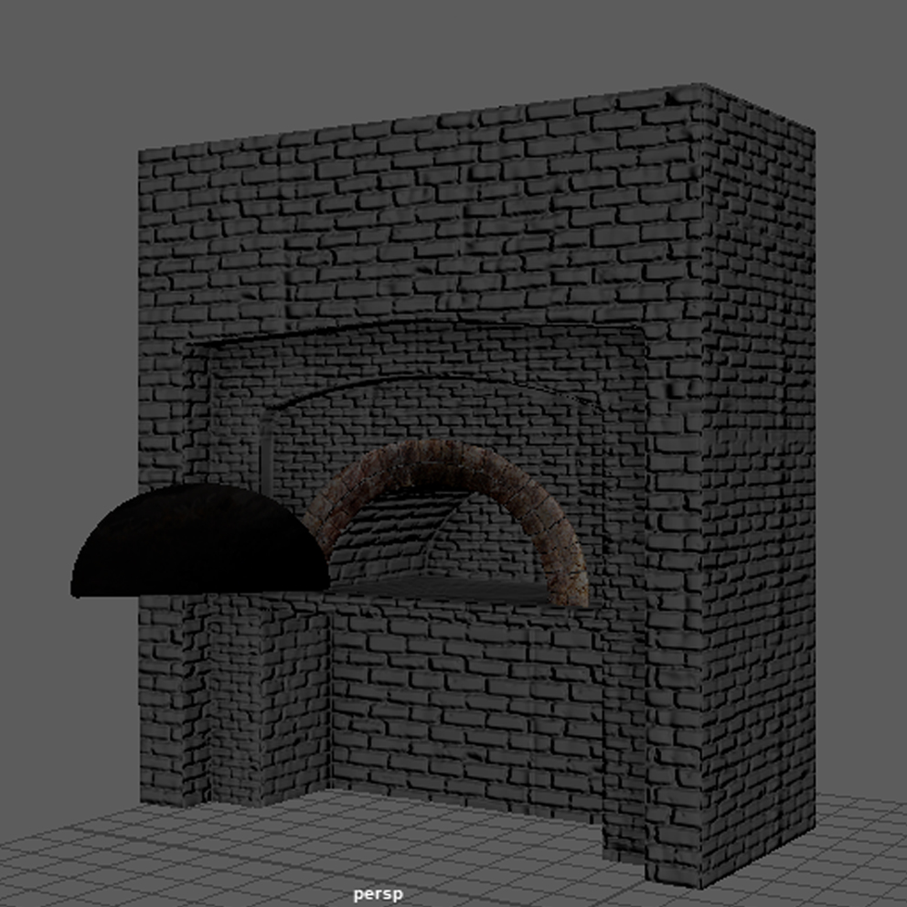
Box modelled bread oven, a base for the mudbox texture and displacement exercise.
Smoothed out base for mudbox.
The model in mudbox – high poly and sculpted with the displacement stencil (described in the section above).
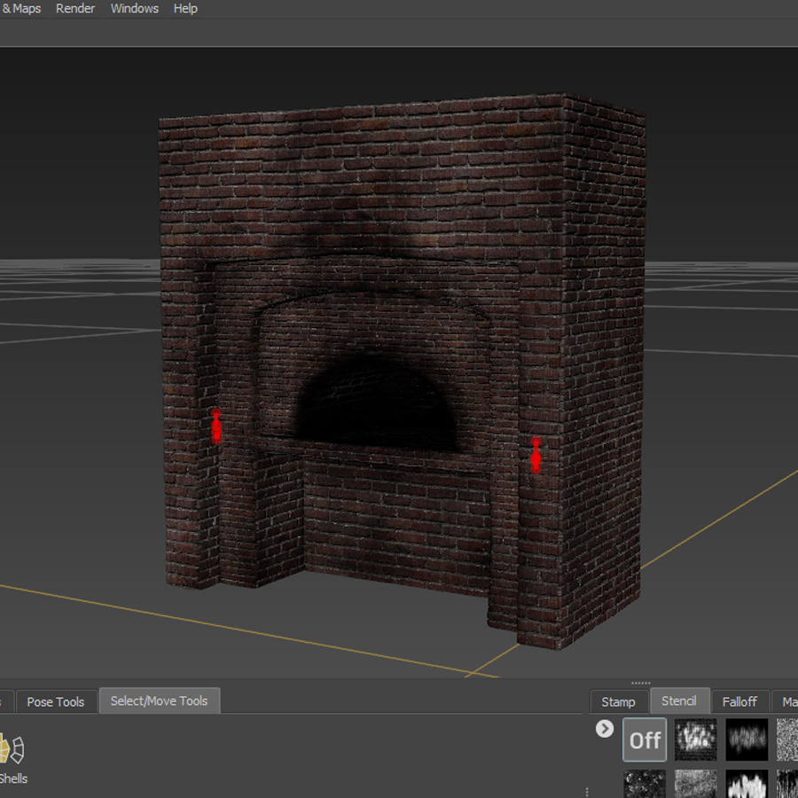
Model in mudbox, high poly, displacement and texture.
Stone arch around the opening of the oven, modelled in Maya (deformers, manual adjustments and sculpting).
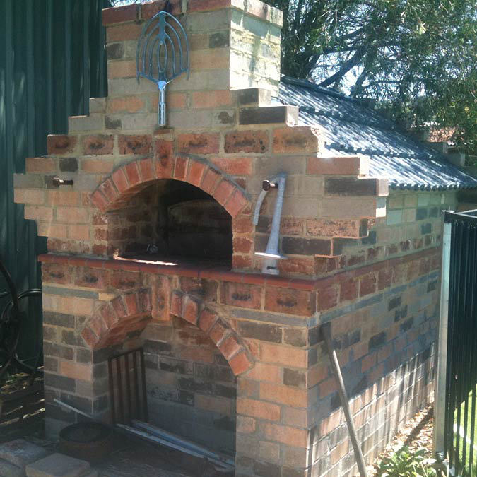
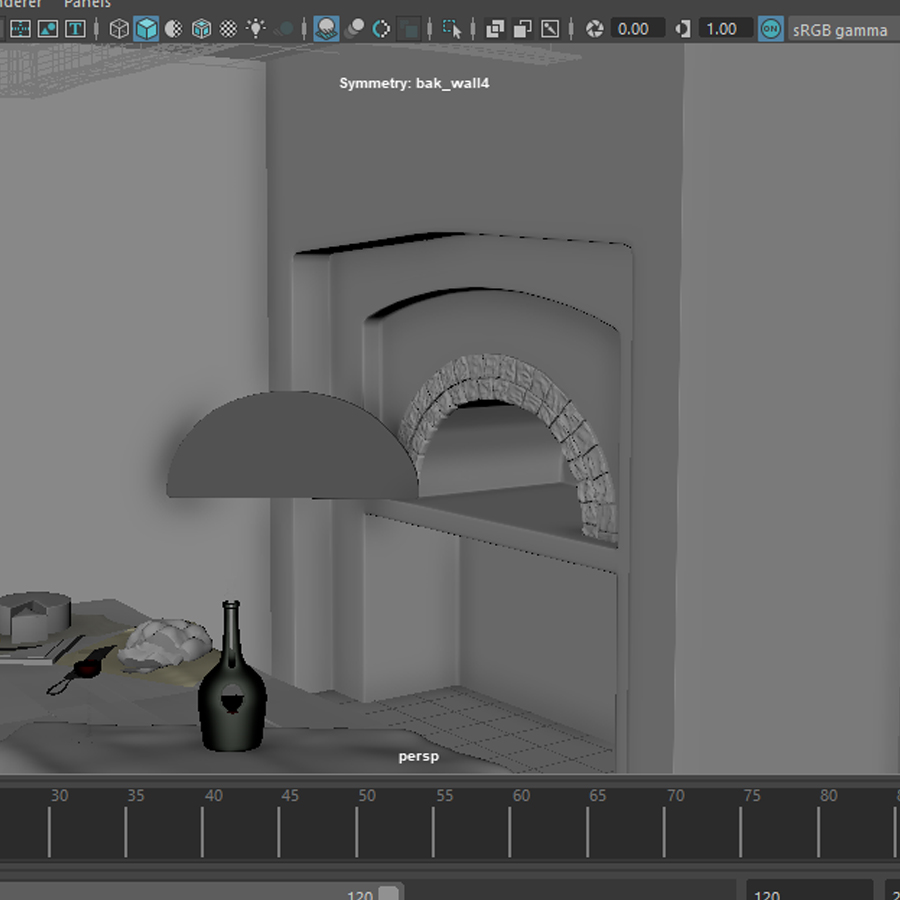
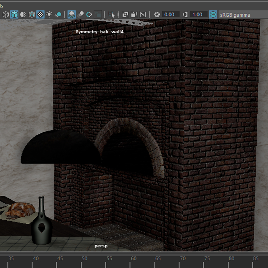
The final model in the setting of the scene (screenshot).
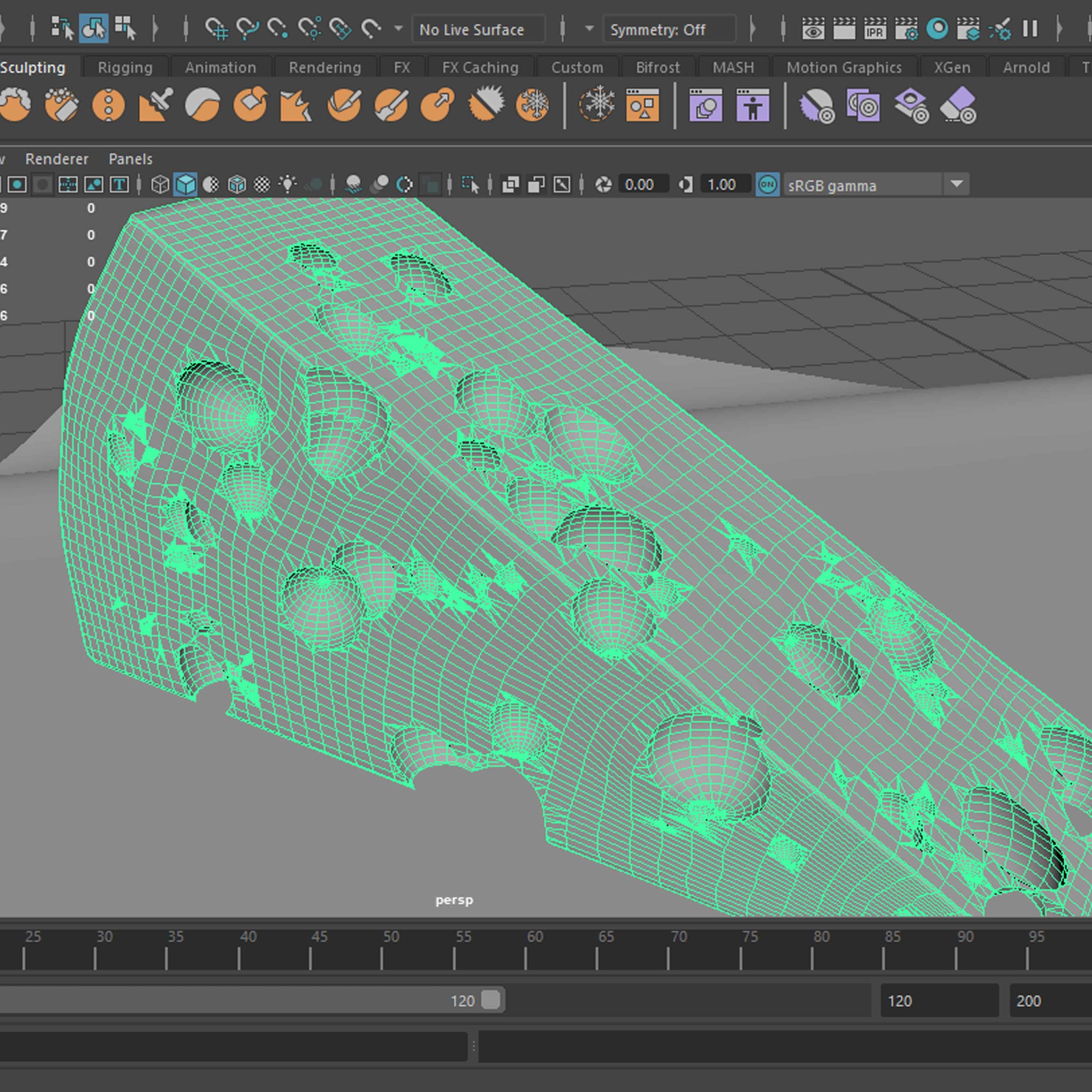
Zbrush introduction – face sculpt
I have decided to experiment a little more with Zbrush (as I had worked with it before) and learn stuff useful for my future sculpting practice. Instead of sculpting a normal head/face, I had decided to try to take it a bit further and make a fantasy creature/ character (still keeping it within the head/face theme). This one is a pixie/ forest imp creature that can be displayed in my cottage project peaking through the window and looking mischievous.
Progress
Face sculpt, sadly I did not save the first stage of it.
ZSphere horn base.
Horn Detail sculpt.
Some short time-lapse videos of the sculpting process. Sadly I have forgotten to save the first stage of the face sculpt, but since it was started from the base project available from ZBrush, not much was lost. The first video documents the process from before the horns were made, however I didn’t record that either and to save the time-lapse I used the changes history tab (not ideal but it works).
Model
For the model can be viewed and inspected at; https://sketchfab.com/3d-models/female-head-c4ad3dcd8a024a0d8a2966eb258d0e0b
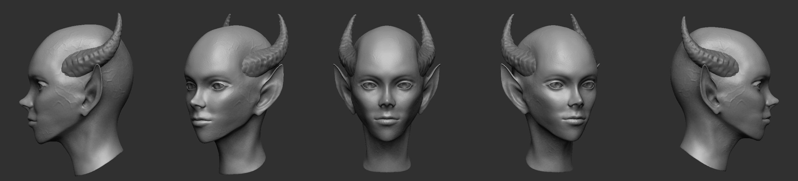
Classic 5 position sheet.
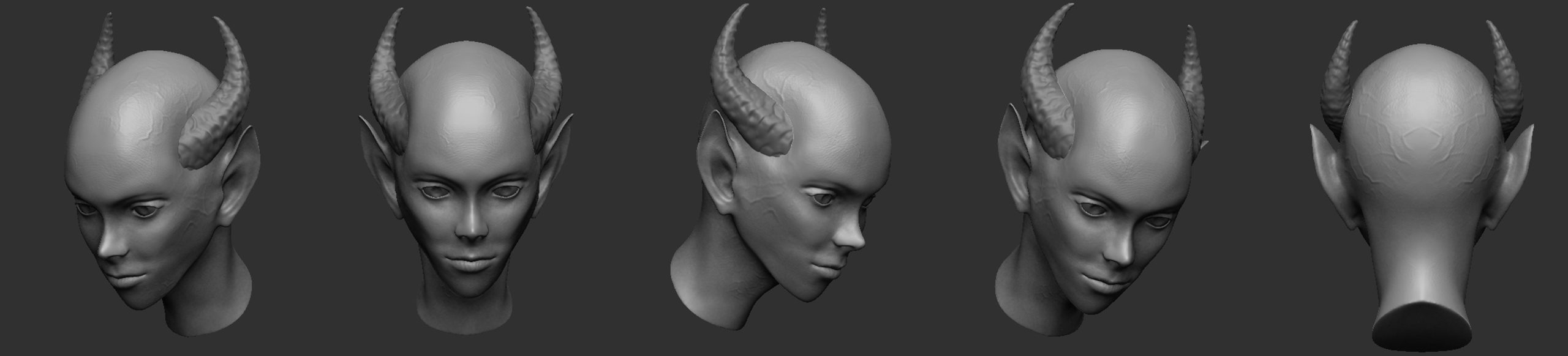
A few more positions. Angles I thought looked interesting or was needed to show the whole model (like the back).
Texture
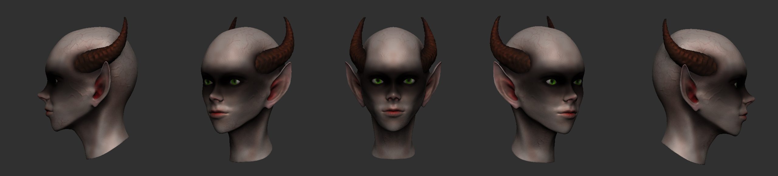
5 position sheet, showing the texture from different angles.
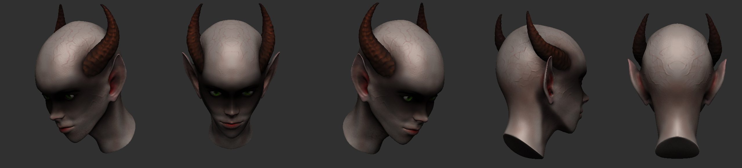
A few more positions. Angles I thought looked interesting.
Week 5 – Sculpting Introduction Evaluation
I have worked with textures before. but just recently I have understood their importance and I decided to explore the displacement maps part of this weeks exercises further. I have separated all the steps and checked how they worked in the 3D software, one by one to see what I needed to adjust to improve the final texture I was working on. Originally I thought that the closer the black and white image to the displacement – the more realistic the result, but this only gave me mess. The more stylised the displacement became, the cleaner the result as discarding little details reduced the noise of the texture giving me clean shapes of the bricks. The best result I managed to achieve was essentially after removing everything and leaving only the main lines that were meant to create the groves between the separate bricks. Originally I haven’t considered that as I thought it would make the bricks too uniform and unrealistic, but keeping the lines messy kept the texture from that too perfect uniformness I wanted to avoid. I hoped that grey areas in the displacement would make for less deep marks, but I couldn’t get that working, however this can be easily added by some alphas in a sculpting program.
The oven I made was different that we made in lessons but uses similar principles, and I have chosen this type as I wanted to stay true to the period I was imagining that cottage scene in and a bread oven like this felt more practical in a poor old-fashioned/historical cottage. I have box modelled it in Maya, smoothed and extorted to Mudbox to texture, using the displacement prepared. It took me a while to get used to the way Mudbox works, but after a few trials I have managed to set up the displacement map to work the way I wanted and I started paining the model. After adding the brick pattern, I have decided to add some details to the inside and I have used a picture of a half round grill grid as a displacement and I painted most of it black to resemble sooth. I did the same around the opening and above it to give the oven the marks of actual use. I did the same with the stones around the opening (which I box modelled, then sculpted and textured in Maya).
The ZBrush sculpt project was allowed me to finally pay more attention to the way alphas work, as I could never before manage to use them properly and since this one was based around a face, I had to figure it out to make sure it doesn’t stand out too much. I have sculpted a female face, staring with one of the base projects supplied by ZBrush, which made me realise how enjoyable working with faces can be (which were too intimidating for me so far) and I decided to have some fun with it as well as to take it a step further and add some fantasy elements to it. I have modelled some small horns using ZSphere, sculpting and alphas and I have worked on the ears to give them the pointy appearance of an elf or other fantasy creature. The alpha was quite tricky to use on those and I had to redo it quite a few times to get it to a acceptable stage. I have also forgot to record the progress and the progress videos show only parts that I was able to get from the edit history. Also, I have realised that I have been sculpting the whole time with the perspective switched off, I managed to get screenshots of the perspective I worked with, but the appearance will vary in other softwares. The texture looks relatively flat, but doesn’t look completely stylised which – in the limited time I had – I consider a relative success (I will try to improve it with time).
Week 6
Animation intro – Bouncing ball
The introduction to animation in Maya. The first project involving animation was connected to a mention of the 12 basic principles of animation (Disney) and so, we had animated a couple of balls. One of the balls was meant to be bouncy, and one firm and not flexible (bowling ball), we had also concentrated on the difference in their bounce mechanics to explore different physics principles and how to simulate them with 3D software.
To take this further and work more with the first Disney animation principle I have decided to add some squash and stretch to the bouncy ball.
Progress
Rendered sequence
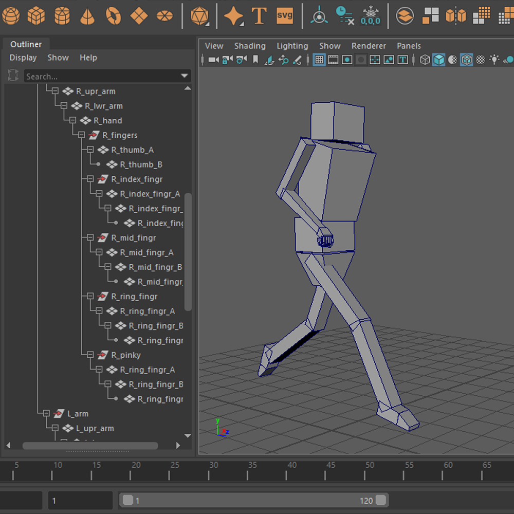
Rigging and animation intro
Introduction to rigging, constraints and hierarchy, as well as to the mechanics of working with a character.
Progress
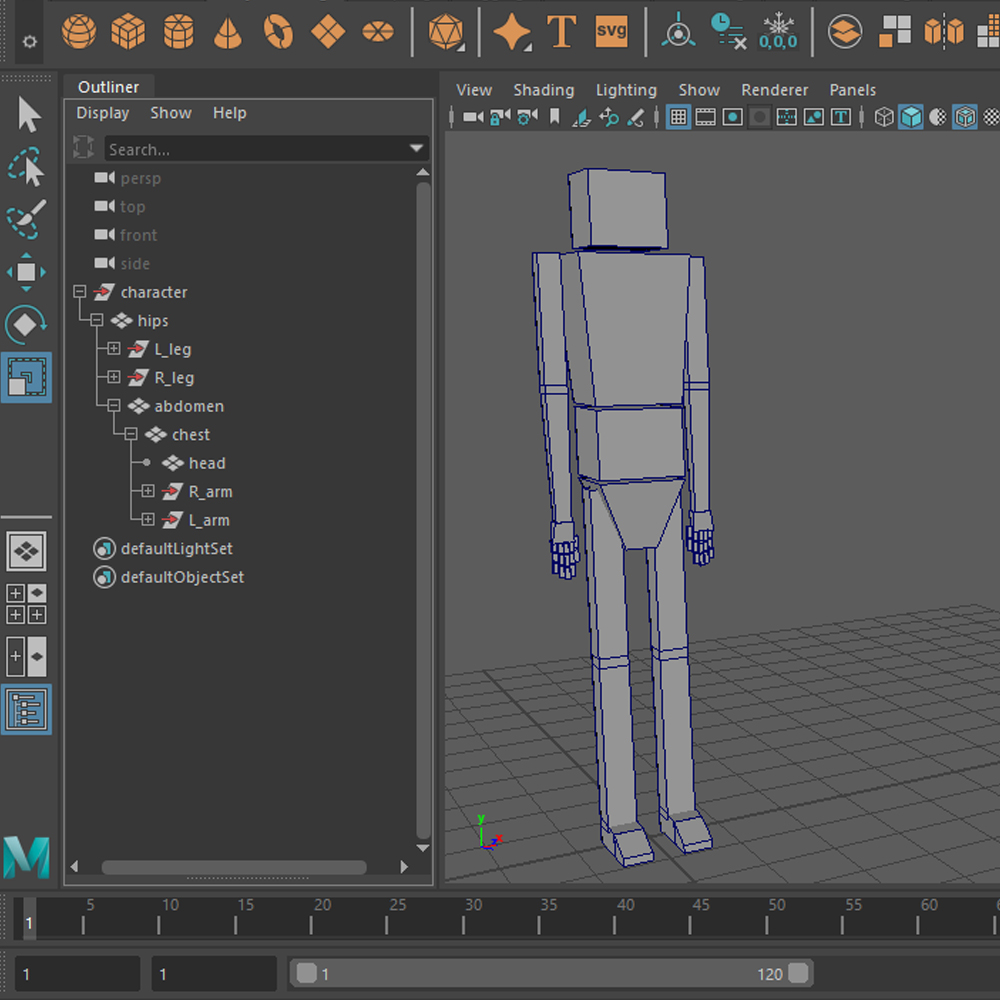
The geometry of the basic box character used for this first rigging exercise.
The hierarchy of the models geometry already allowing some movement.
The joint structure of the model (skeleton).
Some constraints added, as well as the beginning of the controls structure.
The end result of the rig, all controllers and constraints in place.
Some additional joints and controllers for the fingers. I’ve decided to add those as I have never rigged fingers before and it was interesting. For the final animation for this exercise I will use a rig without the fingers to keep it consistent with the lessons.
The render of the very quick and not very accurate animation presenting the working of the rig.
Week 6 – Animation Introduction Evaluation
While working on the bouncy ball example of animation I have decided to add some squash and stretch to recap what I had worked with before, so my workflow for the bouncy ball was slightly different. As an outcome the ball looks way more stylised than I intended and I have spend much more time on it than I should have, but at least I have worked a bit with some additional options and deformers. A ball like that would be useless in VFX as it almost looks personified, like it jumps on its own, not simply bounces (unless I was working with an animated element that was introduced into a real life footage as in the recent ‘Smurfs’ movie or in ‘Who framed Roger Rabbit’ etc). With the hard ball I had followed the lesson materials and using the Graph Editor made the job of making subtle adjustment in animation so much easier. I am not completely happy with that animation, but I think its acceptable. To present my work I have also decided to make a little environment (adding walls, floors, materials and lights) and render the whole thing, which makes the animation look more dynamic and lively because of the light and shadow interaction with elements, it also pulls the attention away from that slightly too stylised bouncy ball animation, which is also an improvement.
The rig was slightly different than what I was used to as I have never just assigned geometry to joints in terms of making the geometry move, but it was quite fun and interesting exercise that definitely taught me the importance of proper hierarchy and the way constraints work. To practice those I have also decided to add separate controls for the fingers, which was the first time I have attempted to rig a full hand, and I found it way less intimidating than I expected. At first I wasn’t sure how to attempt that but then I just went with copying the way we had rigged and assigned controllers in the main part of the exercise and it worked quite well. Since this took some additional time, I had to compromise with the final short animation that was meant to show the rig in action, and the animation is quite bad, but it still shows the success of the rig as I managed to get everything moving the way I wanted without any issues. The animation has the least I could do to get that sequence working, nothing is improved and it has only basic transition between base frames which I would normally avoid, and work on perfecting the frames in between. The right arm looses the right movement at some point but I have only realised that after the rendering (which took some time) and I decided not to redo it as it did show the general idea of the exercise anyways. I would like to revisit this in the future, possibly with a more complicated character (I have a robot/synth character in mind for future projects), in terms of improving my generalist knowledge and skills.
Week 7
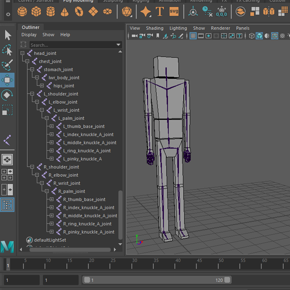
Skinning, Blend Shapes & Custom Joint Structure
Bind Skin is a command that assigns the joint structure and their influence (through painting skin weights) to the geometry of a model in order to later control it, in the animation stage. Blend shapes are controllable sliders with changes in geometry assigned to them, allowing making adjustement to the appearance of the facial shapes of a model.
Progress
Skin Weights and a custom joint structure. Screen recording of the beginning stage of the facial riggings process, showing the workings of joint influences.
Controllers in place with the geometry on a reference type display layer.
Rotation limitations in action, with settings on the right of the scree.
Renders
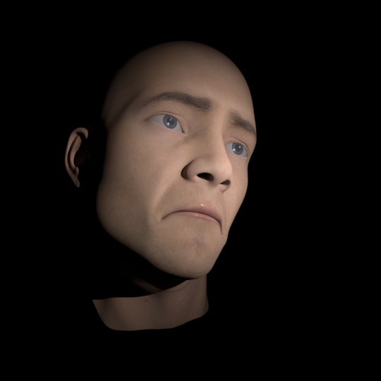
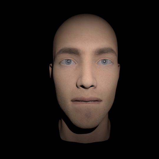
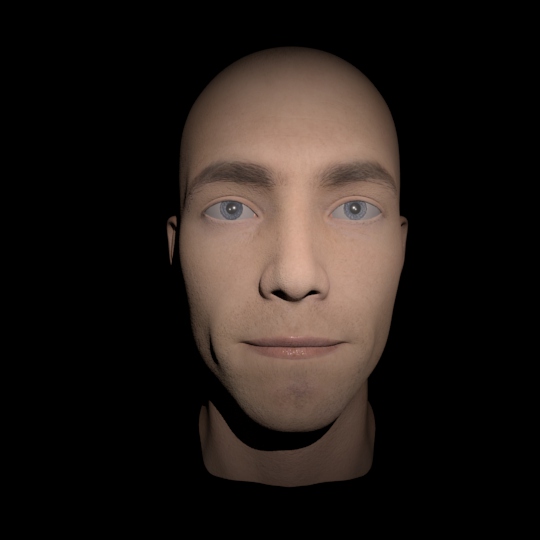
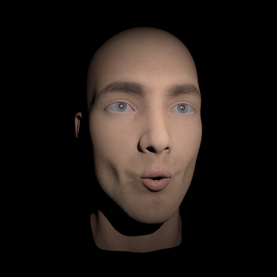
The original model without any blend shapes influences or other corrections.

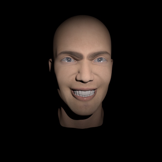
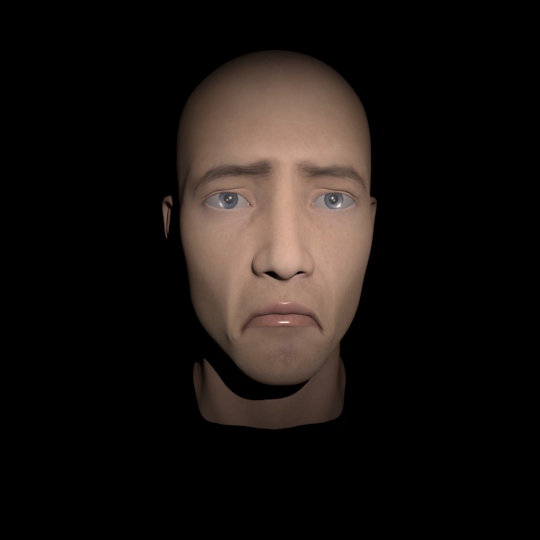


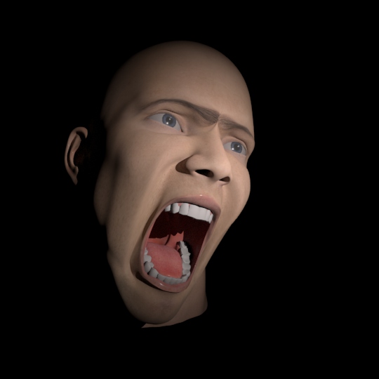
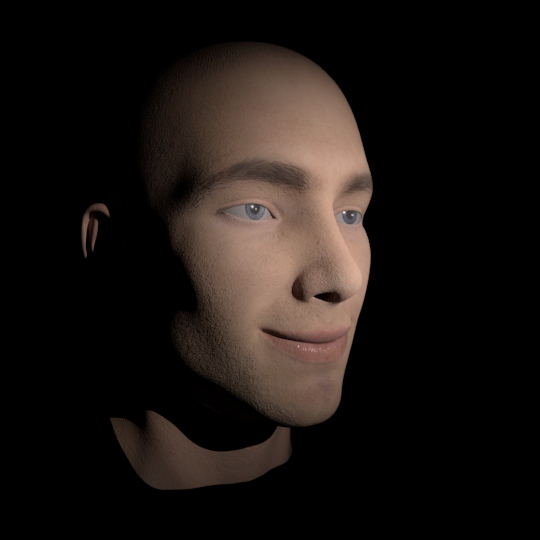
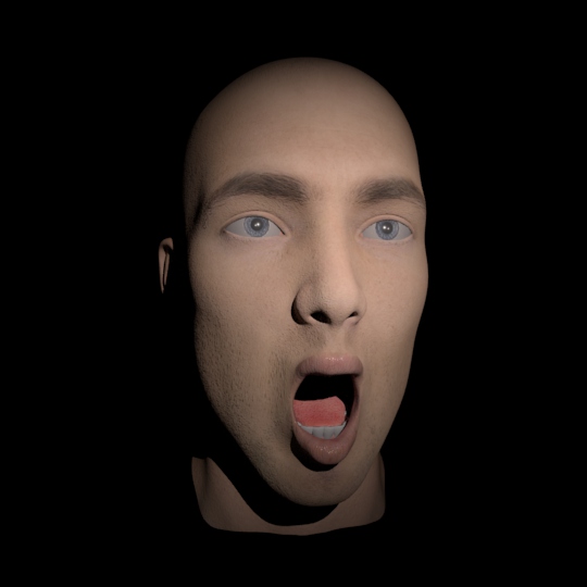
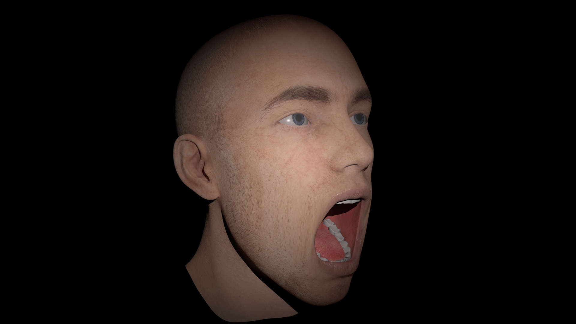
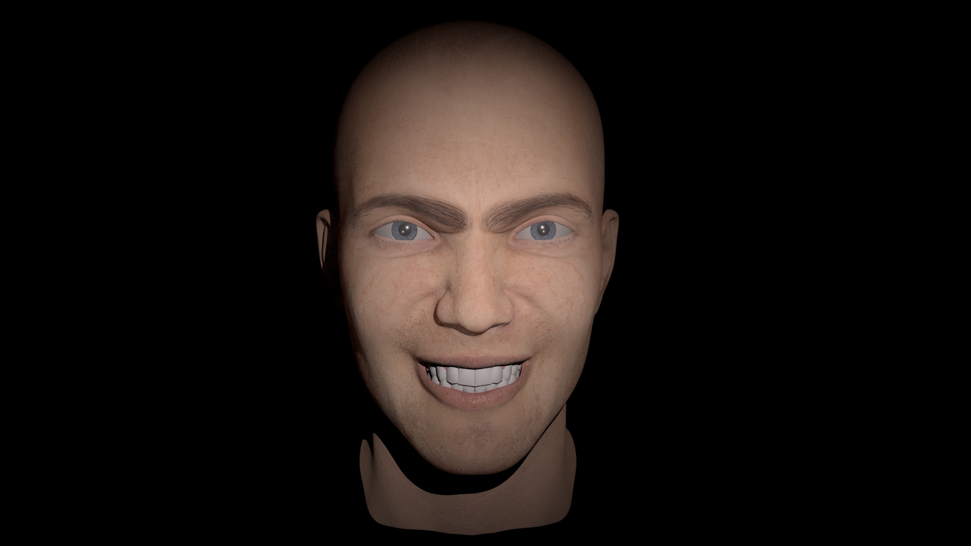
The first three renders showing the full face emotion blend shapes, respectively; frown, snarl and sulk. The remaining three showing outcomes of experiments with mixing the main three. They resemble fright, pain and/or almost crying.
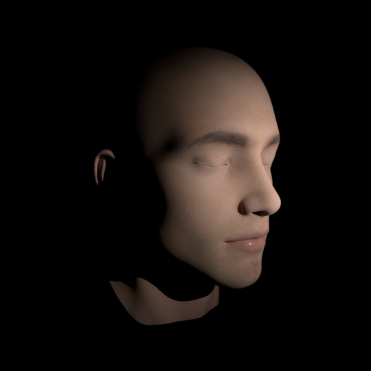
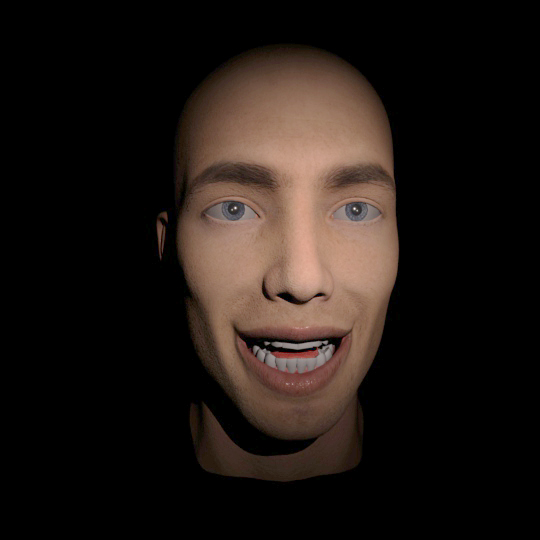
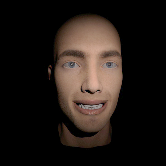
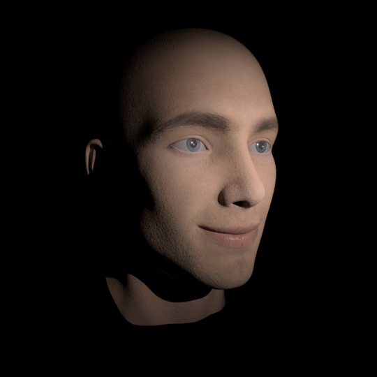
The above three base blend shape emotions used in various amounts and mixes, together with the head rotation of the rig made previously. Sadness, frustration, disappointment, cheekiness/mischief, calmness/rest (the addition of the blink blend shape) and anger.
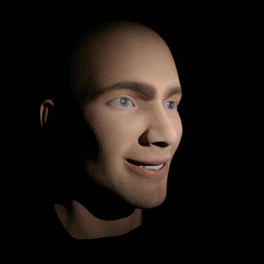
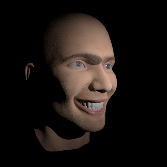
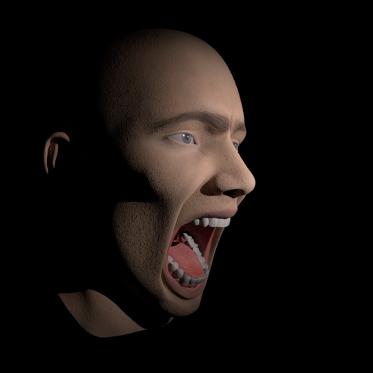
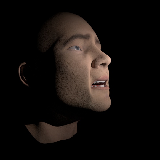
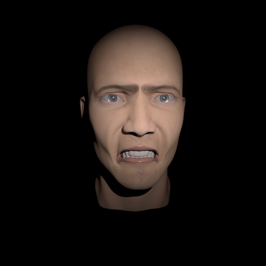
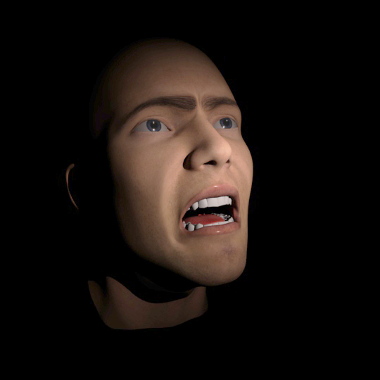
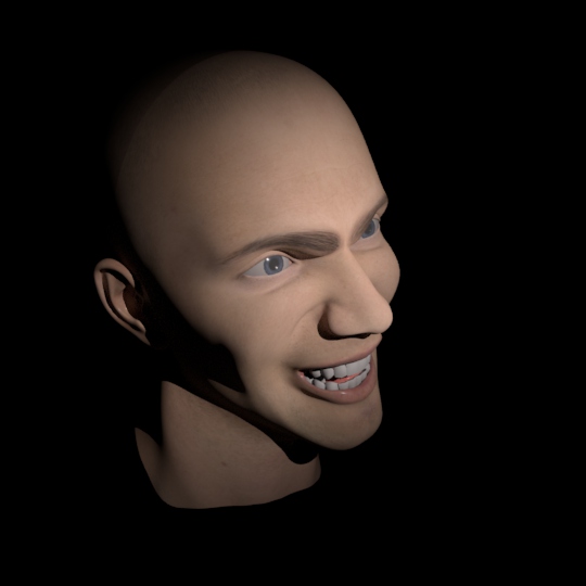
Additional blend shapes and renders showing the mix of them in an attempt to create further face shapes and emotions. The first one uses a smile and the blink, creating a satisfied or happy/blissful expression. The following two use the frown, smile and snarl. The fourth one depicts the ability to use the blink and smile on one side of the face only, making a cheeky, happy winking face and the remaining two use the jaw rotation control of the rig to open the mouth as well as some frown, cheek fall and sulk, respectively creating angry, shouting and very sad expressions.

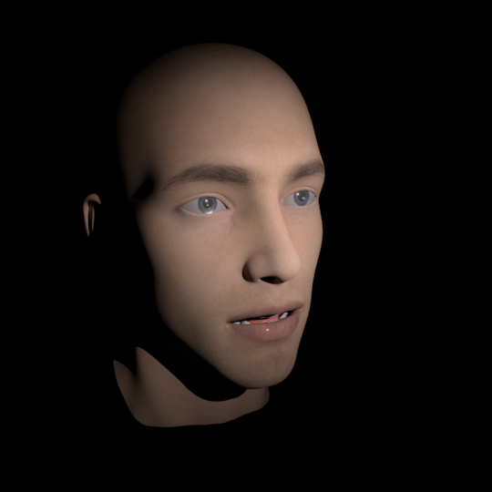
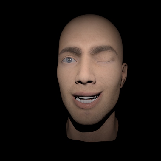
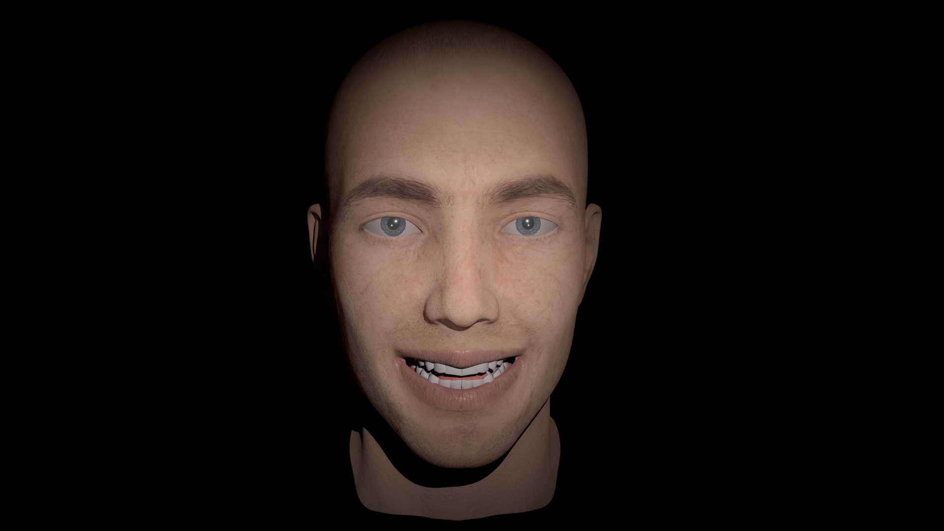
AI C E FV kiss L MBP O rest U WQ smile
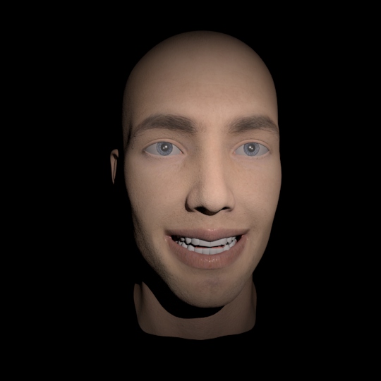
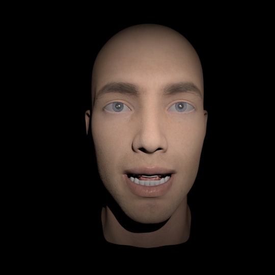
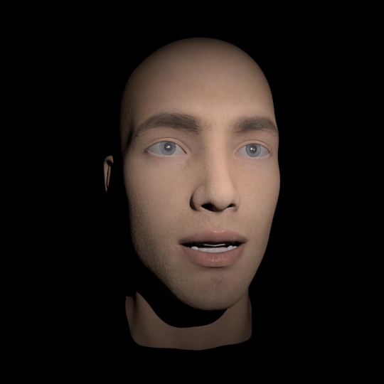
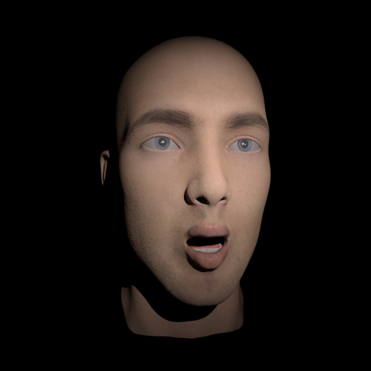
Lip-sync aid, basic mouth shapes imitating the shapes created while talking. In the order of the pictures; AI, C, E, FV, kiss, L, MBP, O, rest, U, WQ and smile.
Week 7 – Rigging and Facial Animation Evaluation
I haven’t finished any rigs I have started in the past because I couldn’t figure out why painting weights was not working for me, in this project I had no other way but to figure it out, as it wouldn’t allow me to progress if I didn’t. I enjoyed rigging before but I always got frustrated and had to abandon it before, this time I’ve learned that the maximum vertex influence value in Maya is 1 and if I used the brush of a full value of one (as I did before) and painted over a vertex multiple times (overlapping joint influence) Maya would automatically take away that influence from previously painted areas to allow full coverage (value of 1) on the currently painted vertex. Figuring this out took me a while but thankfully this was the only problem I had with this project.
The Blend shapes were completely new to me but I enjoyed them a lot, and I really liked working with them. I wish I had more time to spend on this project to make the blend shapes working the way they should, as they look artificial and the potential of the tool allows a huge improvement. I dont see myself in facial animation but I will definitely have to revisit this area and learn more about this. This way of working also allows incredible freedom and resemblance to real muscles, as well as they are very easy to use, I have animated facial expressions and lip-sync before, but this makes it so much easier and more realistic.
The lip-sync aid blend shapes were relatively complicated to get right, and I would say that maybe half of the ones I made are readable enough to be recognised, but it was a great exercise and it really illustrated the potential of the tool. All of them have mistakes, but some of them, like U are completely wrong, which I would have tried to correct if I had more time. The FV and L looked acceptable when I was making them, but later on, from other angles or with differently opened mouth they refused to work, which taught me do triple check one thing from every angle before I decide to move on. The AI, C, E and L don’t go enough inside the cheeks, which makes them look artificial and possibly uncanny, although I did try to pay attention to the underlying muscles instead of looking only at the surface. The kiss is just wrong, possibly not enough pushed out but when I tried that, it looked ridiculous, I worked the longest on it, but I could not get it working, which calls for a rematch, later on. I will certainly try to attempt this exercise at a later date, to learn how to do all this stuff properly, I will probably also look at some anatomy stuff beforehand, as looking at my reflection can only do so much.
Week 8
Image sequence rendering, AOVs, Nuke Adjustments
The introduction of rendering image sequences and the importance and practical use of separating shading network components while keeping a single image for a frame (makes post prod. easier).
Progress
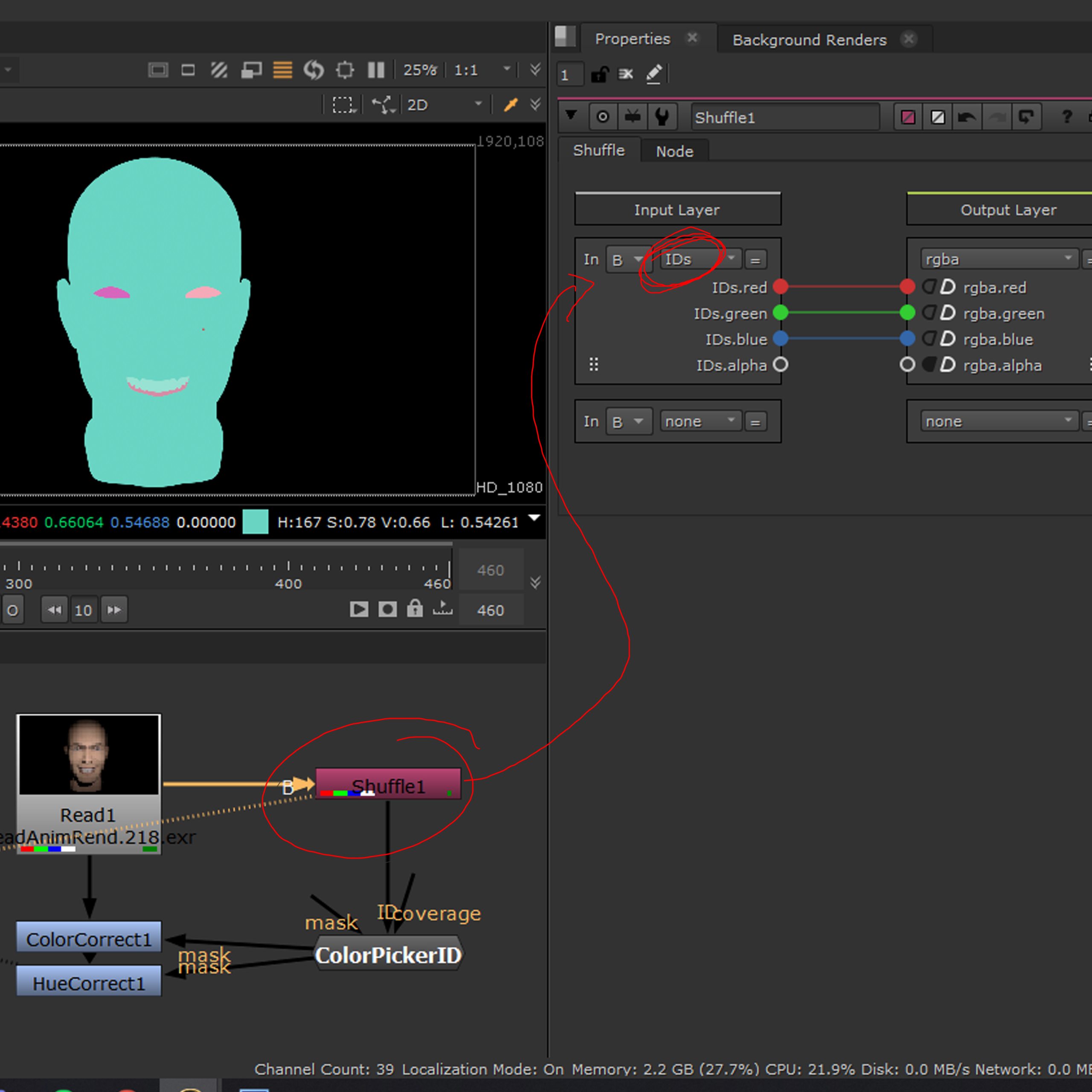
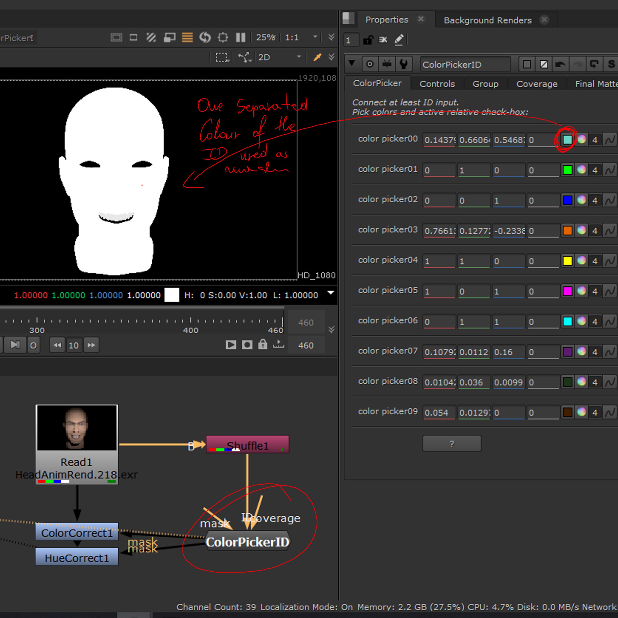
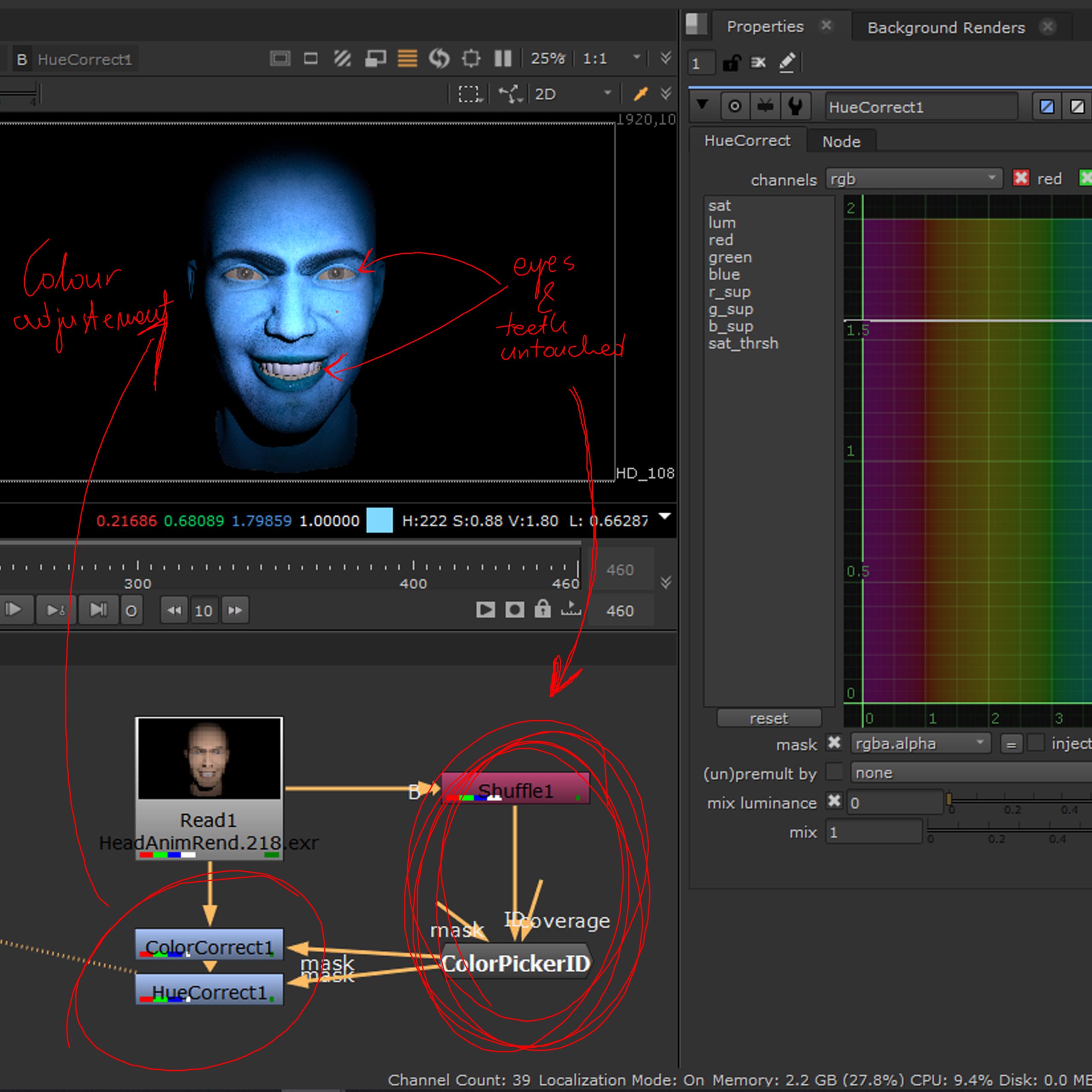
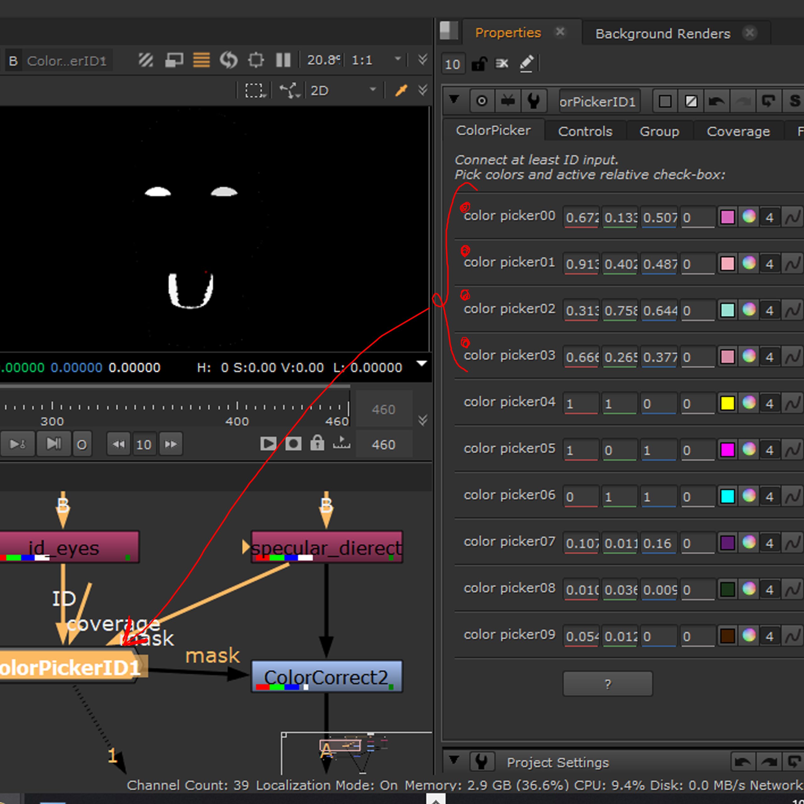
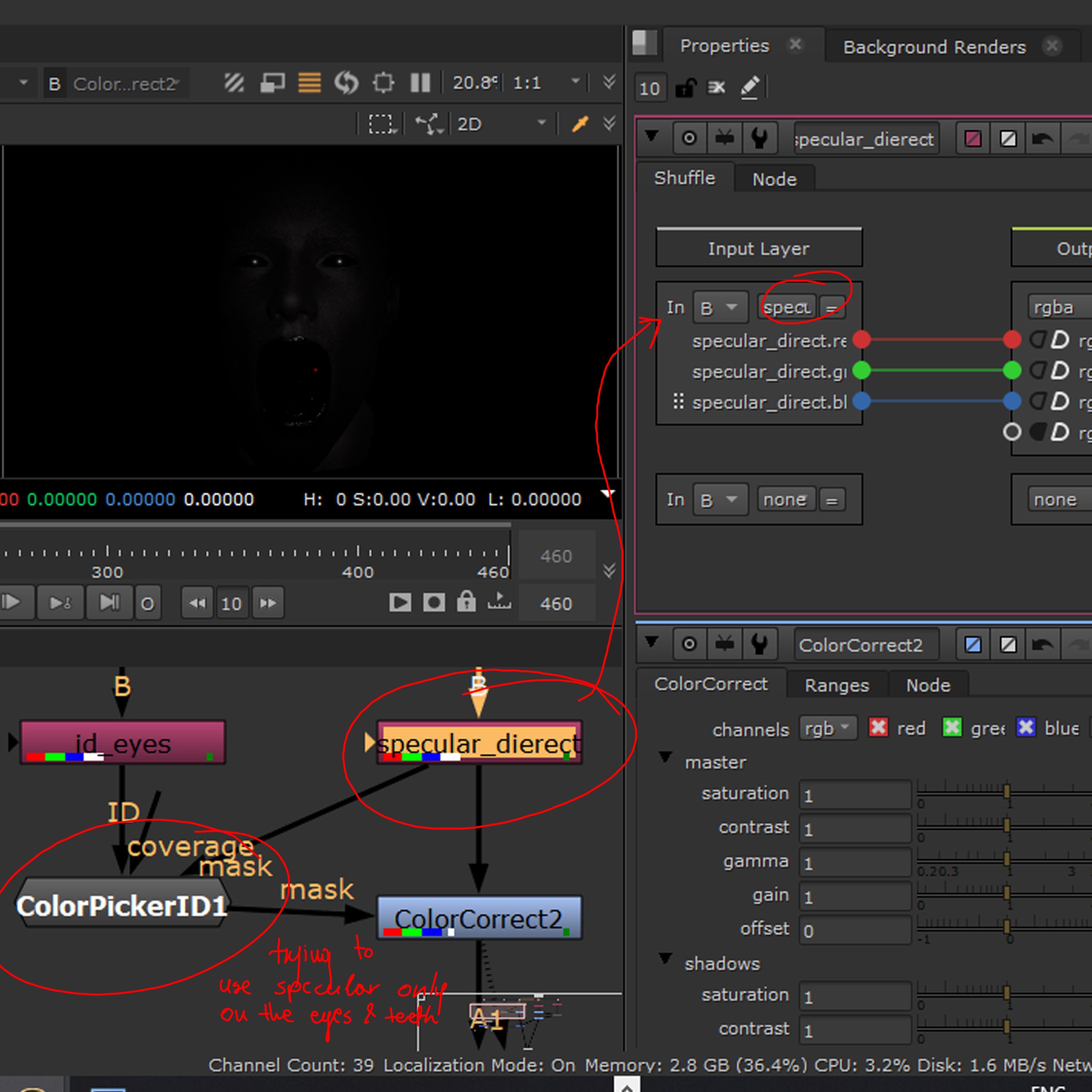
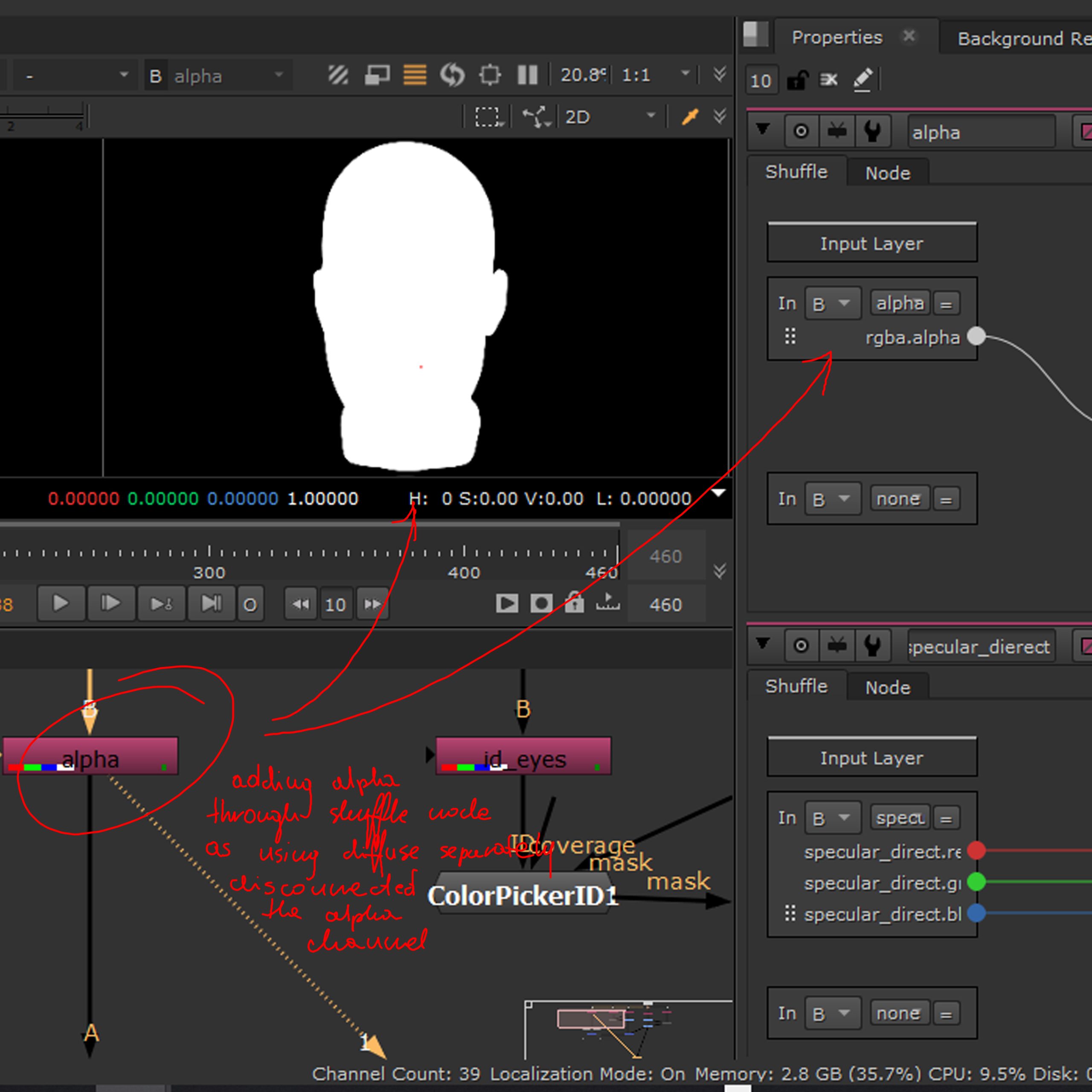
Screenshots depicting the progress of using the different rendered components in practice. The process concentrated on the use of ID map to separate particular elements in order of affecting only some parts of the render with the colour correction. First image showing the ID map of this render sequence, separated out with the use of a shuffle node, the second showing the use of a ColourPickerID node to separate the colour of the face only and create an alpha map out of it and the third one shows the reason and result of that operation, showing the colour corrected (extreme) render with the eyes and teeth colours untouched. Next one shows the eyes and teeth parts as a separate alpha (ColourPickerID -> choose the colours from the ID) followed by a specular direct AOV (Shuffle node separated) in order to add specular only to those parts.
Using the shuffle node and separating every part out, caused the alpha to be disconnected, so the last picture shows another shuffle node adding the alpha back to the footage.
First video shows the render, as it came out of Maya, and the remaining two show the adjustments done to the colour of the render.
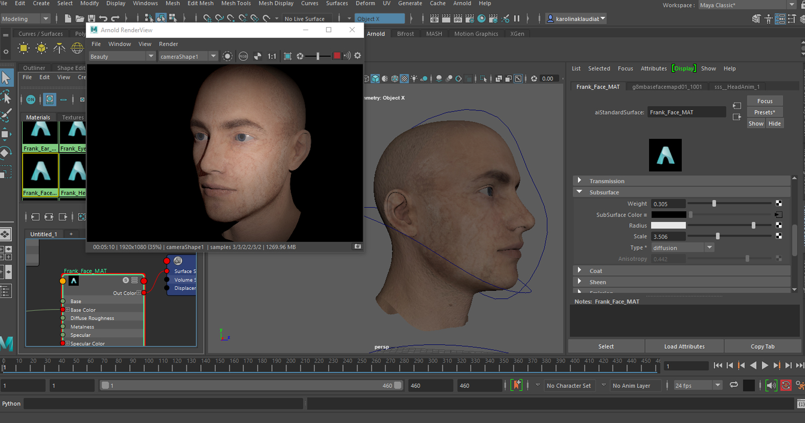
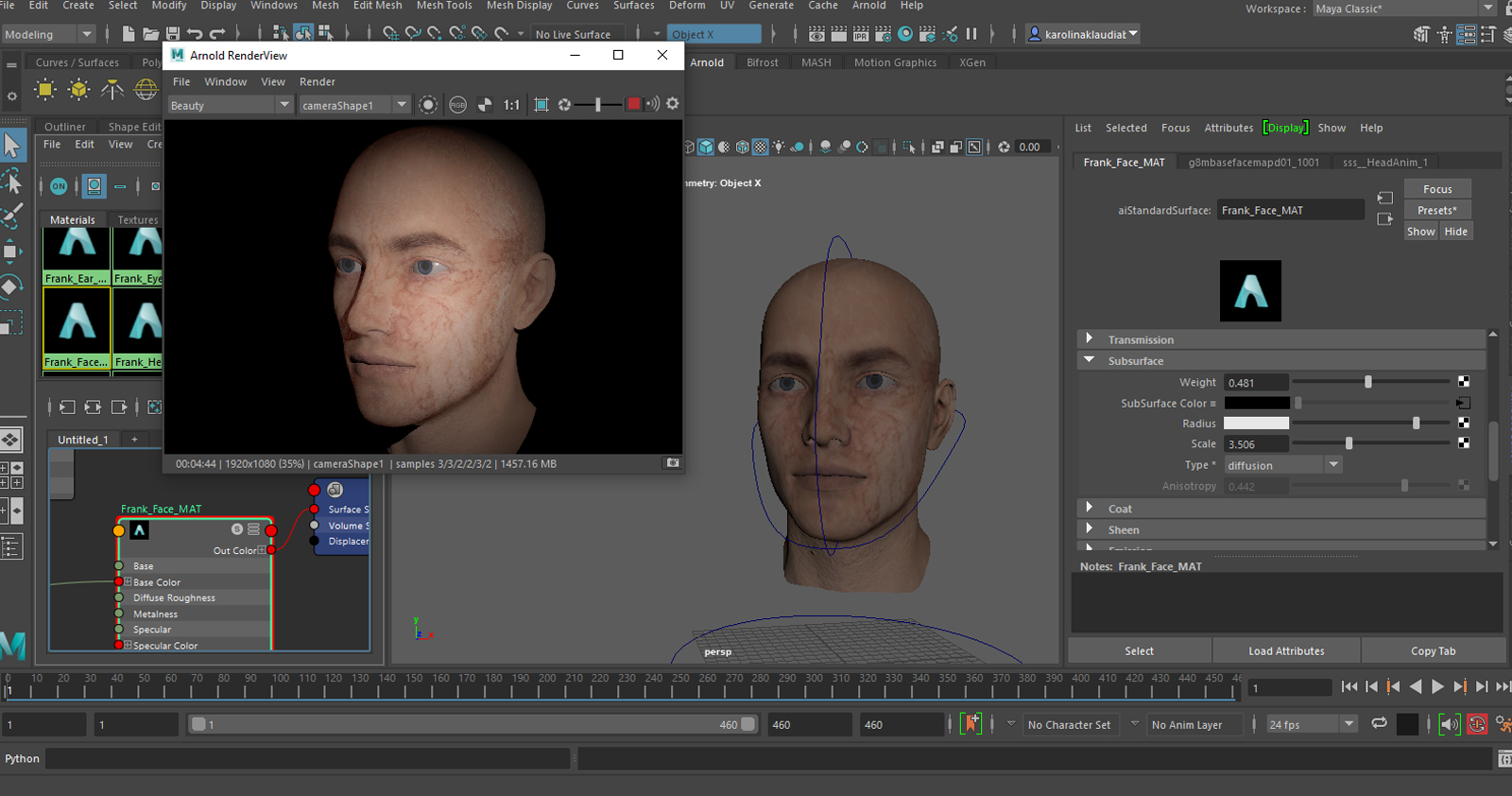
Sub Surface Scattering Exploration
Sub surface scattering is essentially the imitation of the transparency of the top layer of the material assigned to a particular object, most often used for skin, marble, leaves, wax and milk.
In the physical world it is the interaction of the light entering a translucent material and being refracted inside it (the light reflecting at irregular angles inside an object) before exiting it at a different angle and place it would have, if it was reflected directly of the surface.
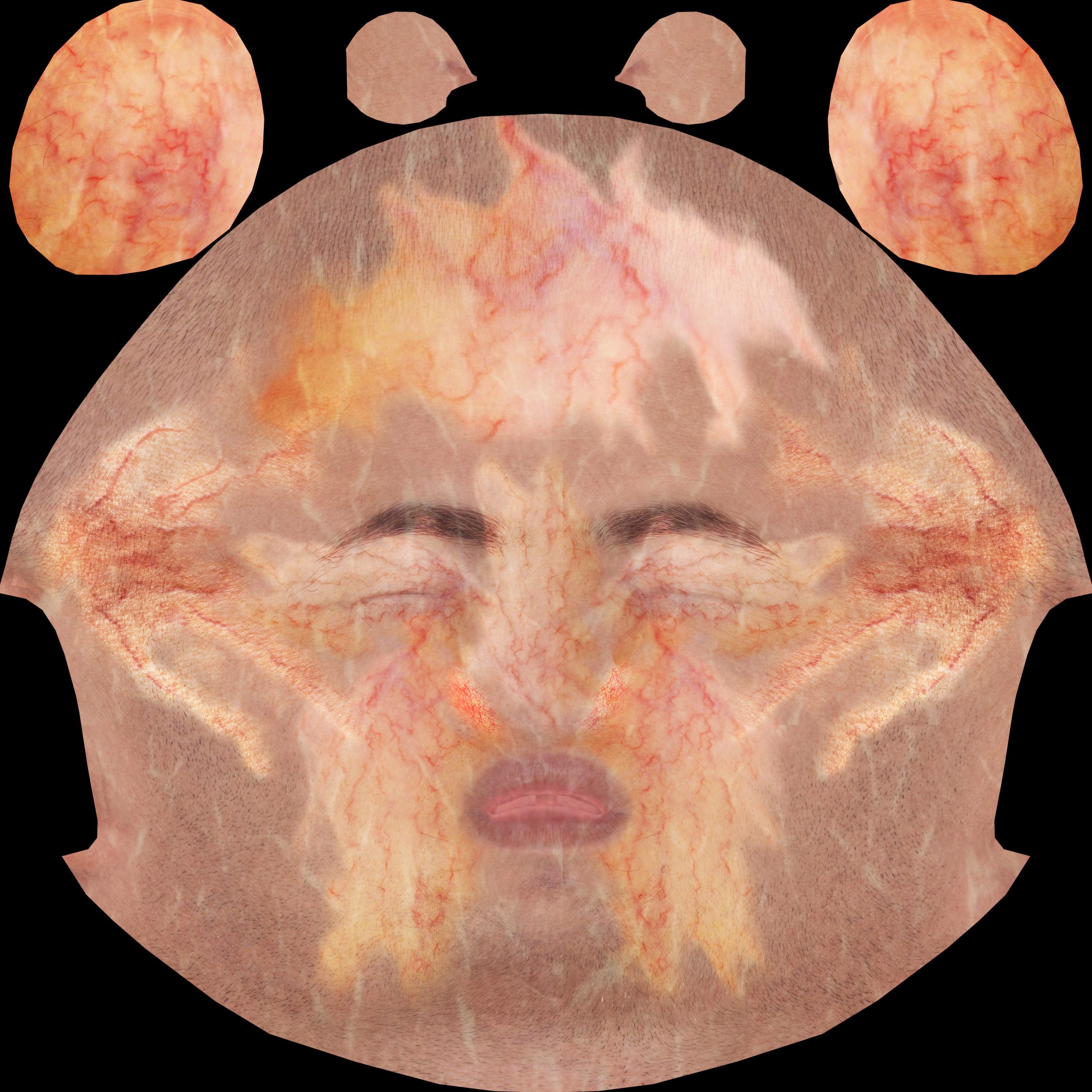
Below a few experimental sub surface maps with their respective renders.
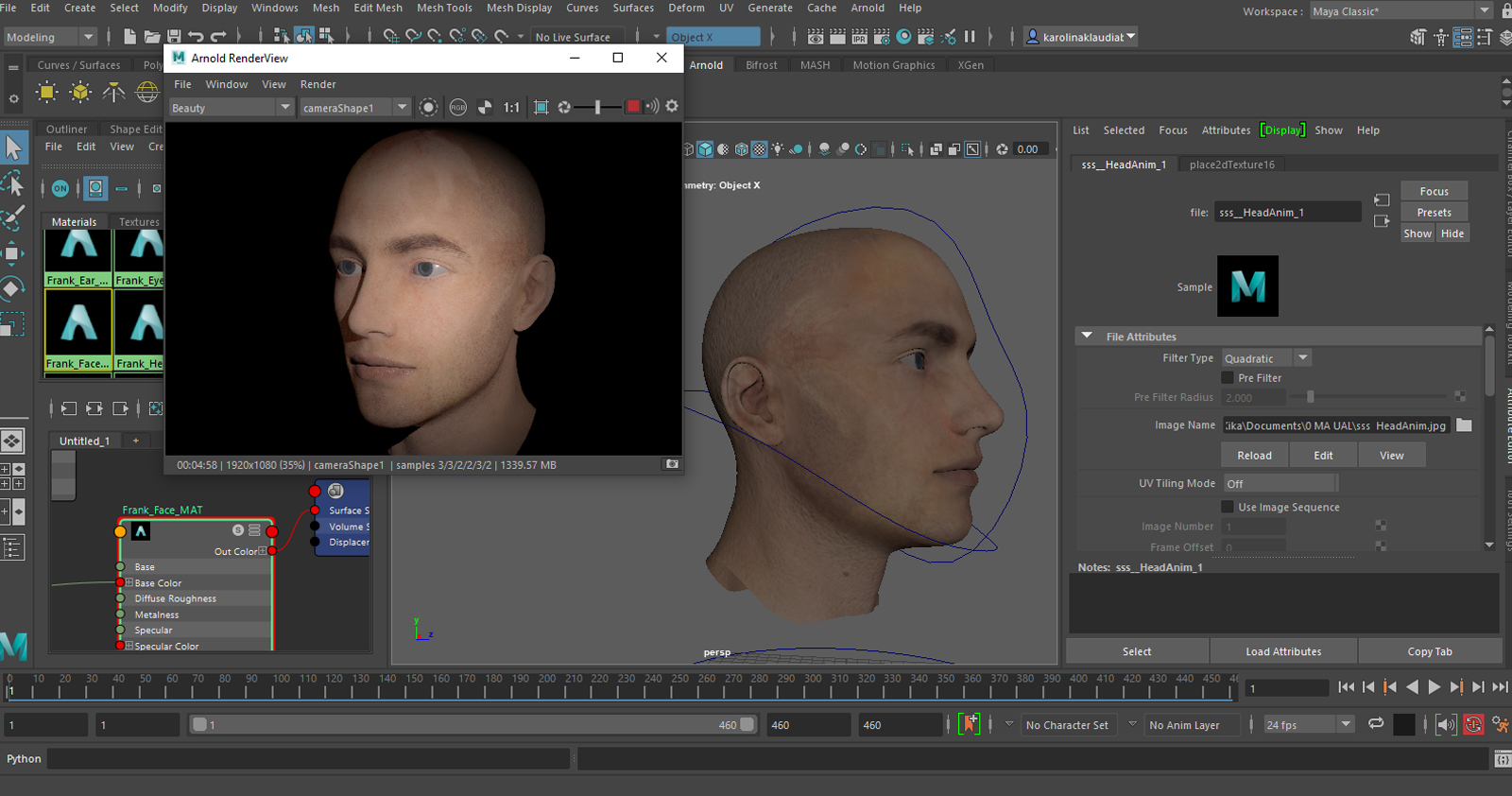

First try of the SSS map, too much colour variation between the skin areas, I thought it wont be a problem in a lower transparency, as I expected only the brighter colours to go through the skin layer.
The brightest white part from the forehead gone and some adjustement added to the veins on the cheeks, near the nose. I had increased the contrast and adjusted the hue to give me more pronounced patterns, as I wanted to check how this would work.
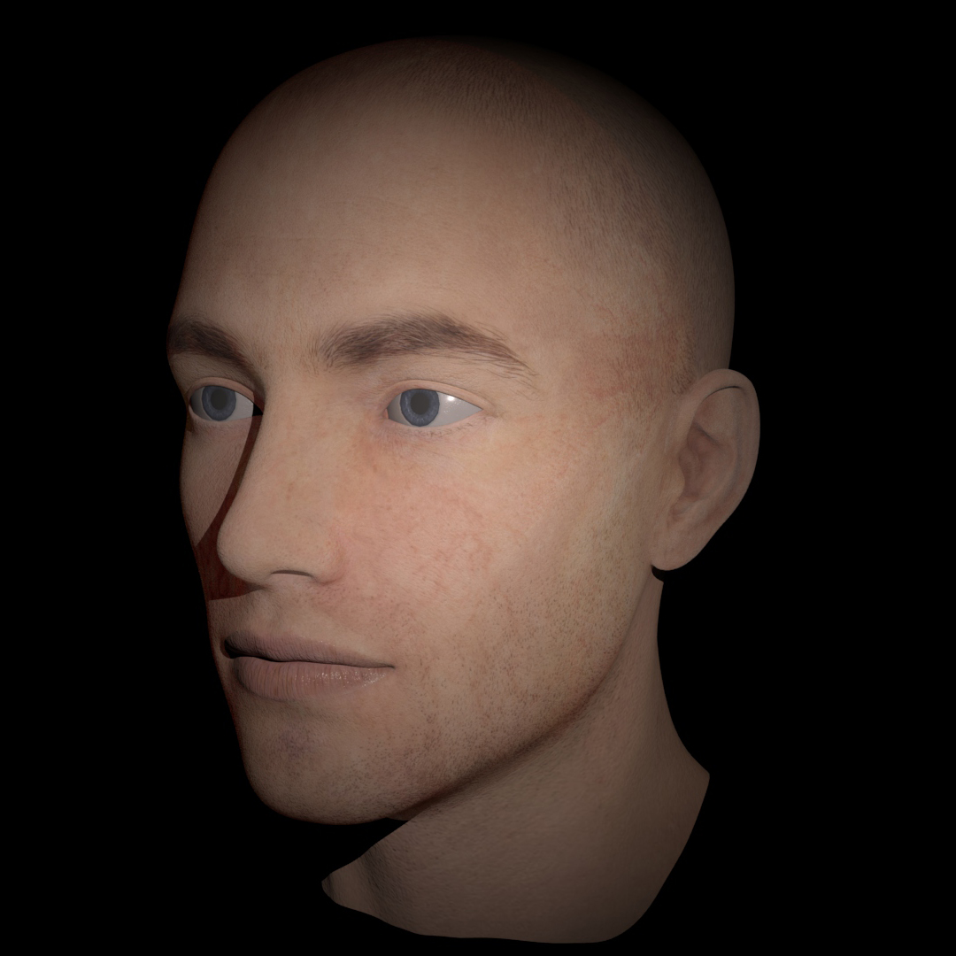
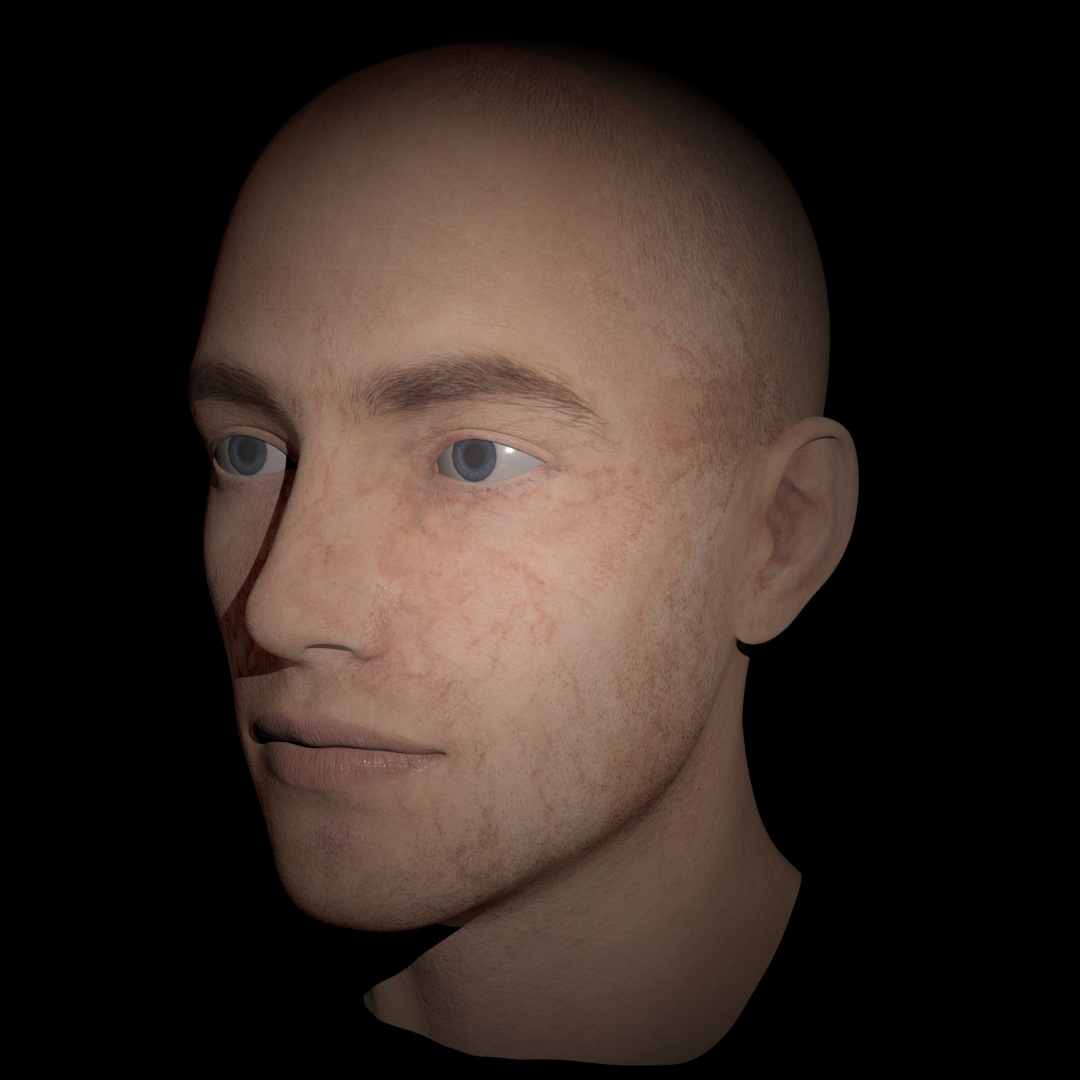
They settings on this render are slightly exaggerated, in the end I had decided to use this texture in a more subtle way (additional renders with the blend shapes further down in this section)
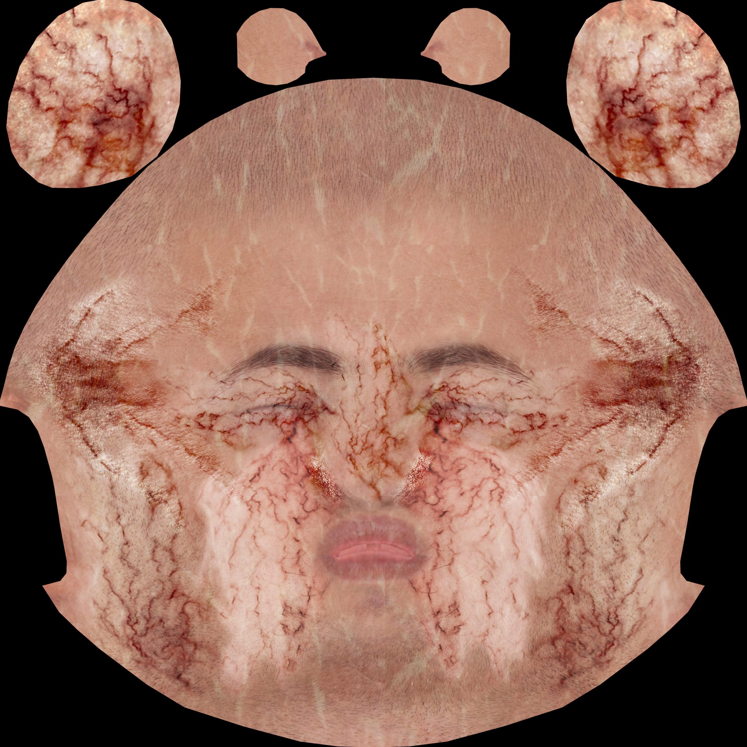
As the above experiment worked relatively well I had adjusted the rest of the veins cut outs in a similar fashion to get a consistent effect across the whole face. Then I had played with the way it appears in the renderer by adjusting how the material and sss works and this is the effect I got out of it.


The above sss texture taken to extreme to show the outcome and see how it would look like on exaggerated settings.
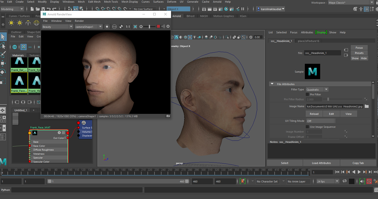
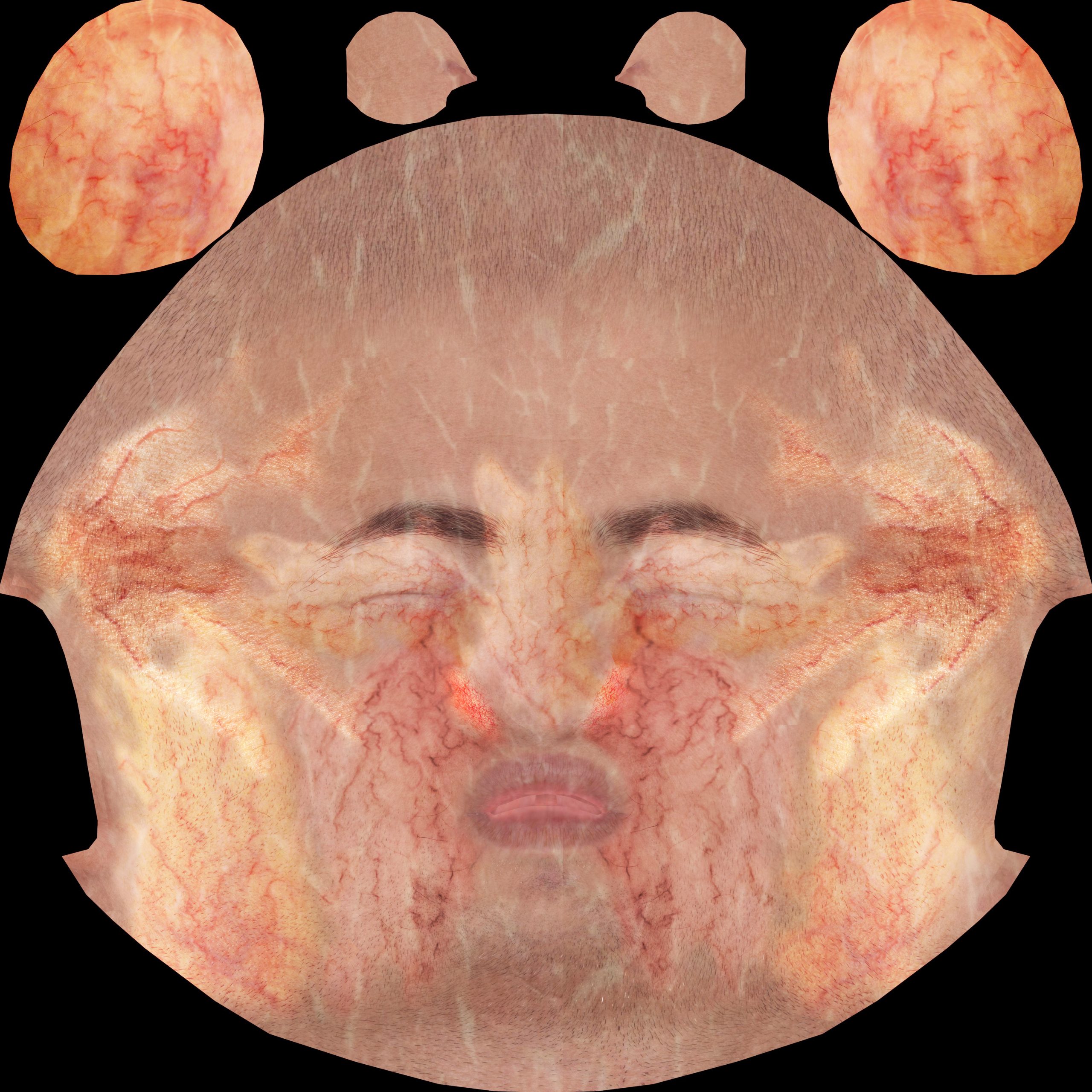
Additional Renders (practical use)

A few additional renders trying the texture out in a practical scenario (face shapes) and using a bit more subtle and natural looking settings of the sss map (more delicate veins showing through)
Week 8 – ID maps and Sub Surface Scattering Evaluation
Using the ID map to separate the components helped me understand the way Nuke works with renders and the importance of being able to separate elements in order to affect one part but not the other one (if not required) of the whole rendered area. ID map comes very handy in this, playing around with the colour of the face without adding hue to the whites of the eyes and the teeth was weirdly satisfying, and it allowed for a more realistic effect. If the eyes took the hue of the rest of the face it would look artificial and stylised to some point. I wanted to take this exercise further and use the specular on the eyes and teeth only for practice, but here is where it stopped working, and because of the time it took me to render the sequence I had to move on from this exercise before I could figure out my mistake. Originally I thought that I used the specular channel as colour, but the teeth work fine, I am planning to revisit this exercise to find out what I did wrong. I find this quite interesting and I will be looking more into using Nuke alongside Maya in the future.
To understand how sub surface scattering works in practice I decided to experiment with it in Maya using the trial and error method. To make the first texture map, I simply placed some vein picture cut outs on the texture, blended the edges and adjusted the hue and contrast in a way I expected to give me effects (not to subtle or light etc.) and loaded it up in Maya to see what will happen. From the result, I’ve learned that big colour value variations will show up quite clearly on the final render, and I had to delete the forehead veins as they were too white on one, and orange one the other side. I have also decided to make the veins the centre of attention, get rid of as much of their original background and bring out their colour as much as I could (as I should have tried from the beginning), to see if that would work, I have done it to a part of the texture (the cheeks near the nose) to start with. I have also added some barely visible meat texture to add some variation to parts of the map. This worked quite well and I have added adjustments to the whole thing to match the look of those first veins, and I experimented with how much the texture was visible in Maya which gave me the final result.
The quite large veins that I chose dont look very realistic, but I decided to treat this as an exercise not something that needed a proper outcome (I feel this way I have learned more) as well as some of the smaller broken blood vessel pictures I had used, barely showed up at all (sides of the nose). In the future, to Improve the outcome I should look up picture of full faces with those elements as well as do some research into which areas those elements should be located on, as here I just placed the images wherever, only to see how they will work.
I feel like this texture needs more of the smaller broken vessels, some more redness and some skin imperfections to make it look better, the large veins should also be kept less pronounced and visible, as right now it looks a bit like something out of a horror movie.
Group projects – short video
Head hologram
References
A part of a video using the idea of holograms around the city, as does the idea for the group project.
Progress
Model
Time-lapse of a part of the modelling – left, and a turntable of the final model – right.
Early Development – first tests
Head – Rendered sequence straight from Maya, some work on the material, no post adjustement.
Particles – Rendered sequence straight from Maya, material and no post adjustments.
Both elements in nuke, with colour and exposure adjustments. More pronounced shadows and highlights.
Nuke – transparency
Nuke – Experiment
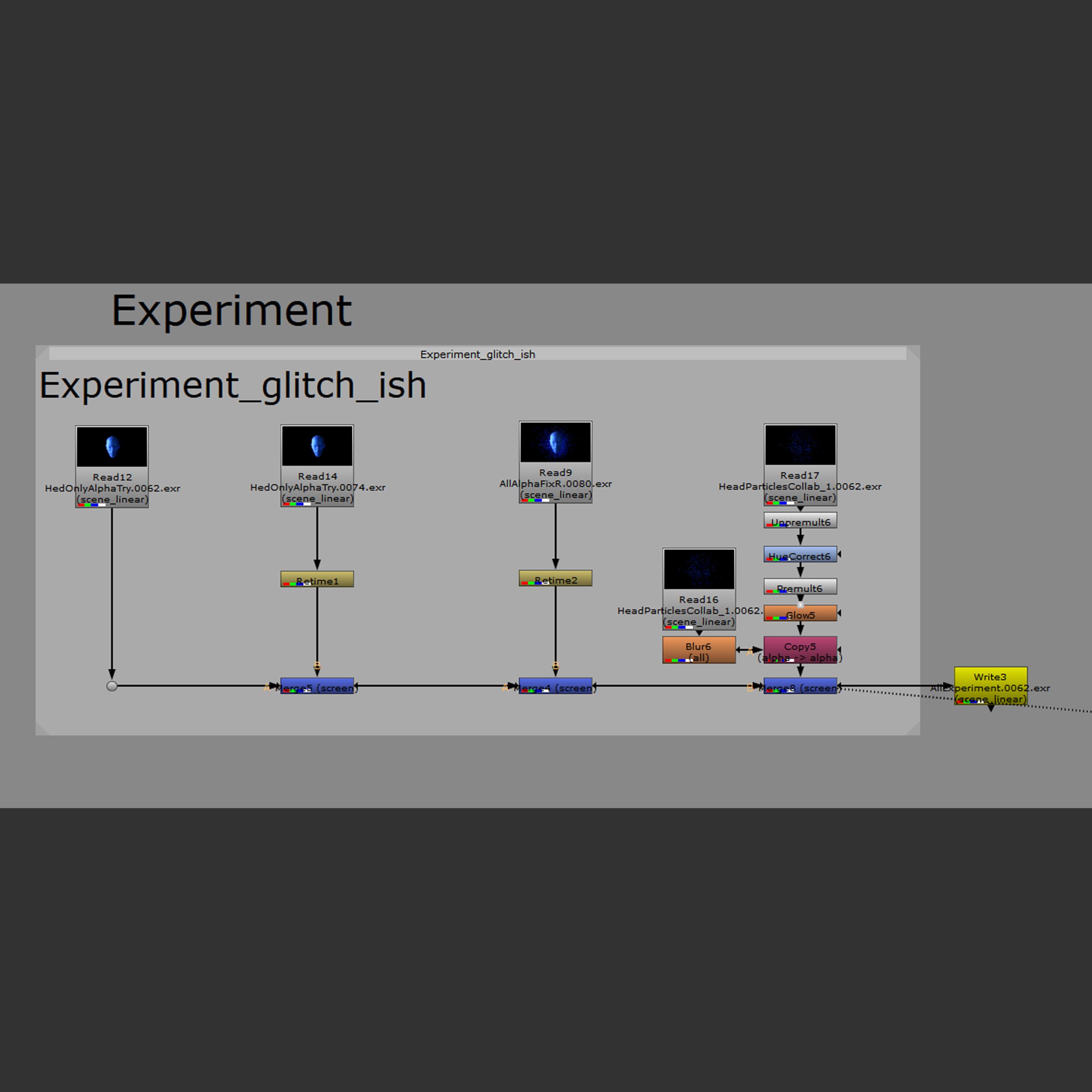
This experiment uses instances of the read and retime node, respectively increasing the time of the video.
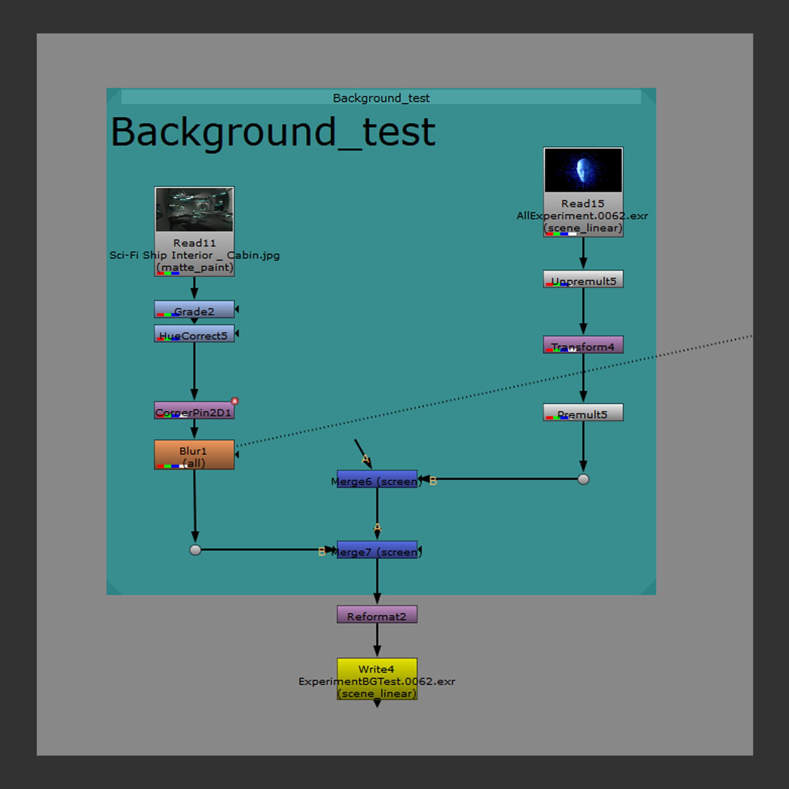
Nuke – The whole thing placed on a temporary background picture with some failed corner pin.
Nuke adjustements
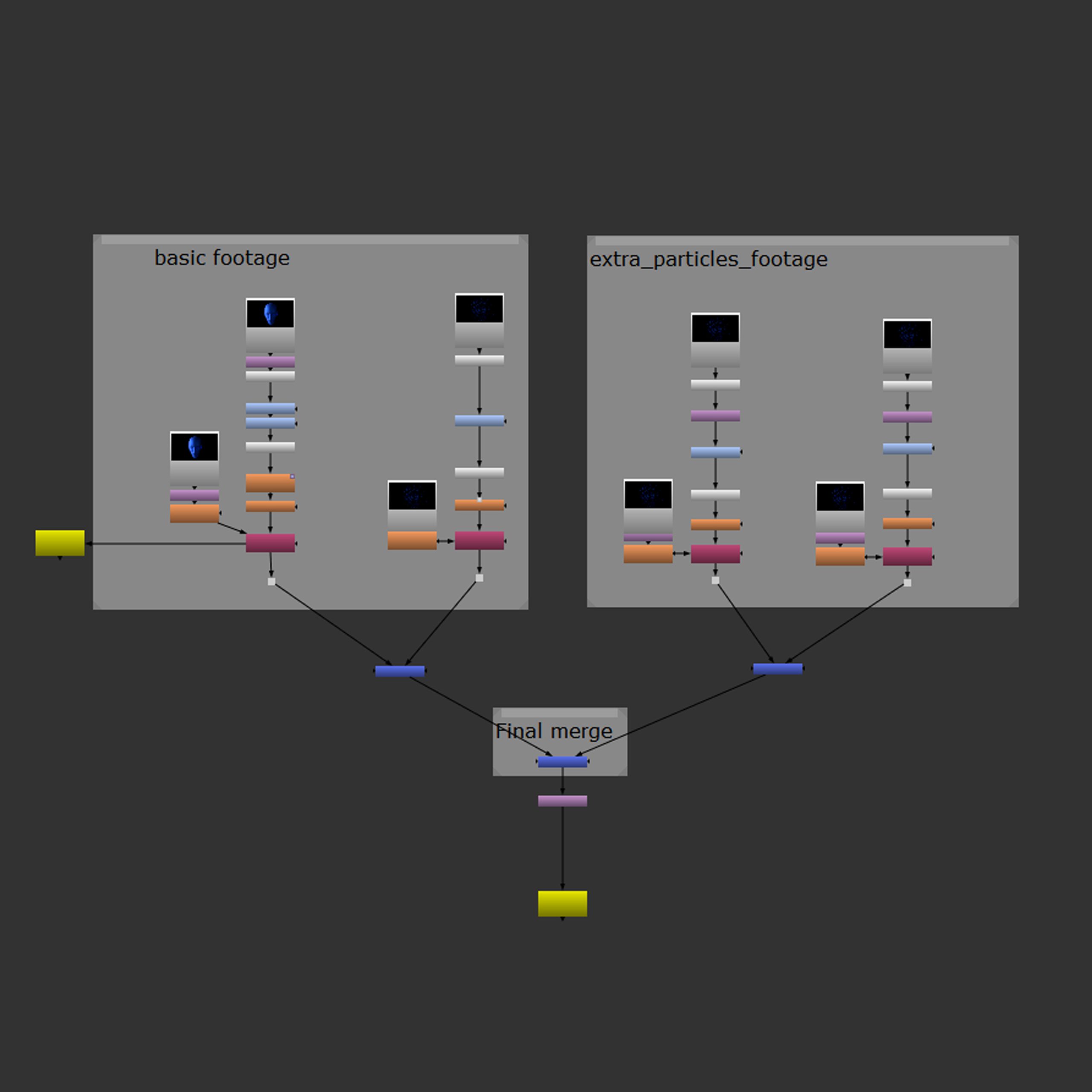
The hierarchy of the main part of the adjustement.
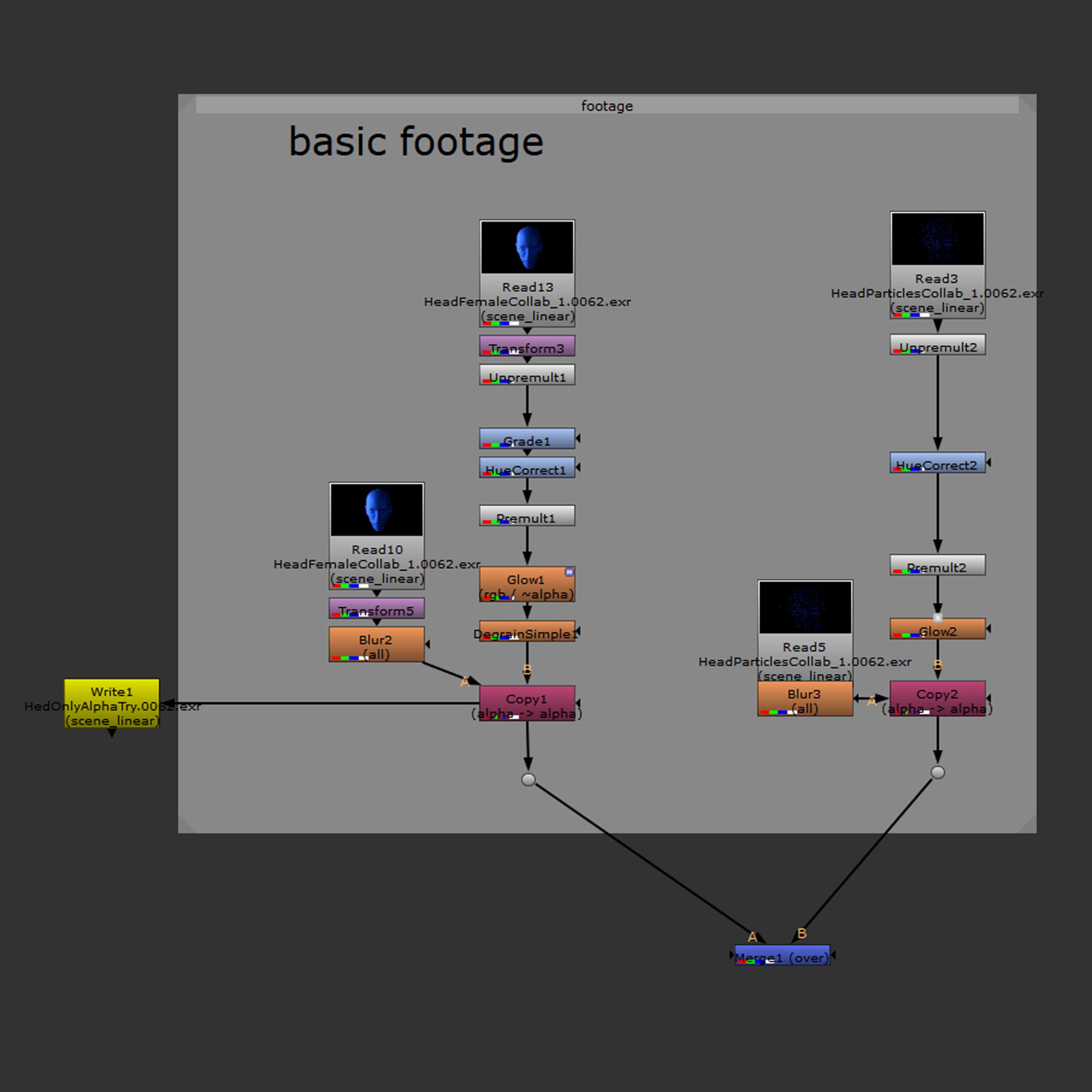
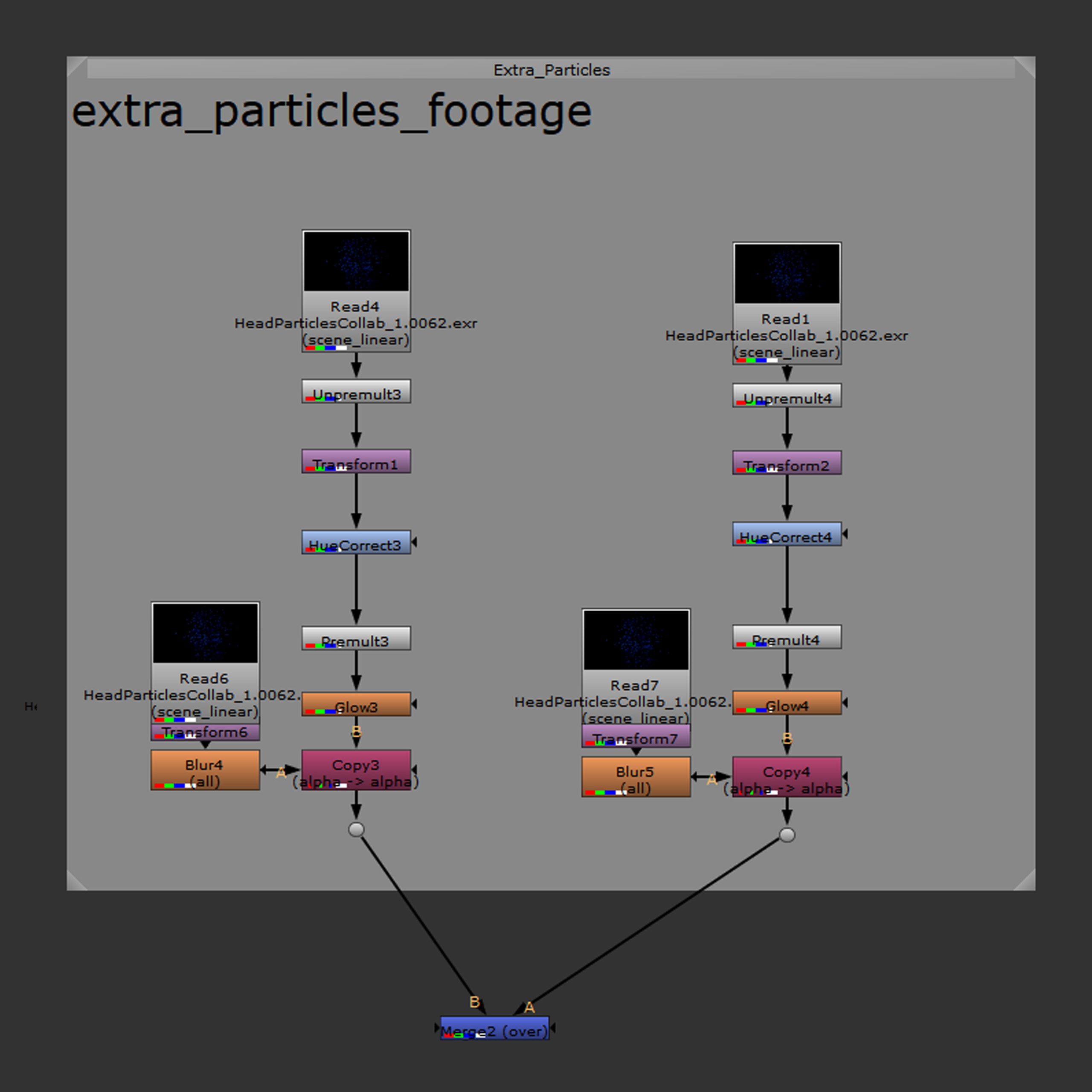
The main footage, the head on the left and the particles on the right, with their adjustement nodes.
The additional particle copies, with their adjustement nodes. I added more copies of the particles to make them more pronounced in the final outcome.
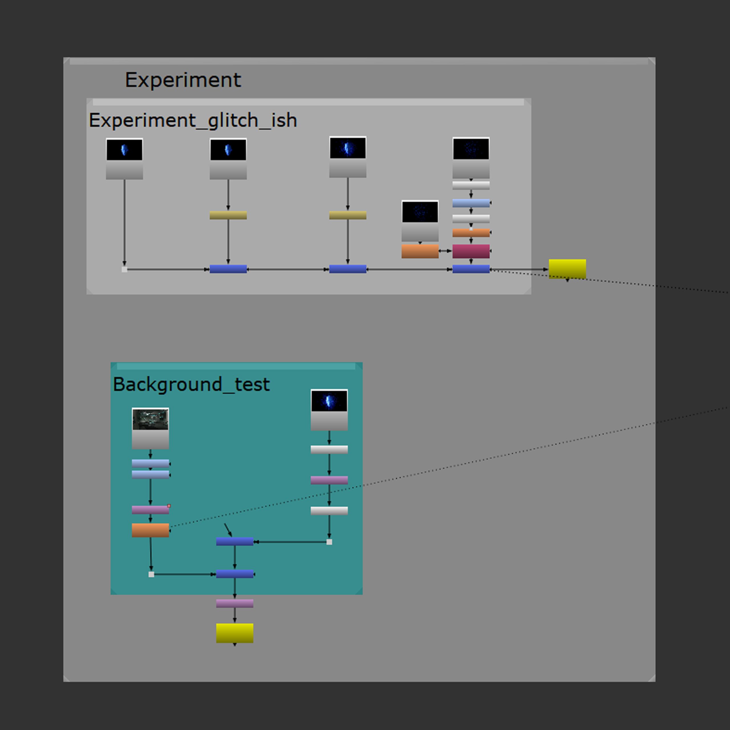
The hierarchy of the experiment, using renders from the previous setup.
The setup of the duplicate and retime experiment.
The setup of the background test I did to make sure the transparency works right.
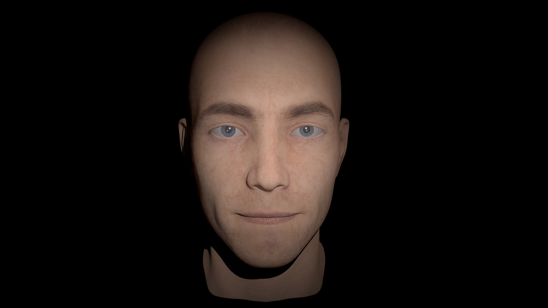
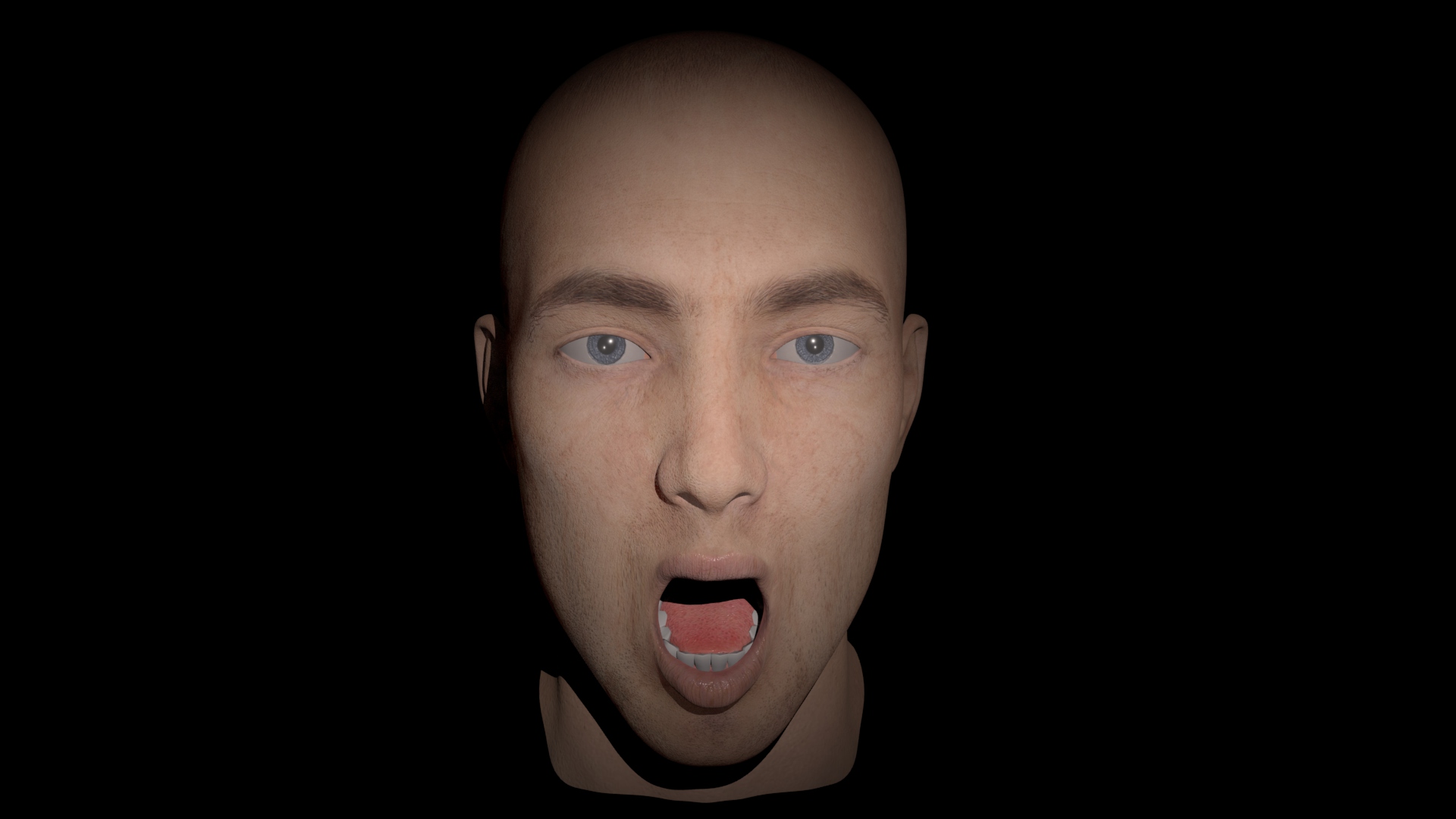
Outcome
Head only Nuke render with transparency and glow.
Maya particle re-render – I’ve noticed that the particles got cut out in a straight line and when scaled down, they would look unnatural.
Both together with the new particles.
The experiment, adjusted to fit my idea better, the previous one went too slow and the last head lingered for too long. Here I sped up the footage instead of slowing it down like previously, and the resulting overlap looks much more like a lagging VR/AR/game.
The final experiment rendered on the same background as before to check it works correctly.